Strings of Autumn 2017
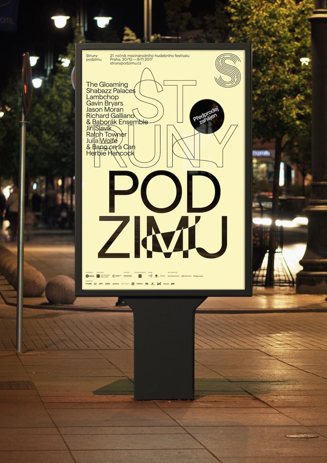
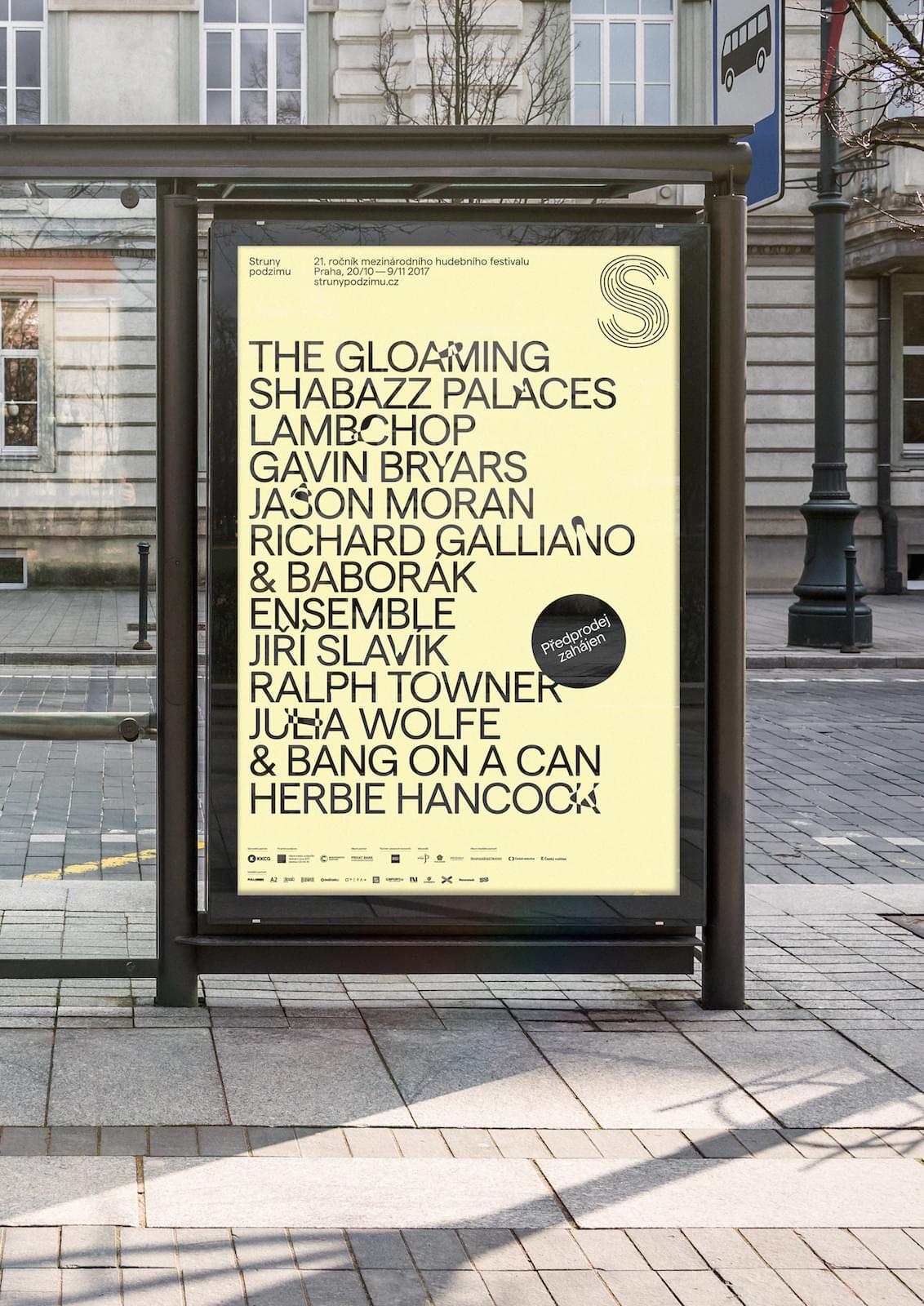
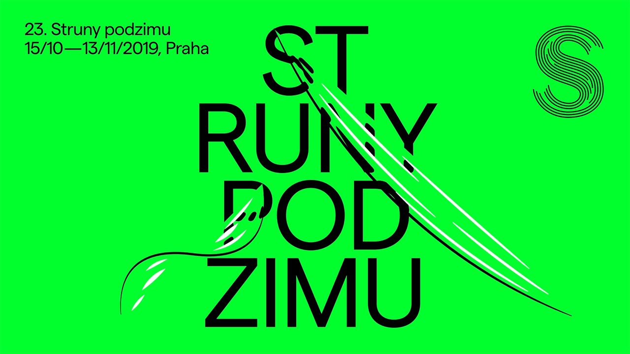
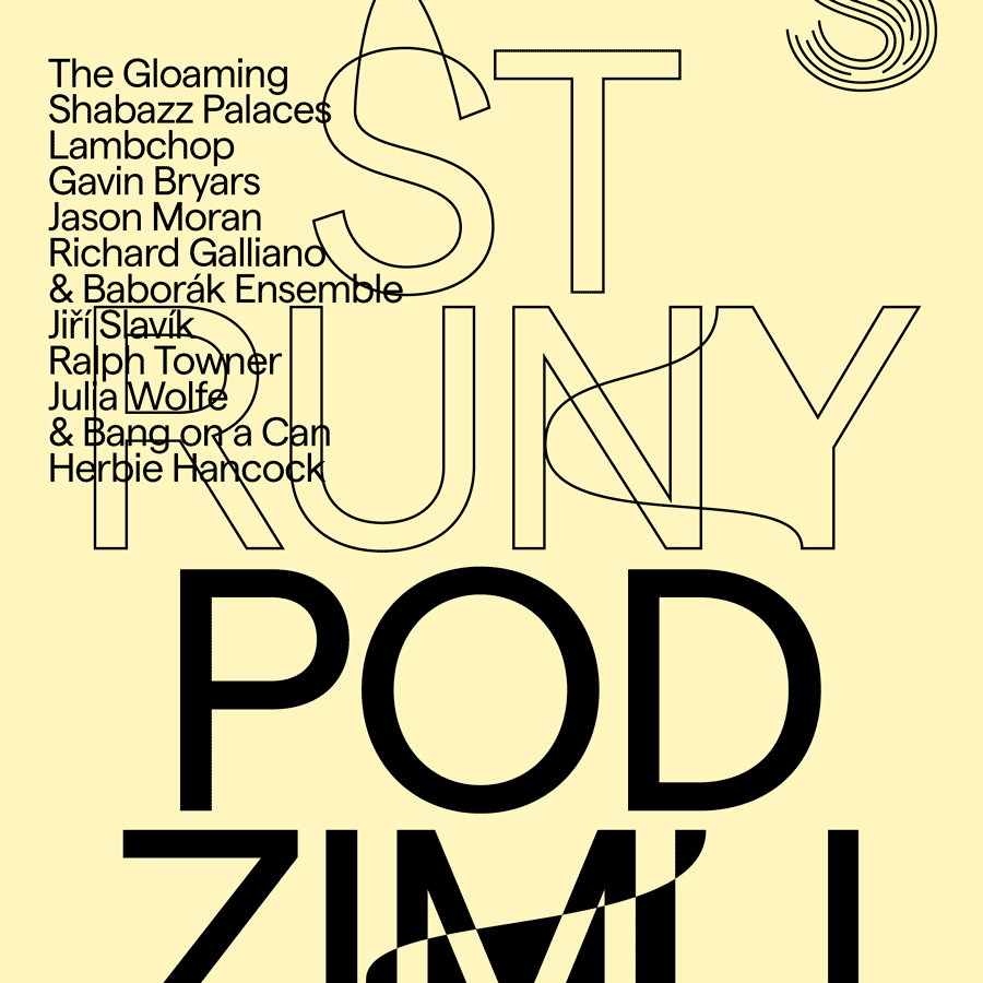
Back after a yearlong pause, the Prague’s twenty-one-year-old multi-genre festival returns in October with a renewed team and a new visual identity. Martin Vácha twisted and turned the strings into the S-shaped logo and built on the idea with the contours of the letters, which from time to time “skip a beat” as a small glitch, dissonance or line-up experiment.
02/08/2017
Related authors: Martin Vácha,