Avenga
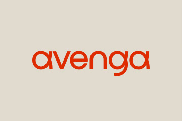
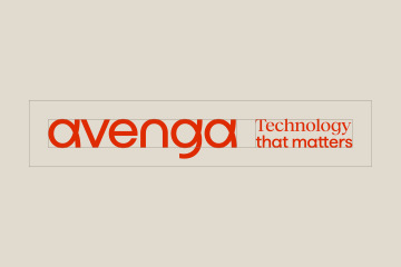
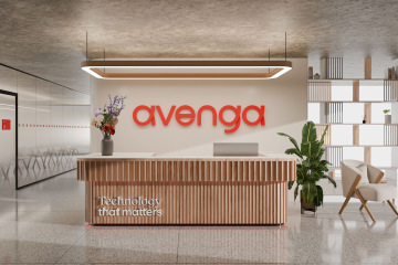
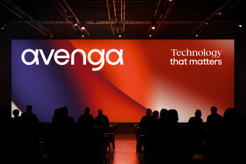
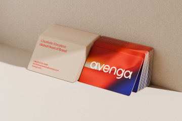
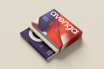
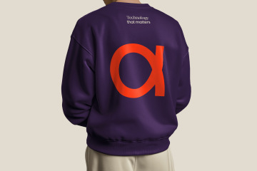
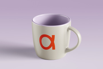
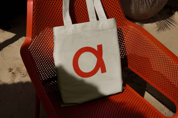
Companies Avenga and Qinshift have merged under one brand, strengthening their global capabilities in software development, enterprise technology, and artificial intelligence. Avenga is a combination of the words "avenue", suggesting a path, and the Spanish "venga", meaning "come." The main principle of the new logo is the distinctive loop in the letters "a" and "g," which symbolizes dynamic connection and collaboration with the client.
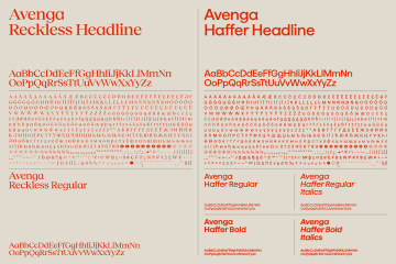
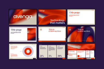
For the visual style, two typefaces were modified in collaboration with Displaay Type Foundry to be proportionally suitable for the Avenga logo, containing specific character shapes based on the same principle as the logo and offering broad language support.
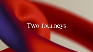
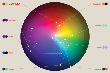
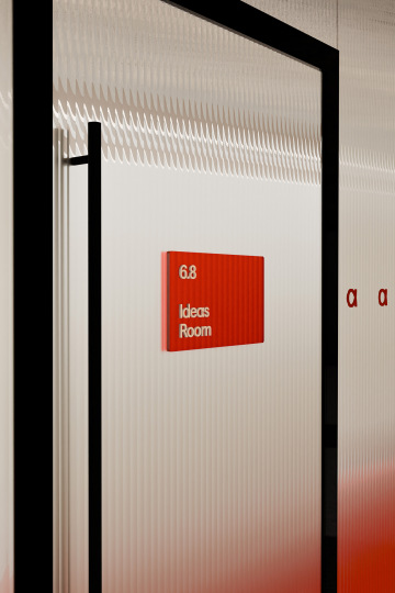
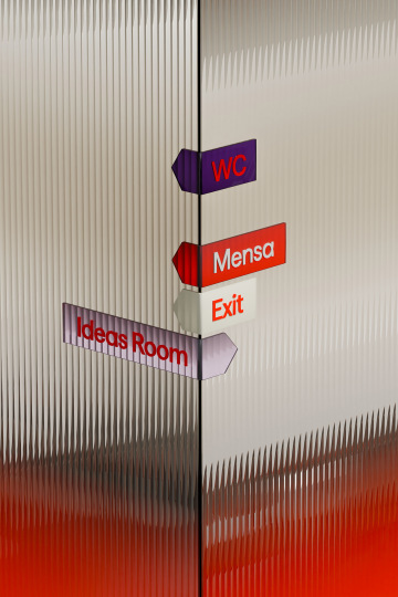
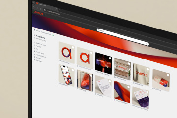
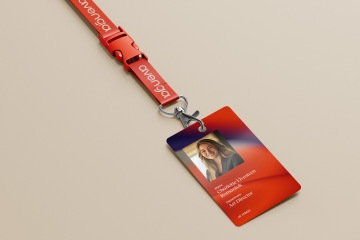
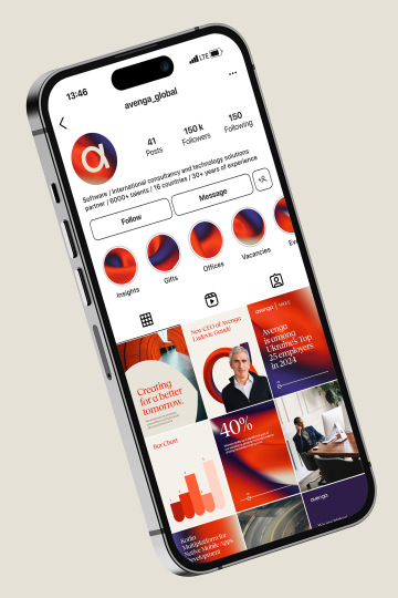
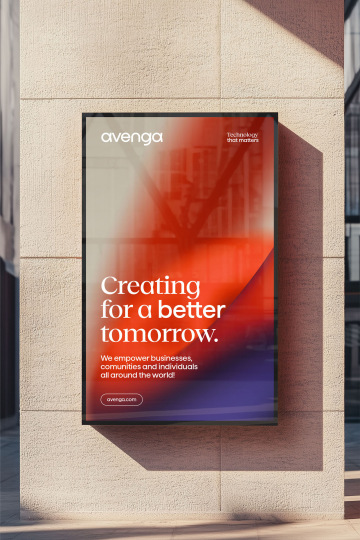
The main visual element are 3D motives that capture the loop in detail in various forms and serve as an abstract visual motif. Combined with bold colours, they help the Avenga brand stand out from its competitors in colours typical of the technology sector.
Client: KKCG,
Designer: Jonatan Kuna
Art director: Aleš Najbrt
Cooperation: Jakub Spurný, Michael Dolejš
3D: Jonatan Kuna
Animation: Jonatan Kuna
DTP: Mária Černá
Technical cooperation: Marek Pistora
Production: Adéla Pěchočová
Additional cooperation: Displaay Type Foundry (typography edits)
Type: Exterior, Interior, Brand, Web, Social media,
Year: 2025
