Bjukitchen
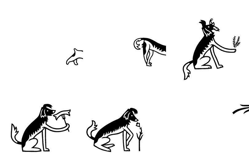
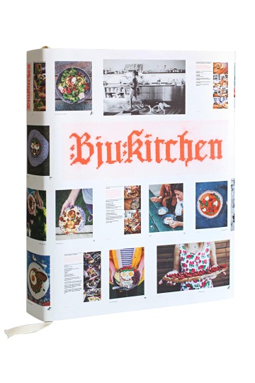
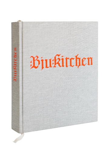
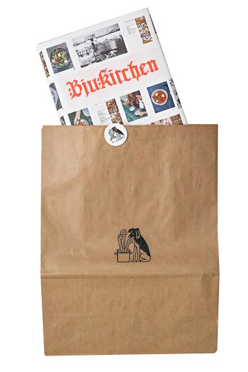
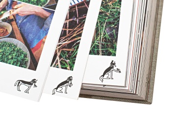
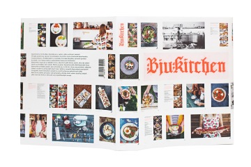
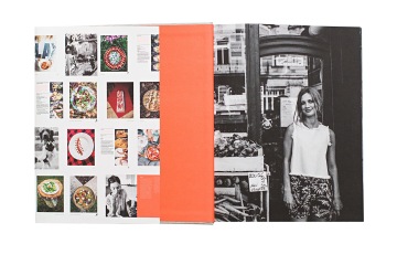
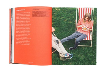
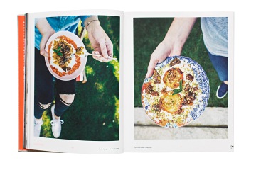
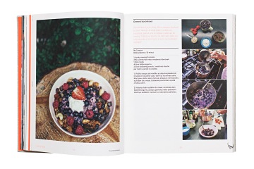
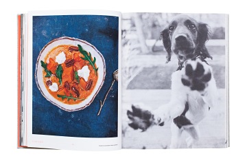
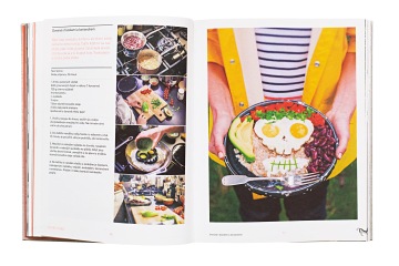
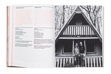
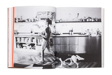
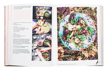
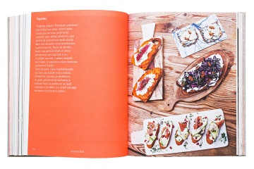
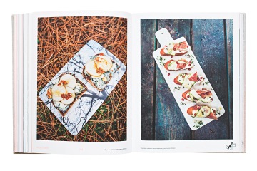
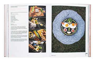
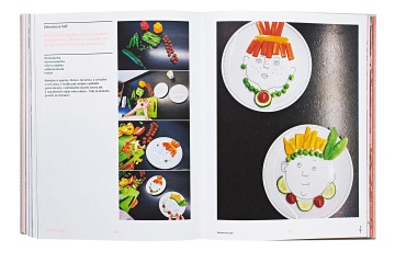
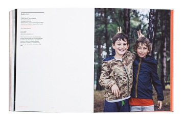
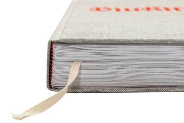
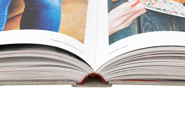
Bára Karpíšková aka Bjukitchen lives in a culinary lifestyle magazine editorial. She lives there with Tomáš Karpíšek, the owner of the restaurant group Ambiente, and they live there idyllically, which is why the logo of her cookbook is inspired by over the stove hung covers and aprons embroidered with motivational / protective slogans such as Home Sweet Home and An Gottes Segen ist alles gelegen. Since Bára doesn’t cook on a wood-burning stove and doesn’t wear five petticoats, a reflective orange color often seen on Karpíšeks’ outfits brings the logo up the date. Such logo would be embroidered with Nike Flyknit laces – by a new, free-spirited housewife who loves to work the kitchen because to cook for her family and loved ones is fun and not a chore! And such logo can only appear on cloth covers of Marie Janků-Sandtnerová, a classic Czech early 20th Century cookbook author. As if cheerful, independent Sandtnerová lived today, purchased her groceries on a farmers market, and instead of butter, granola solved everything (put there at least 200 instagrams!). Brambora [Potato] is the second logo. A puppy that grew up during the annual shooting of the book and stuck her nose into everything over Tomáš’s resolute and futile protests. This resulted in a paraphrase of Nipper, the dog listening to "His Master's Voice" from the phonograph on many labels for several music publishers – an obvious reference to the fact that food today replaces the arts. From there it was only a whisker to the flipbook at the bottom of pages where Brambora grows together with a fork flower. Inside the logo’s typeface follows Organon typeface by Czech typographer Jan Pelíšek and the layout serves cookbook’s original function: non-stylized pictures of preparation are shown clearly on spreads so that the only thing you have to flip is the oats in the oven.
Client: Bjukitchen,
Designer: Zuzana Lednická
Additional cooperation: Bohumil Vašák (illustrations), Maxim Velčovský (illustrations)
Type: Book,
Year: 2015
