Makropulos
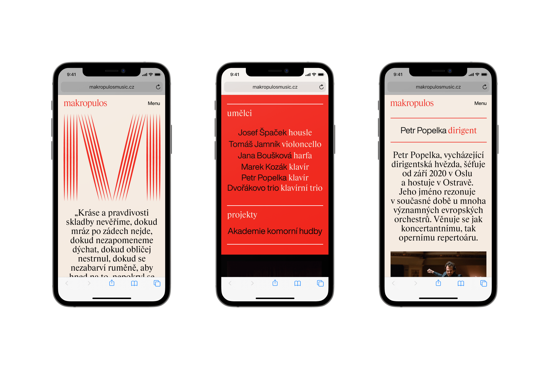
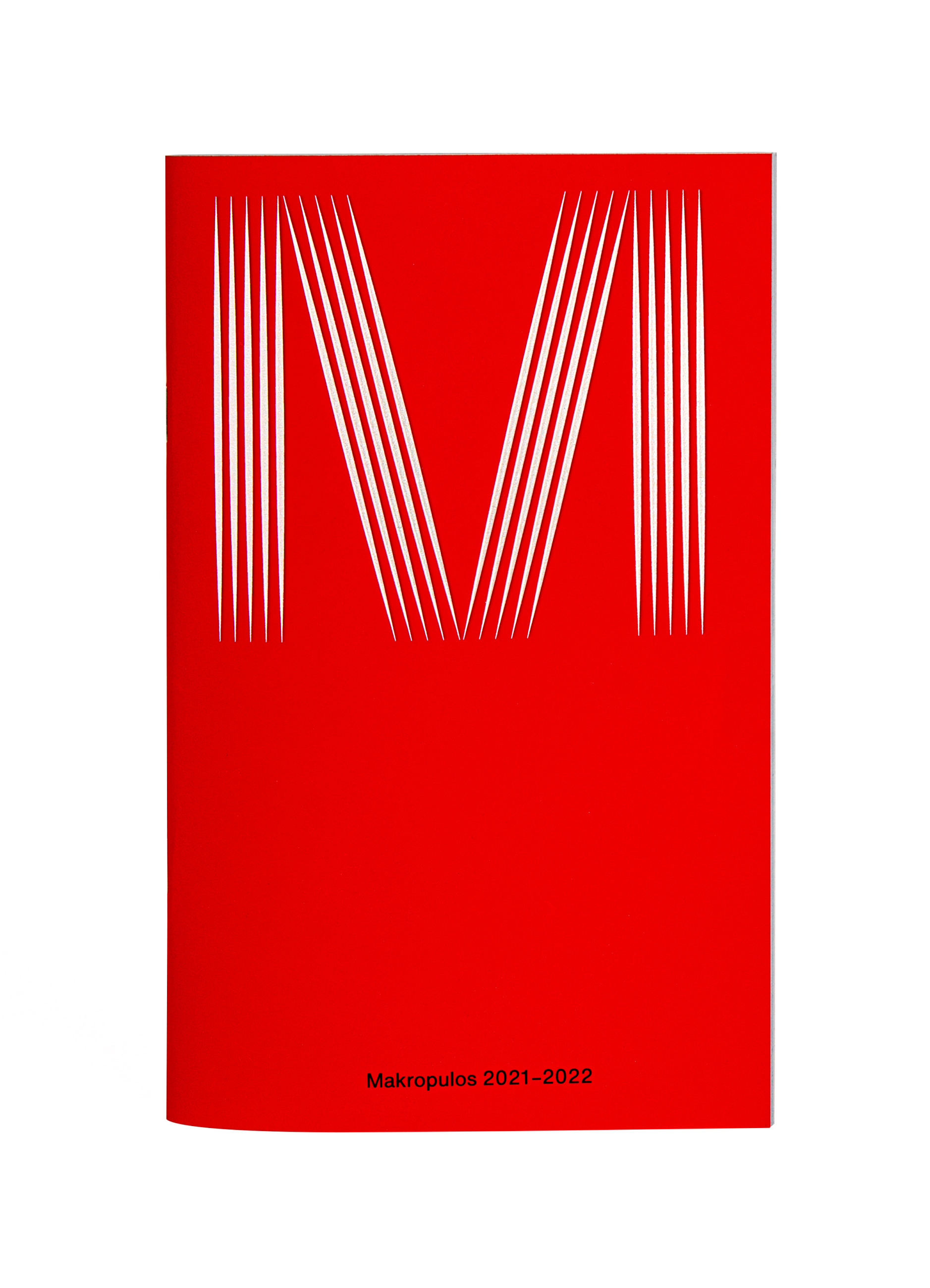
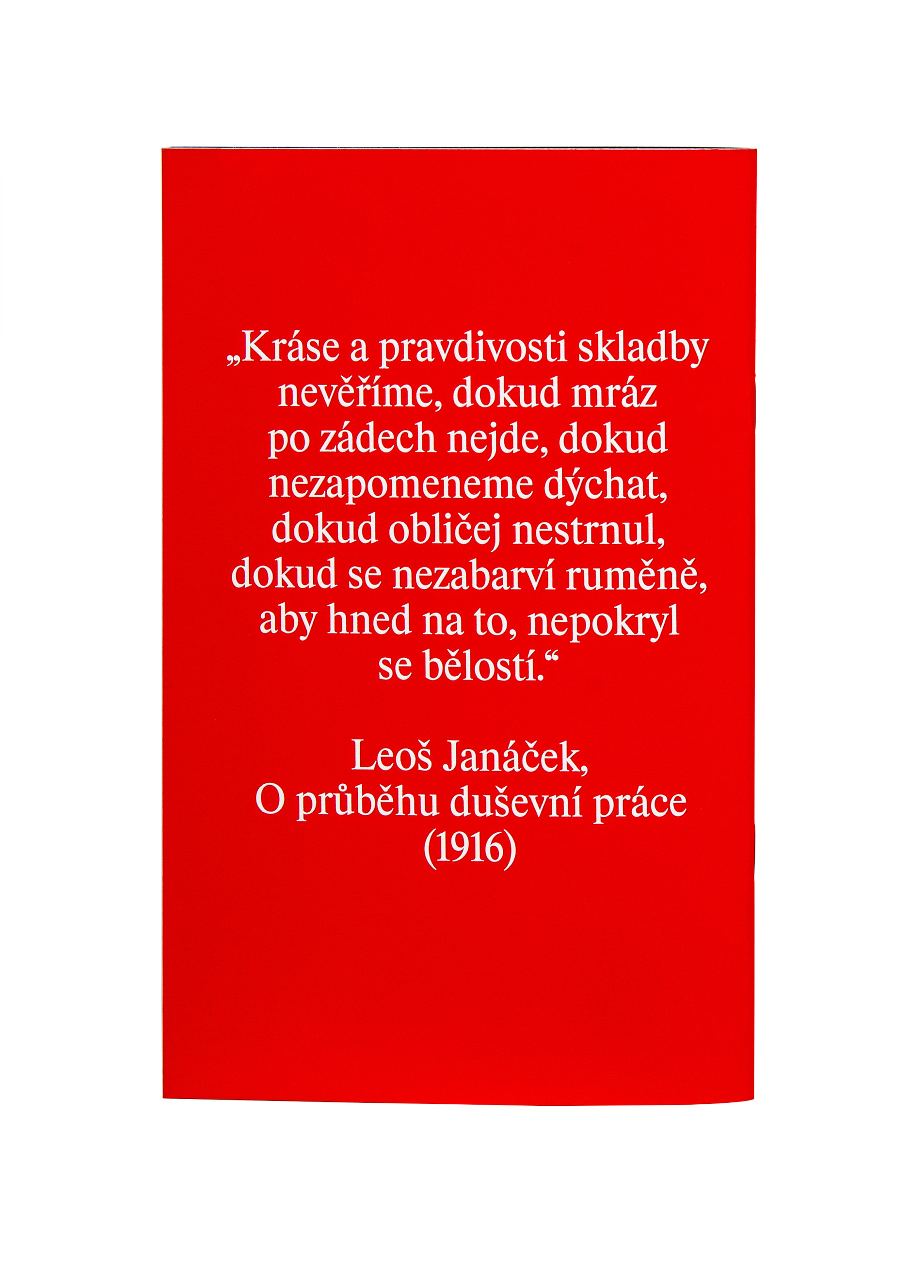
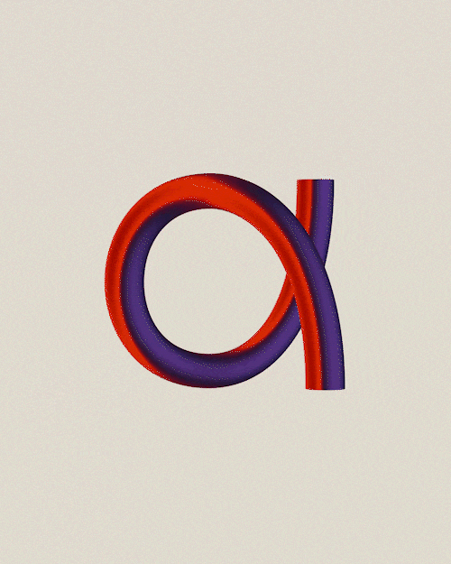
Agentura zastupující přední mladé hráče staré hudby si zasloužila značku bez klasických klišé – zvučně rozechvělou literu M z pěti linek rozvibrované notové osnovy v kombinaci s pulzující oranžovočervenou mladé krve, barvou téměř pokrevního spojení pevně semknuté rodiny jednatelství a reprezentovaných interpretů. K tomu písmo Rhymes, nejsoučasnější interpretace nejtradičnějšího Timesu a makro efekt zoomu – nahlédnutí do tepny současné vážné hudby.
Client: Makropulos Music Agency,
Designer: Andrea Vacovská
Art director: Zuzana Lednická
Webdesign: Michael Dolejš
Animation: Zdeněk Trinkewitz
Production: Michaela Gabriel
Font: Helvetica Now,
Year: 2020