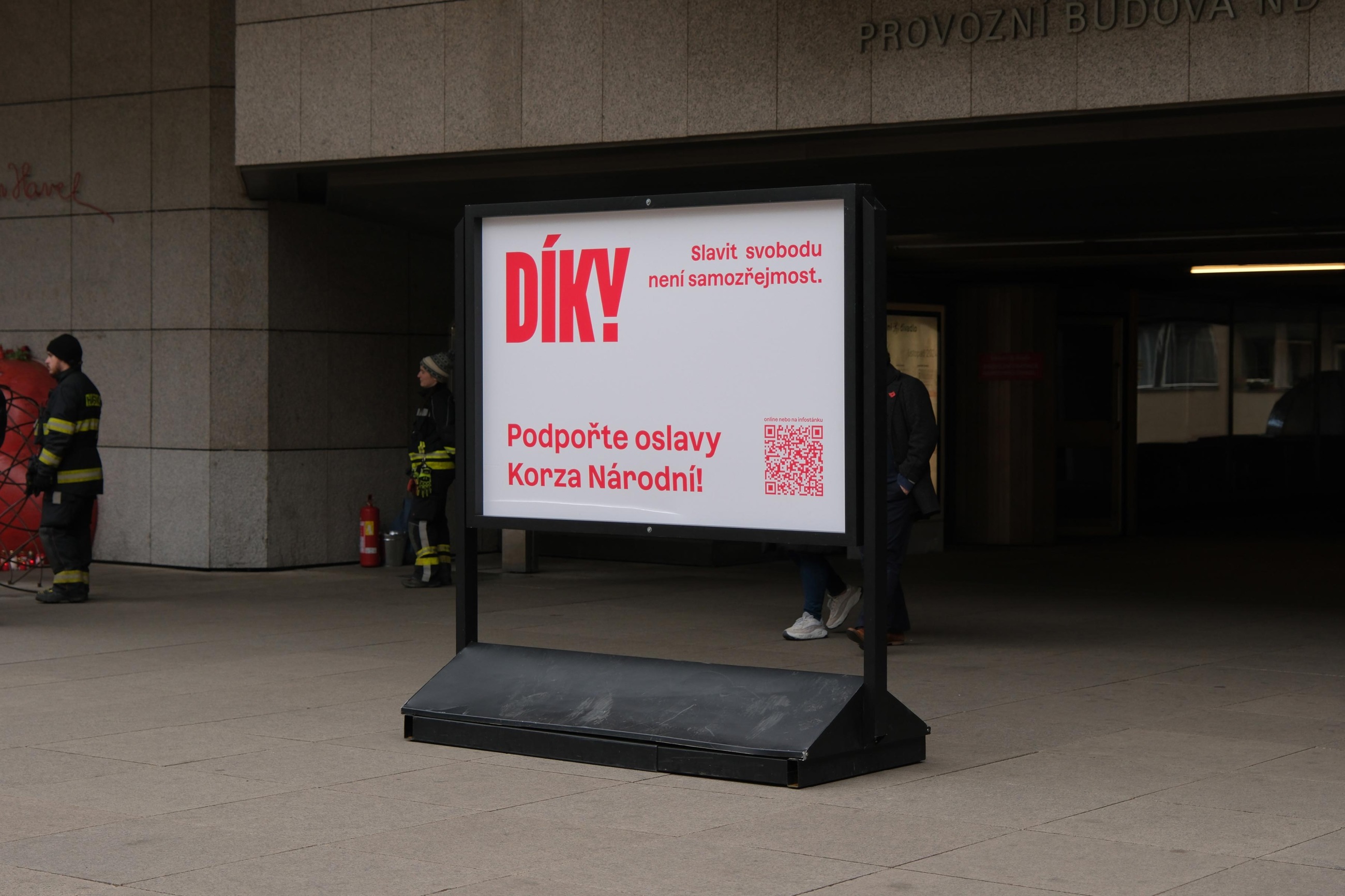
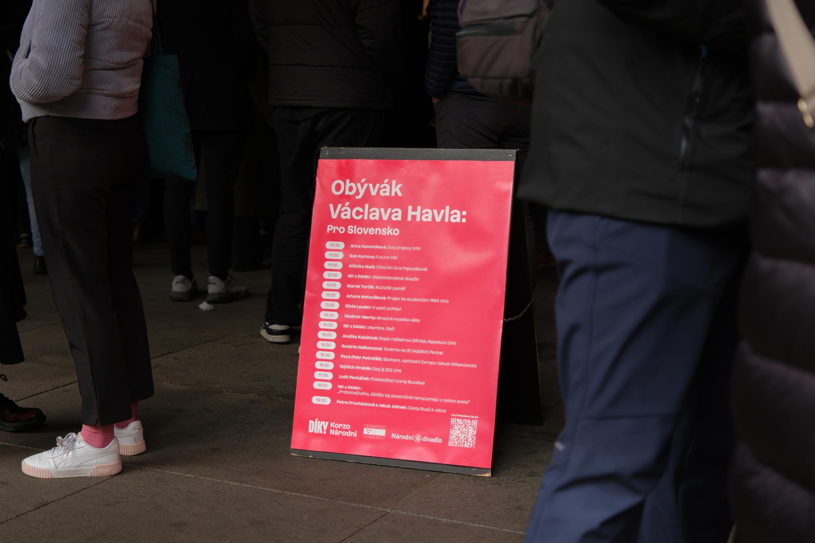
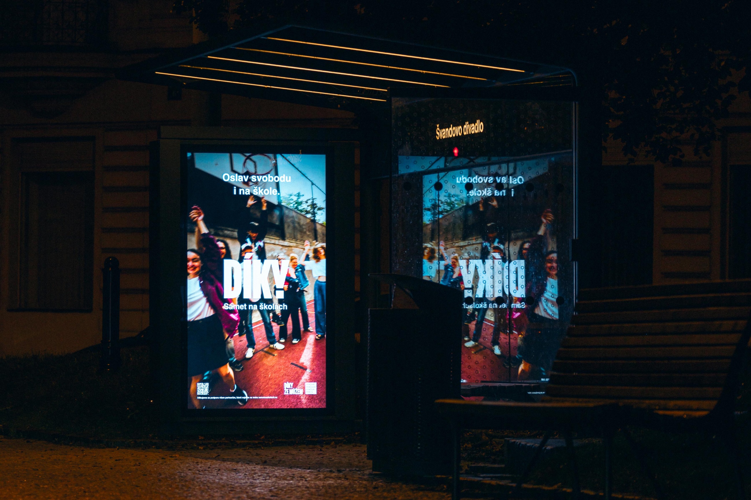
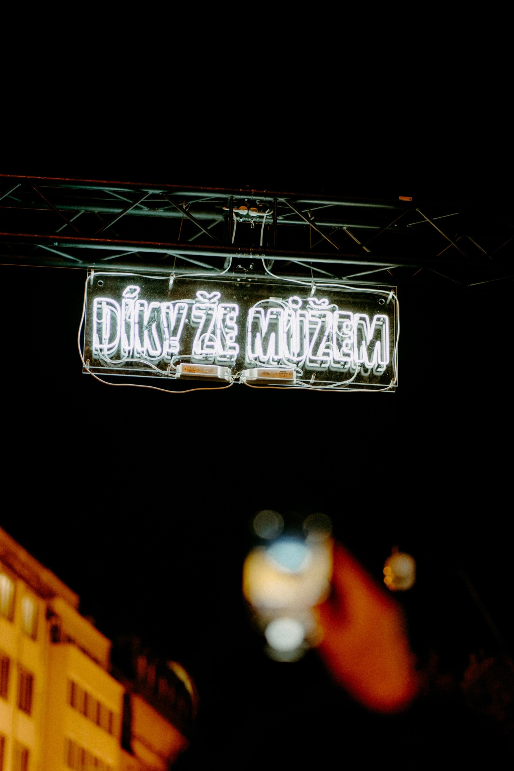
Díky, že můžem
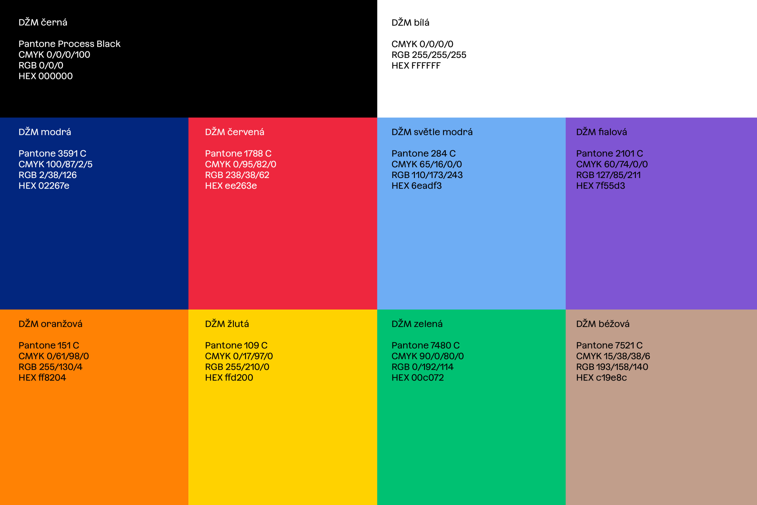
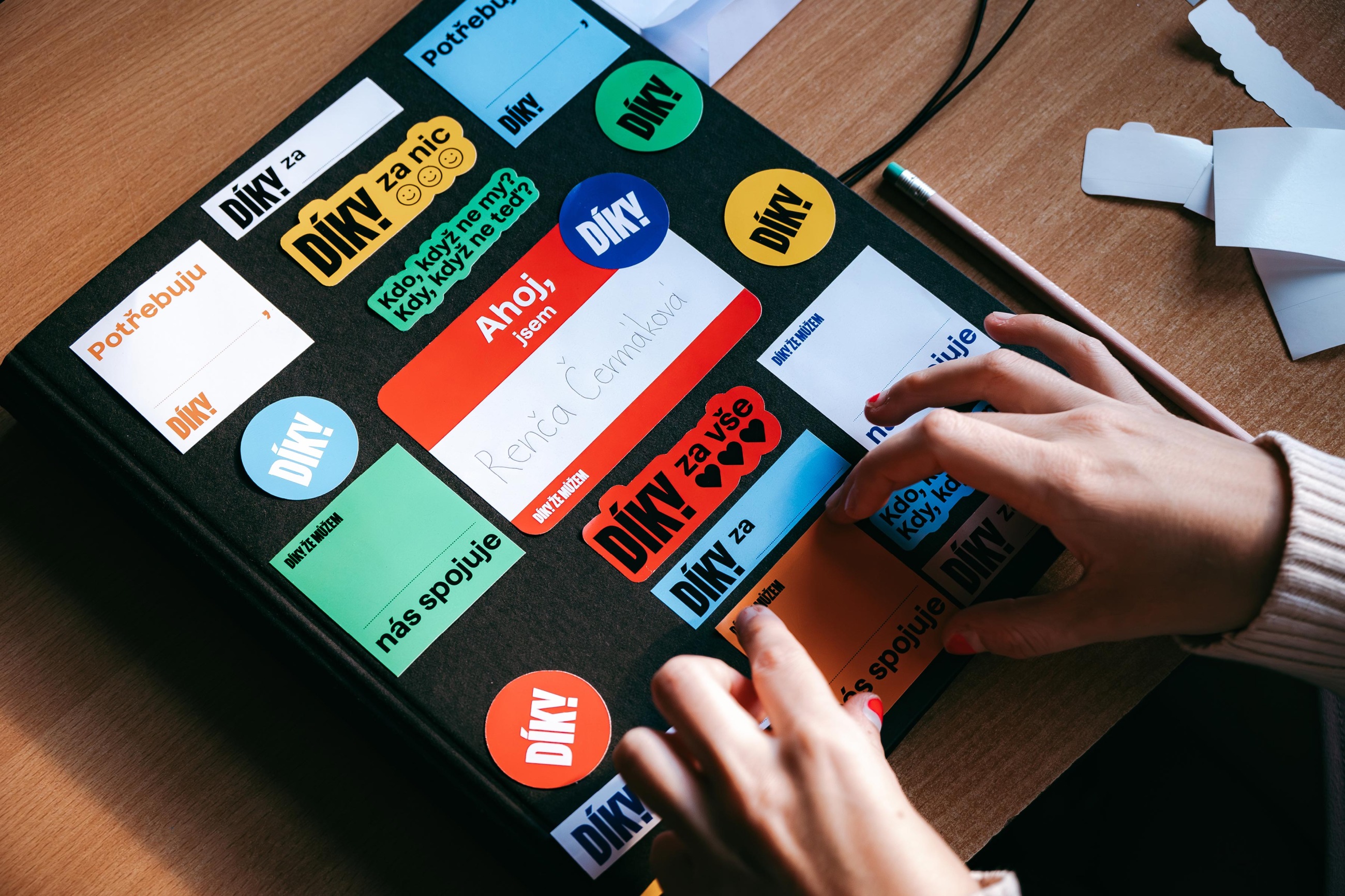
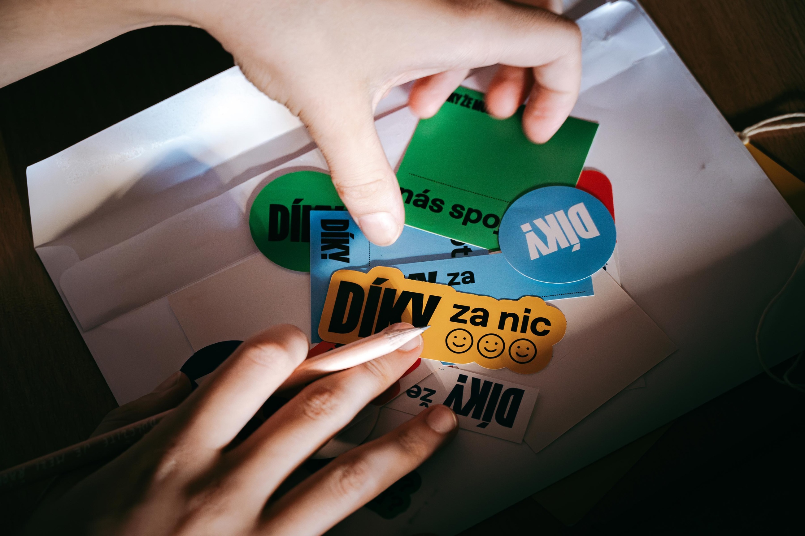
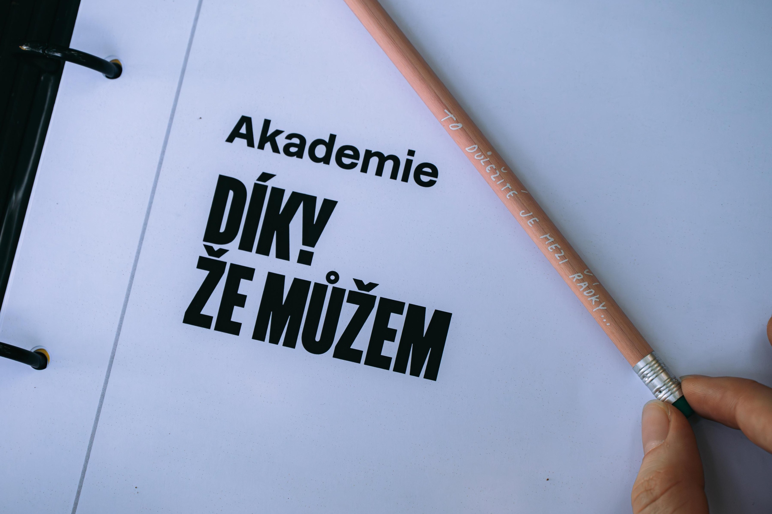
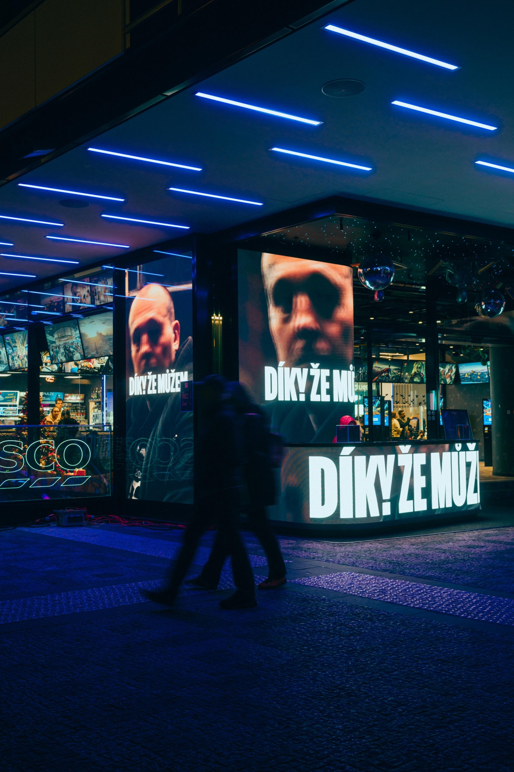
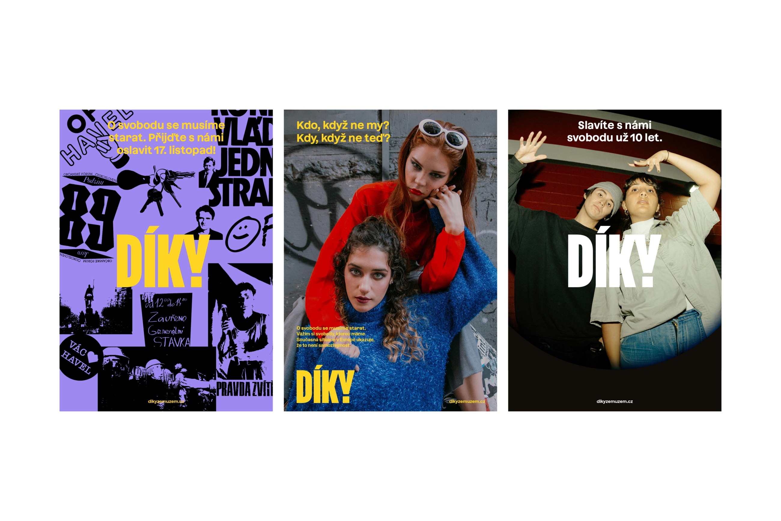
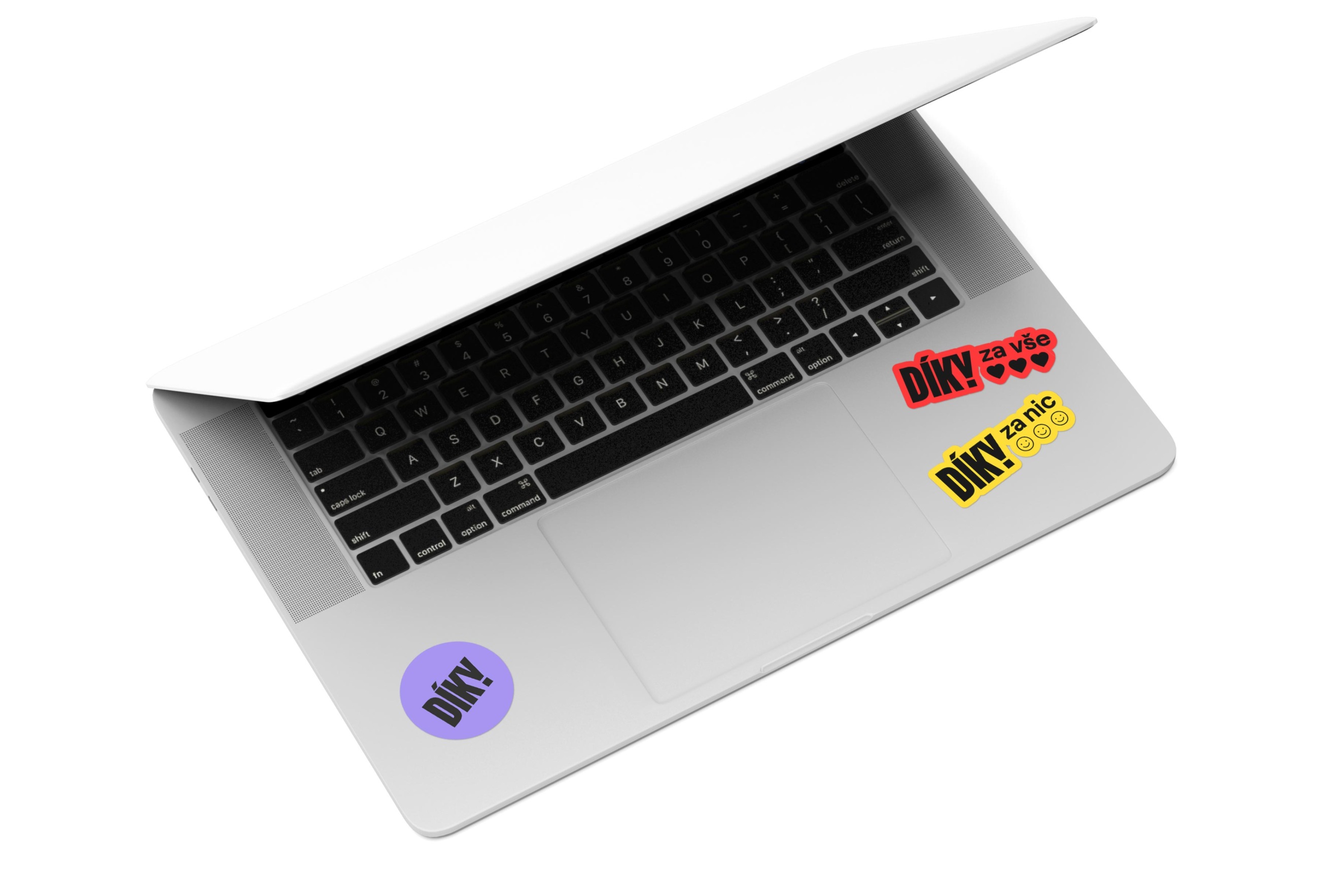
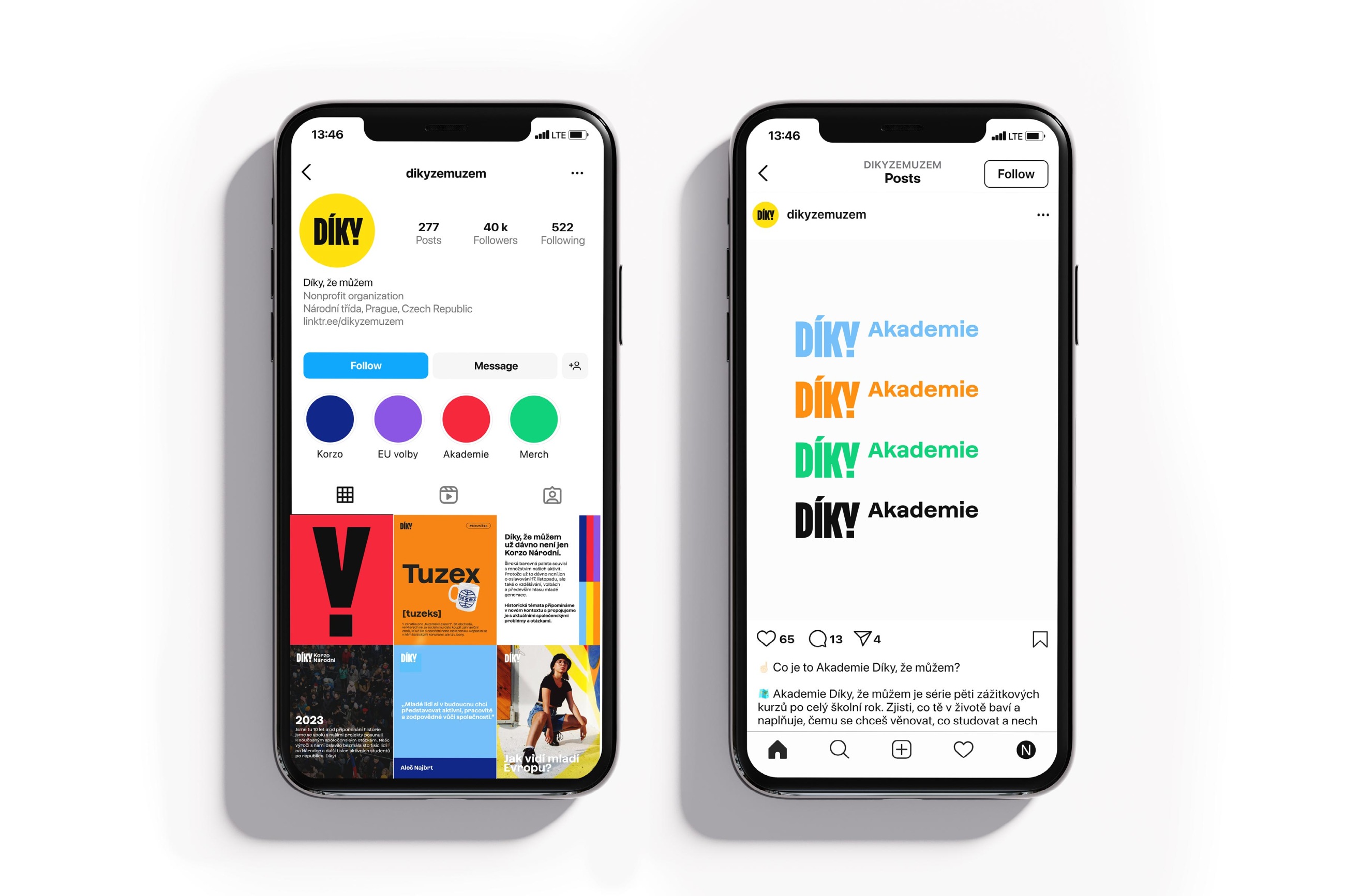
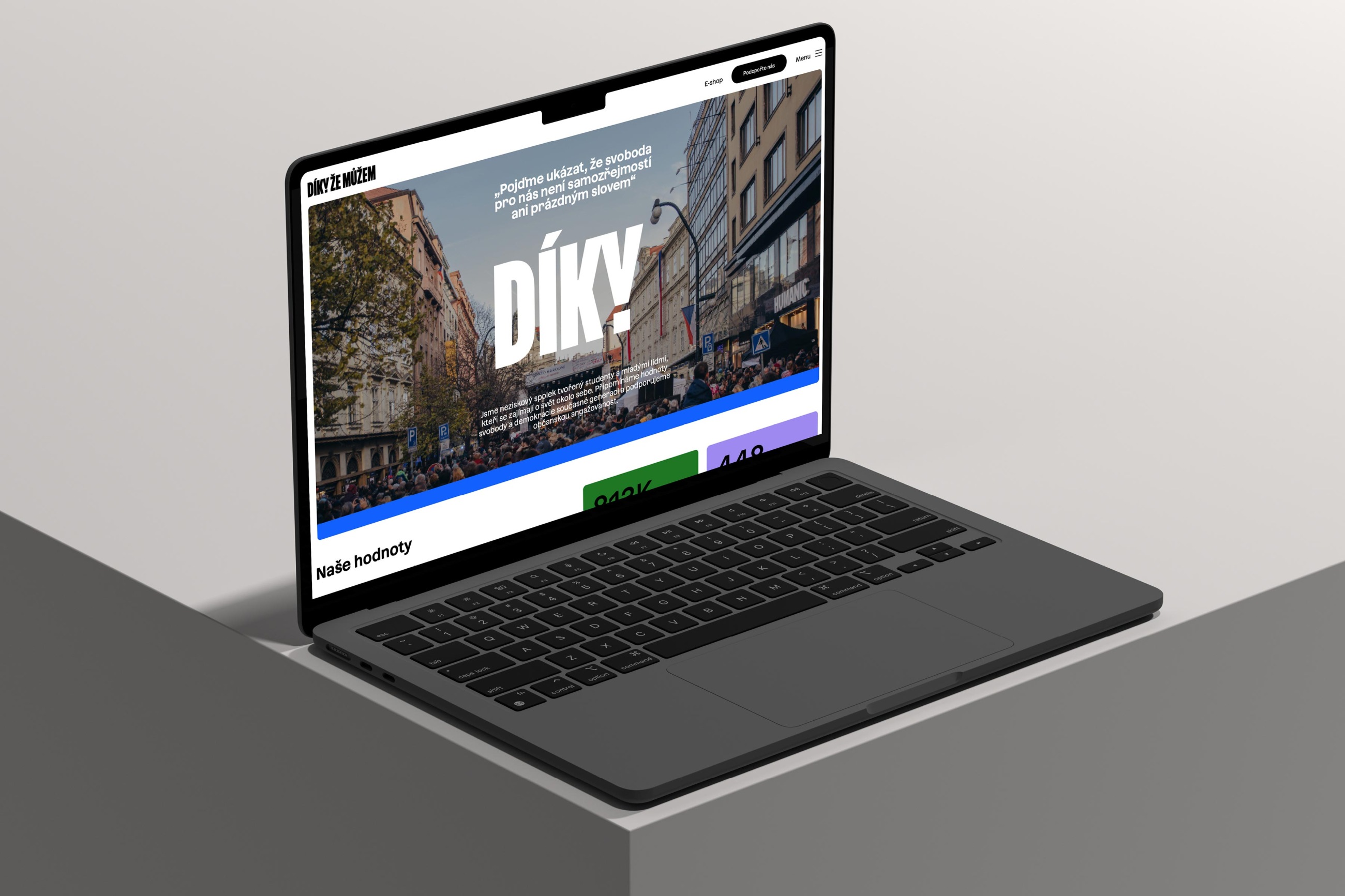
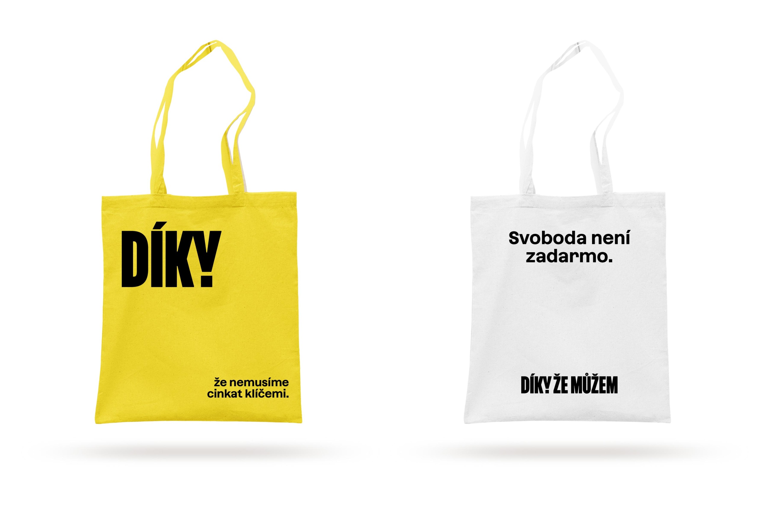
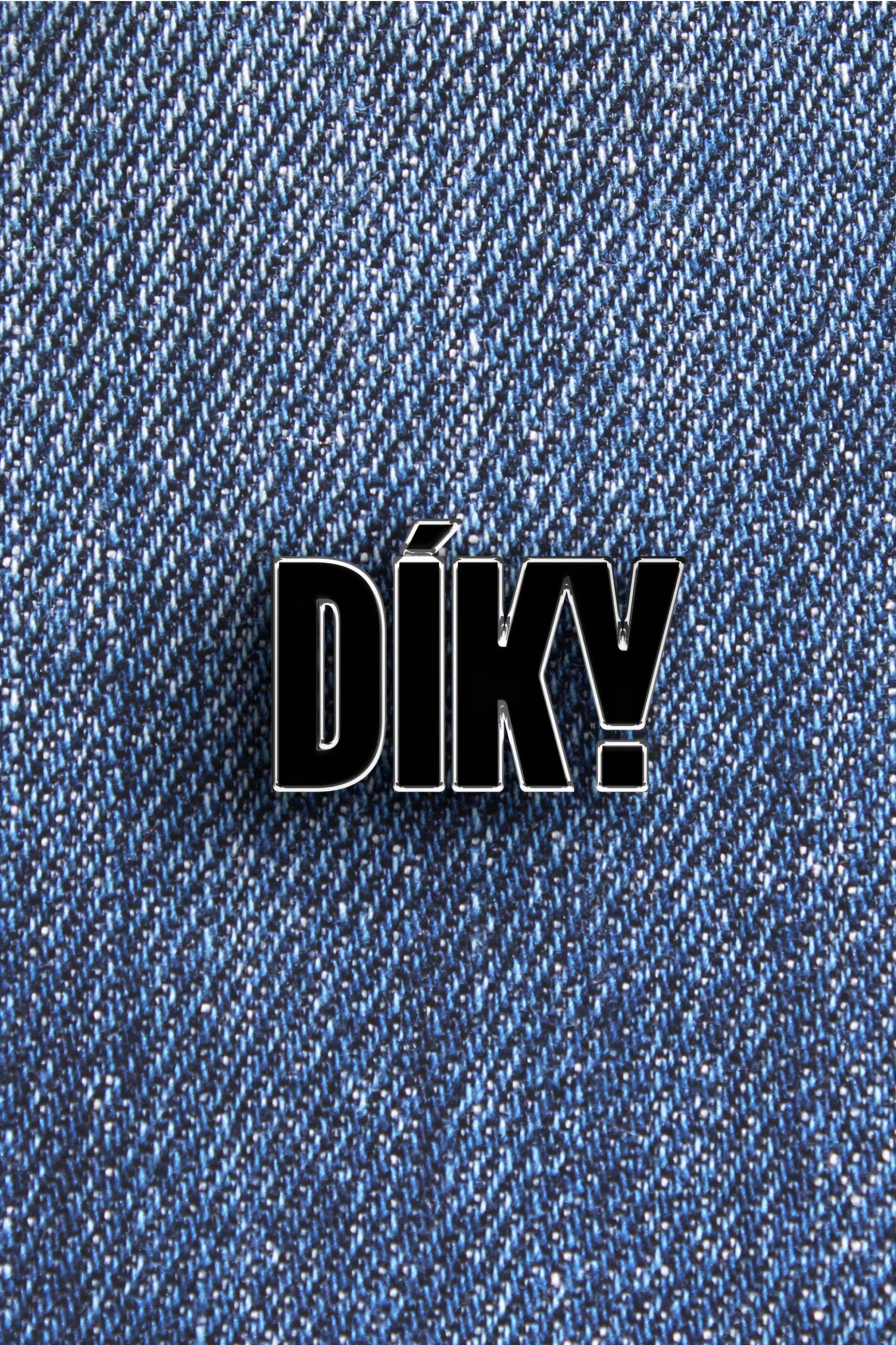
For the non-governmental organization Díky, že můžem, we designed a new visual identity that reflects its current direction and diverse target groups. The new logotype merges a stylized V with an exclamation dot in the letter Y, becoming the foundation for all versions of the name – from Díky, že můžem to Díky, and even the standalone Y. The visual style employs the principle of abbreviation along with a broad color palette that represents the diversity of their activities.
The reference to the revolution is the basis of the logotype, but the entire visual style looks to the future, emphasizing new energy and younger generations—especially since the Díky, že můžem team consists of young people.
Client: Díky, že můžem,
Designer: Tuan Vuong
Art director: Aleš Najbrt
DTP: Mária Černá
Production: Adéla Pěchočová
Additional cooperation: ManGoWeb (web development), Léa Decroix (photo documentation), Štěpán Filip (photo documentation), Marie Hronová (photo documentation), Sabrina Kulhánková (photo documentation)
Font: Azeret,
Type: Brand, Web, Social media,
Year: 2024