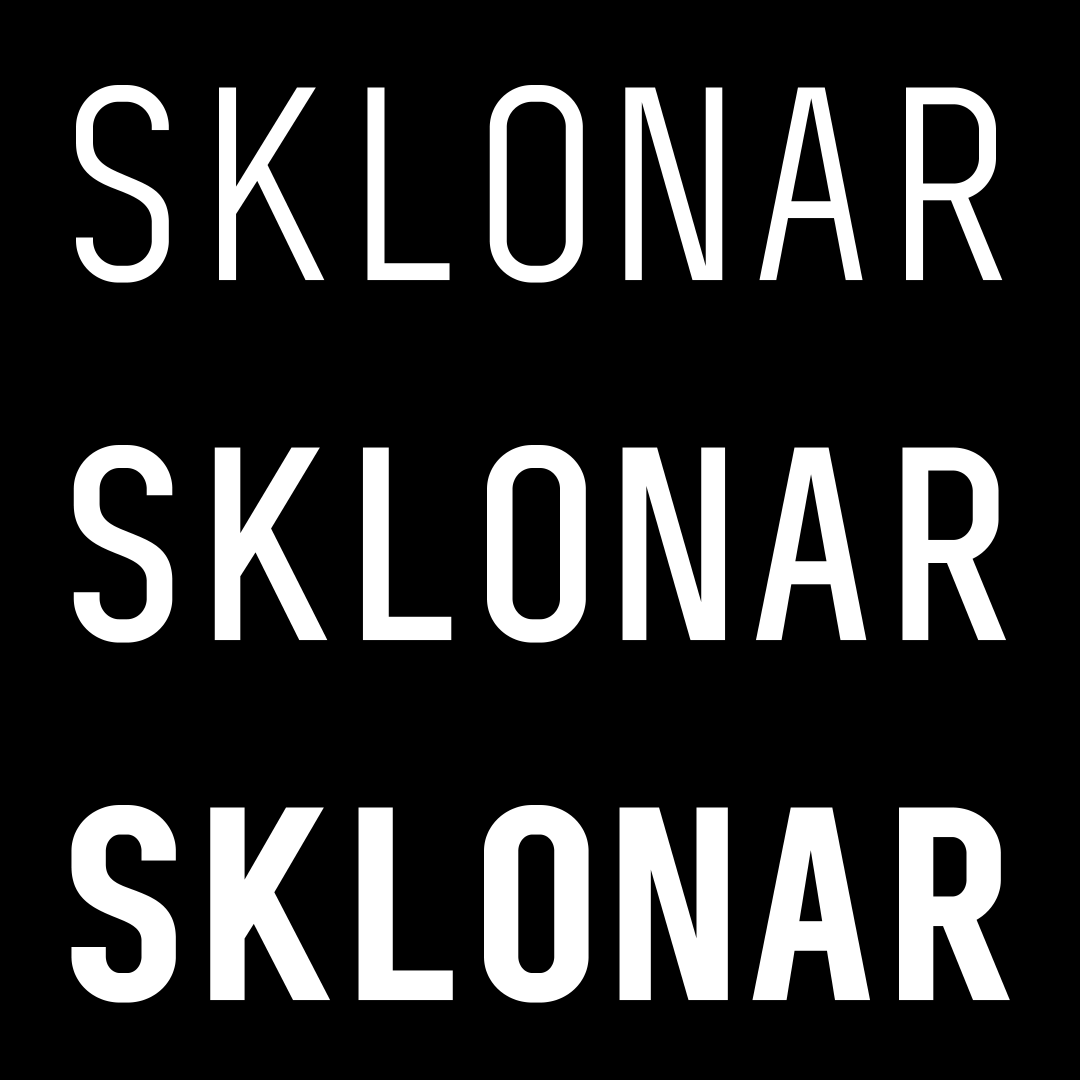
Sklonar
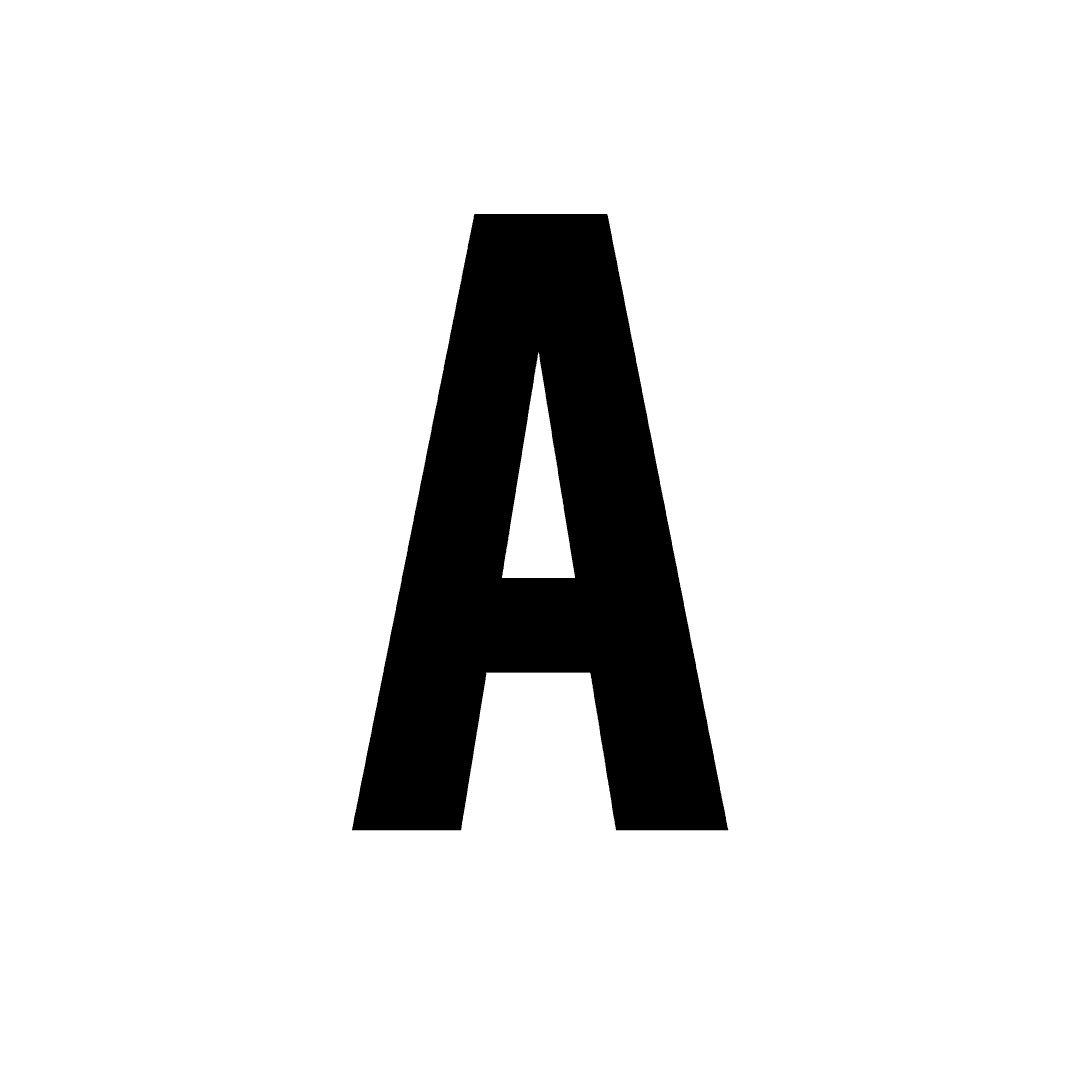
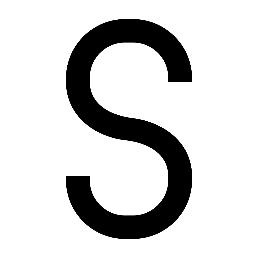
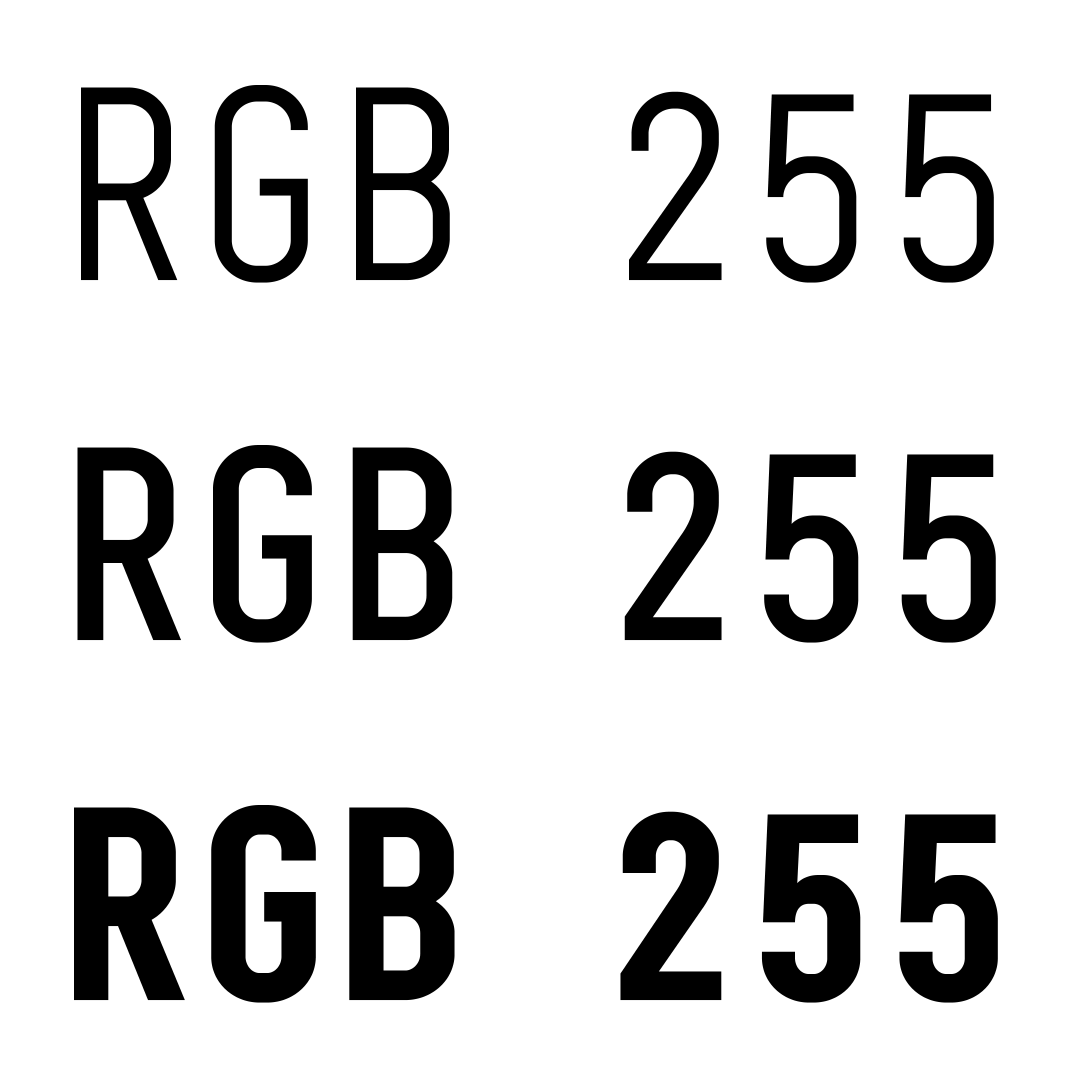
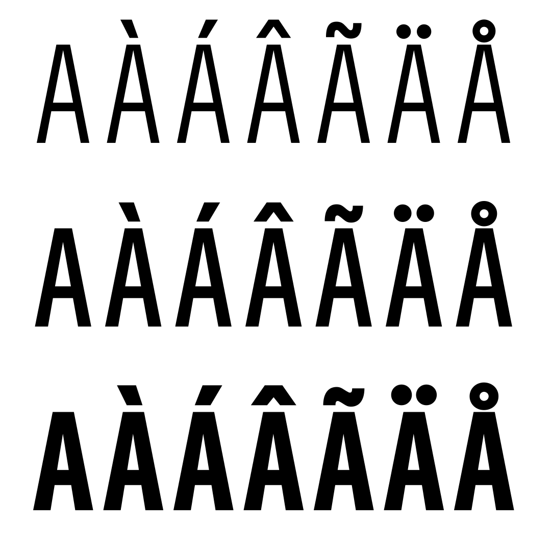
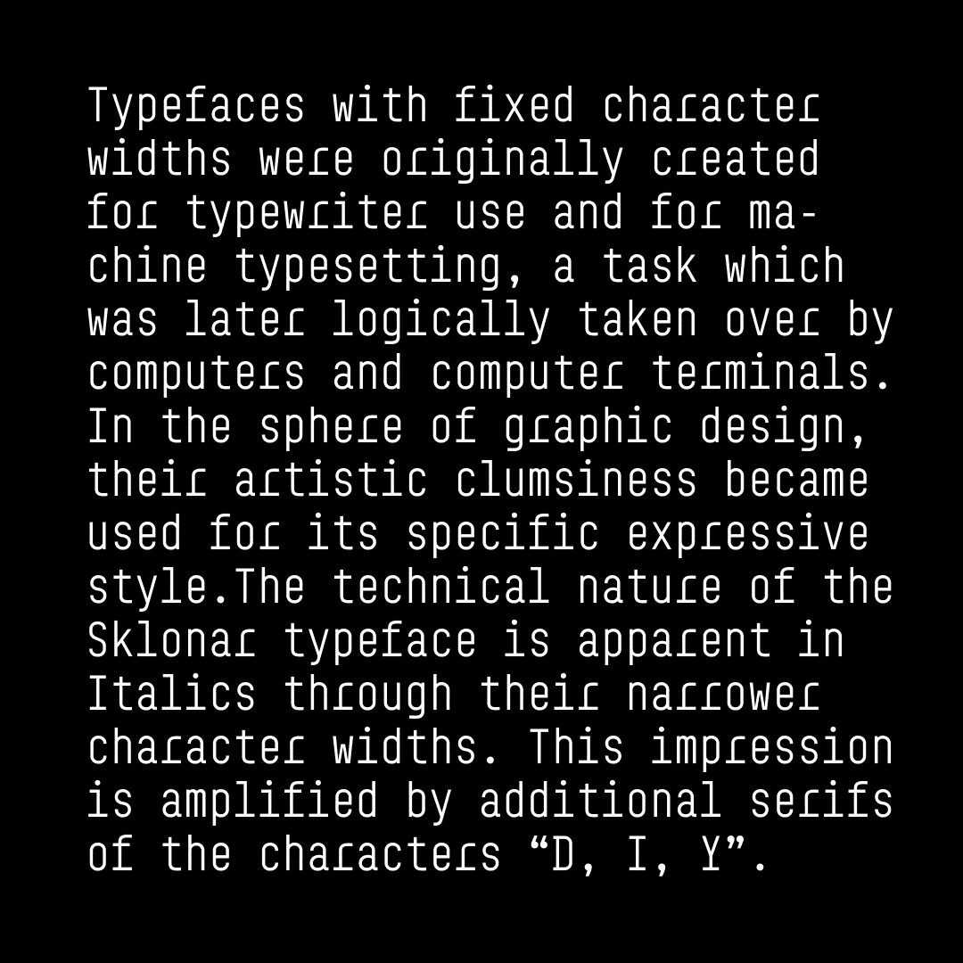
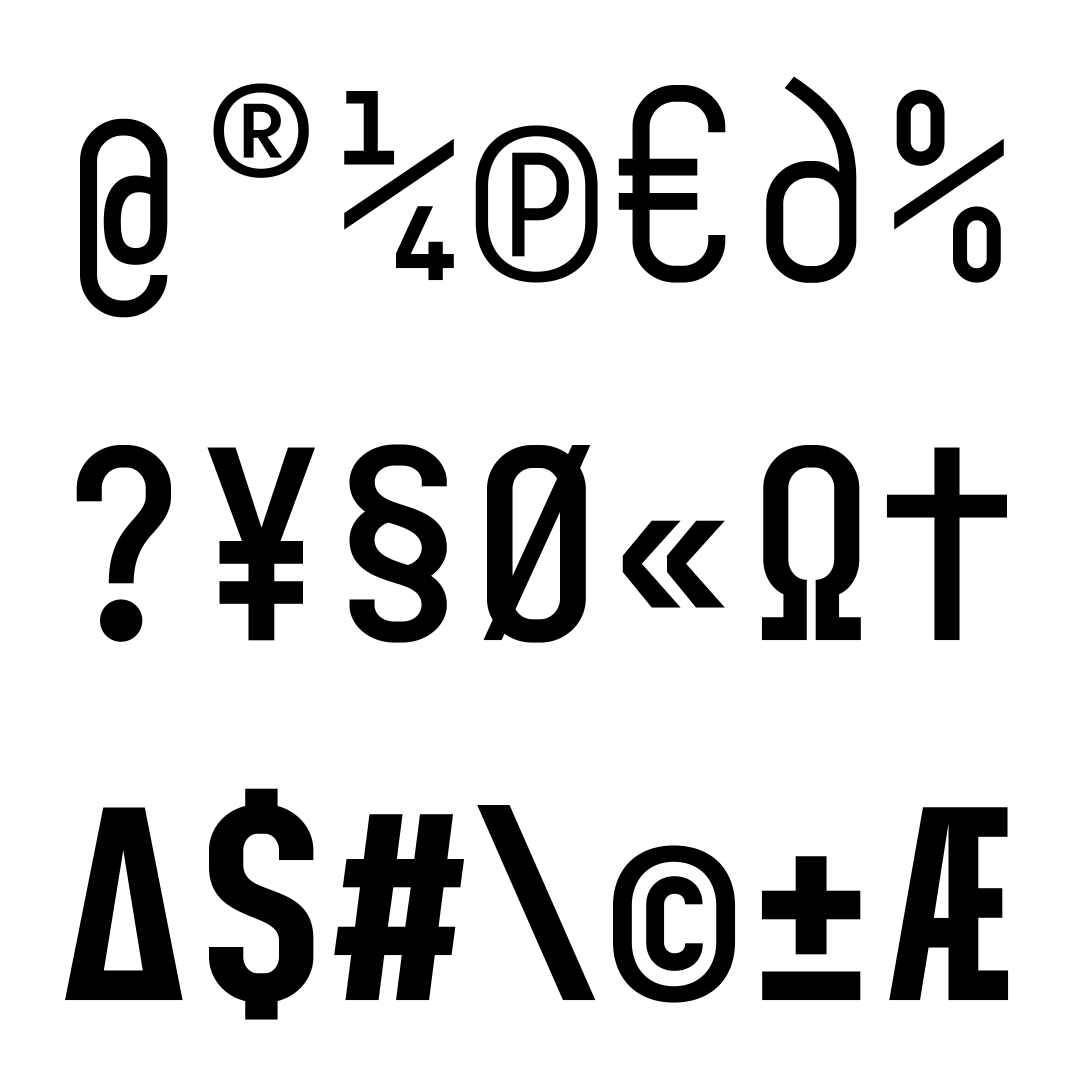
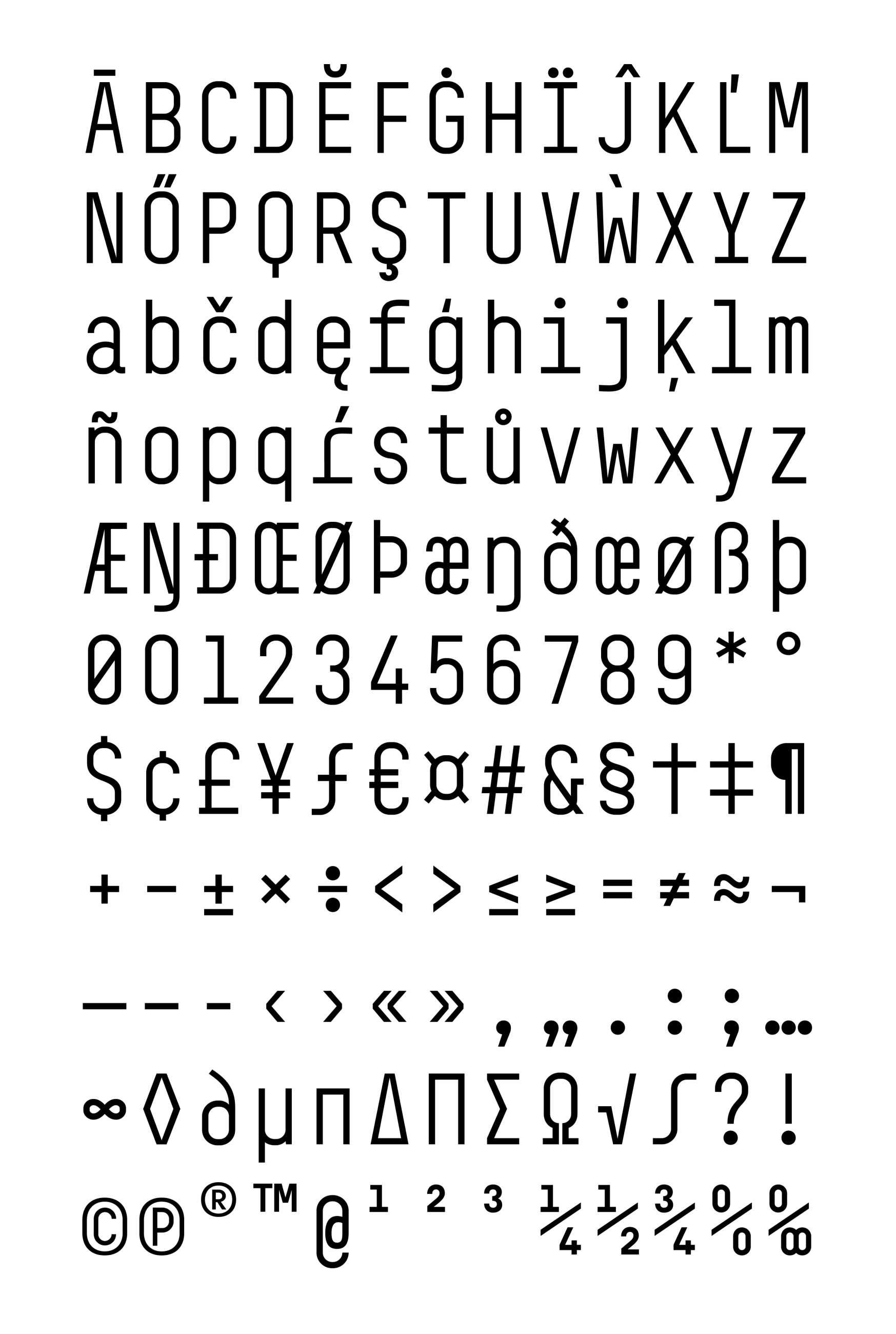
In 2011, the gallerist Zdeněk Sklenář opened a white cube with a simple name S at Smetanovo nábřeží in Prague. The plainness of space by the architect Josef Pleskot was reflected in tiny cards of the invitations, which always stated a different numerical value derived from the exhibited artworks. After just two years, the gallery was blown up by a gas explosion in the neighboring building, but the studio uses the technicist typeface for further and further projects – probably the most frequently of the more than 20 alphabets that emerged here. Characteristic of the Sklonar are the characters “D, I, Y” with longer serifs. The vertical, open ending of the lowercase strokes “f, g, j, r, t” and “y” brings light dynamics to the otherwise geometric form. The consistent “s" is in pleasant contrast to the pronounced “a”. Distinctive punctuation and diacritics underline the playfulness of the alphabet. Sklonar is a refined font that at first glance seems strictly geometric, but a closer look reveals surprisingly vivid details. It can be used inconspicuously or to attract immediate attention. Last time we used it for scooters.
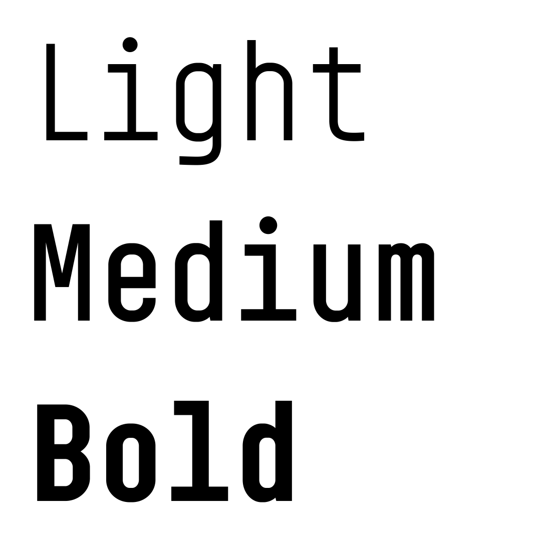
Number of styles:
3
Glyphs per style:
411
Available at briefcasetype.com
Designer: Marek Pistora, Martin Vácha
Additional cooperation: Briefcase Type Foundry (technical cooperation)
Font: Custom,
Year: 2016