Reflex
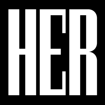
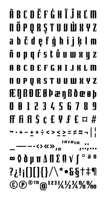
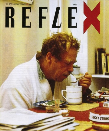
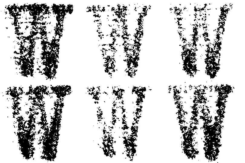
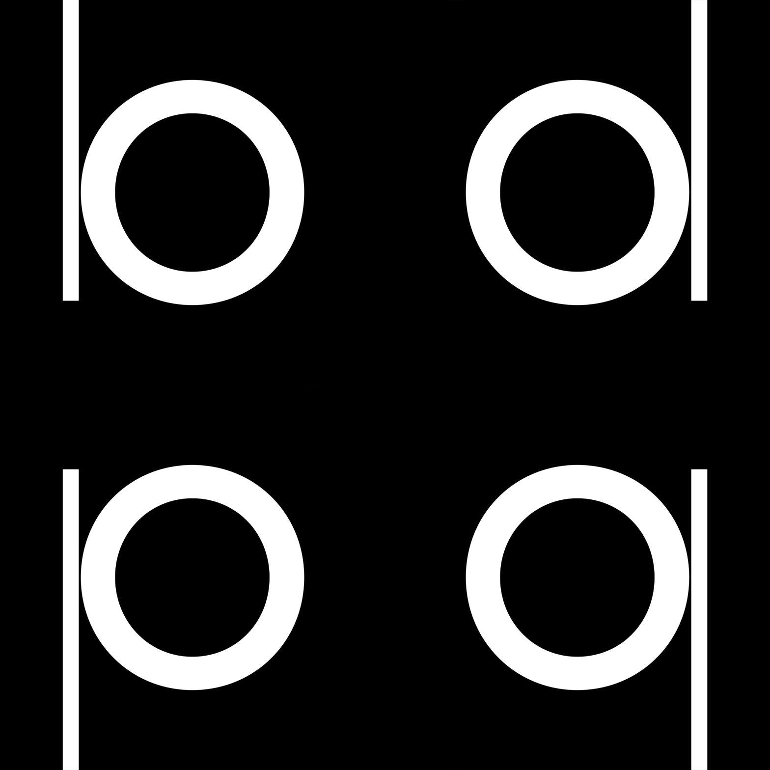
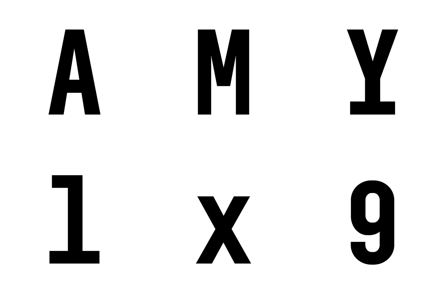
The logo and the treatment of visual material, that Aleš Najbrt designed for the first issue of the weekly magazine Reflex from April 1990, is still in use today, almost intact. In the course of three years in the position of an art director, Najbrt drew dozens of original headlines, with entire alphabets having developed from them sometimes. The logo has remained preserved, although Marek Pistora successfully redesigned the magazine in 2001 and started the second golden era for the magazine. Then, after Pistora joined Studio Najbrt 10 years later, he and Najbrt completed the typeface from the logo, digitized it and continue to use it. Reflex represents a category of geometrically designed typefaces, which differs from similarly conceived typefaces mainly by atypical, thin vertical serifs, or semi-serifs. The high contrast and the vertical shadow axis give it an unusual character, which, together with lower capitals and short spurs, predetermines Reflex for headlines and titles. Reflex not only has a wide range of diacritics, ligatures and fractions, but also a number of small caps with numbers, creating de facto additional width proportions. Reflex offers five fonts, from the compressed Extra Condensed to the wide Extra Extended. Each width is also complemented by italic variant with a significant inclination of the characters, based on the angle of inclination of the letter “L” in the logotype.
Number of styles:
10
Glyphs per styles:
601
Reflex is available at briefcasetype.com


