Thomas Ruhller
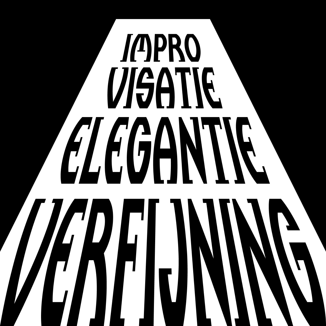
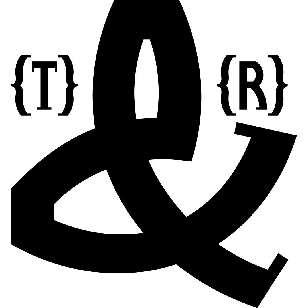
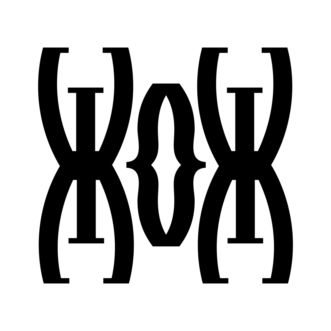
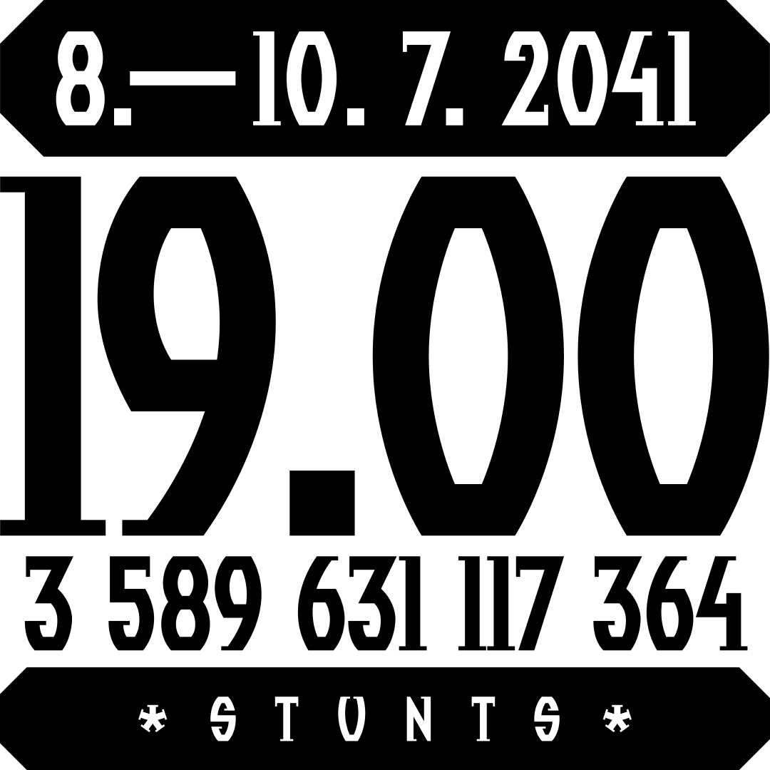
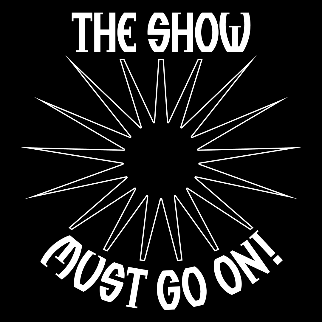
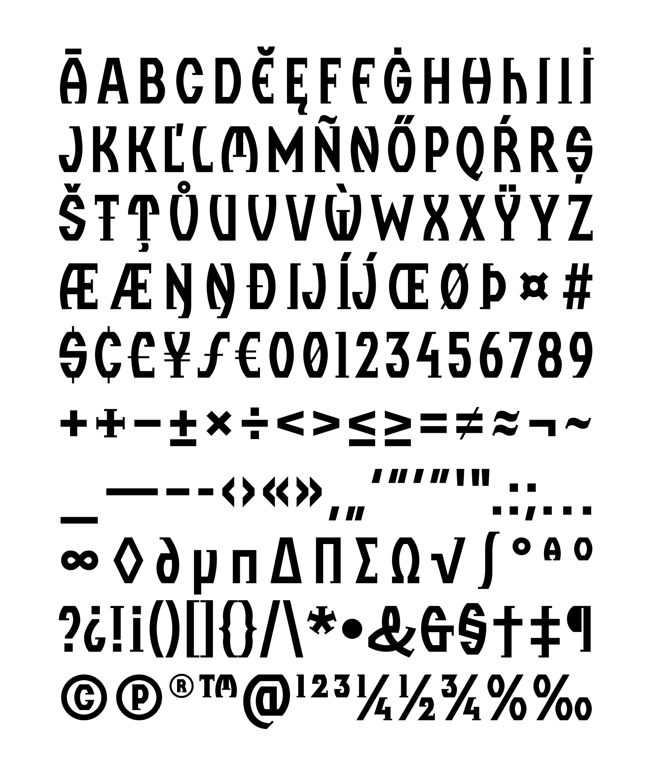
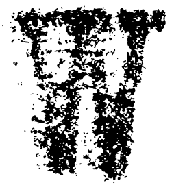
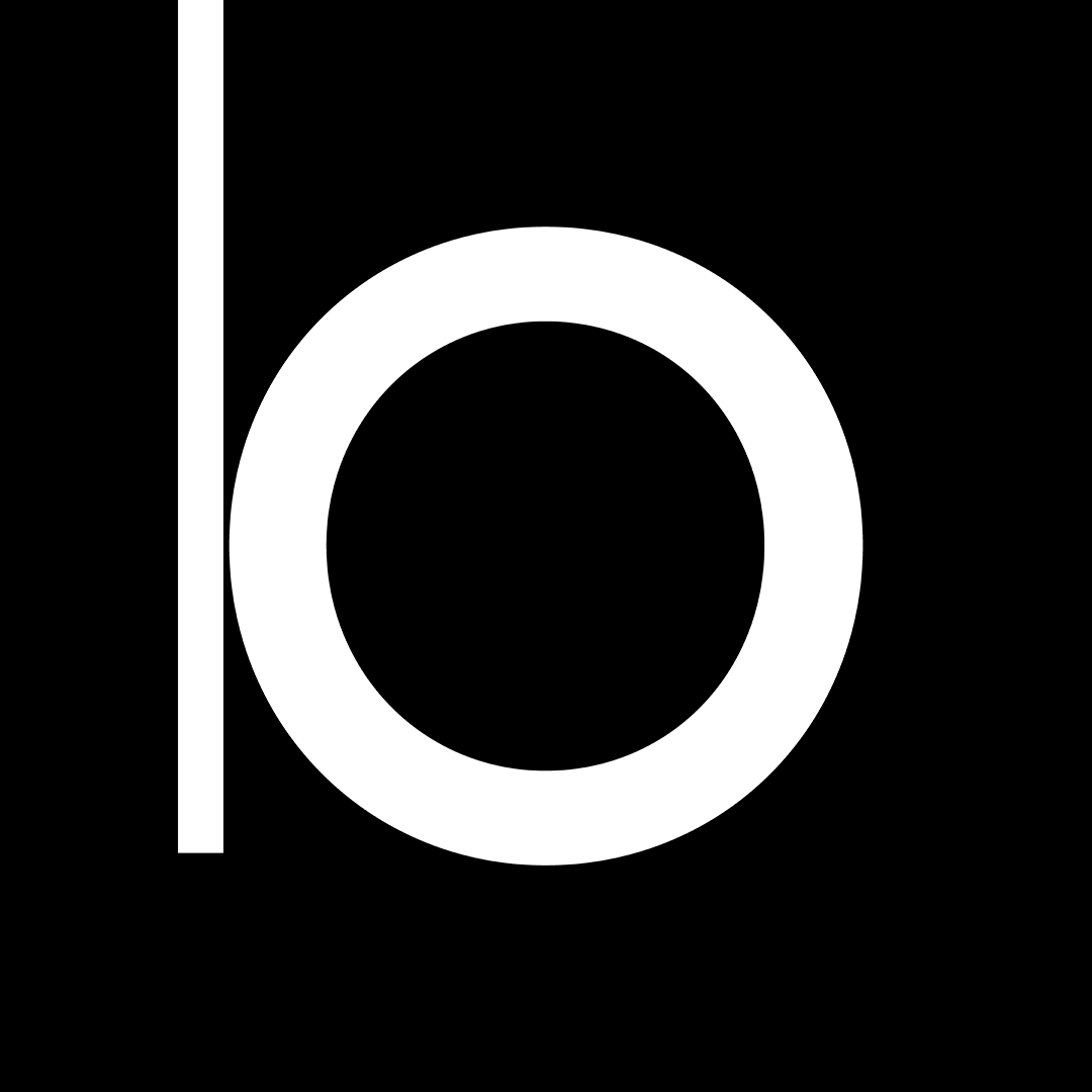
In the late, pre-digital 1980s, designing a poster meant for Aleš Najbrt to design his own fonts for it. Sometimes it was only a few letters in the name of the film or the performance. But on the first poster for Thomas & Ruhller, there was so much text that it made sense to complete the whole alphabet. Thomas & Ruhller, “a performance parodying performance” that has become a regular performance over the years, right from the start required a wealth of (pseudo-Dutch) headlines and a professional-looking promo to support the mystification about Dutch equilibrists. The resultant typeface follows the elongated shapes of the slow-moving performers themselves (Aleš Najbrt & Jan Slovák), with sharp endings of half-serifs betraying the postmodern times they were conceived in. The typeface has been the staple of the duo’s graphic identity for more than three decades, but in addition to obvious places such as Reflex magazine during Najbrt's art direction tenure, it has now been used in such diverse places as the exhibition of the Czech artist Federico Díaz or the album cover of the actually world-famous horn player Radek Baborák. In 2013, Najbrt digitized the font with the help of Tomáš Brousil and Radek Sidun, who added their own alternative characters and added a character set for most of the Latin world. But the uppercase alphabet still offers only one small letter “h” as an international accent in the fabled names Thomas & Ruhller.
Number of styles:
1
Glyphs per style:
569
Thomas & Ruhller is available at briefcasetype.com
Designer: Aleš Najbrt
Additional cooperation: Briefcase Type Foundry (technical cooperation)
Font: Custom,
Year: 2014