Air Navigation Services of the Czech Republic
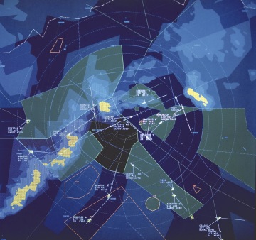
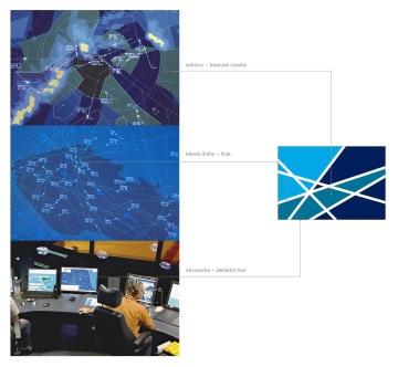
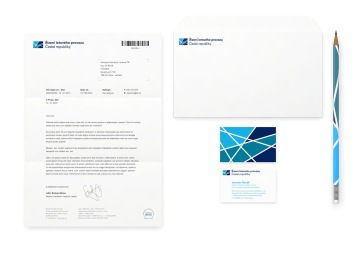
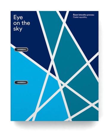
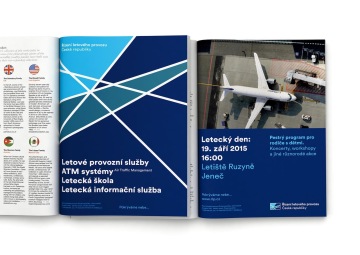
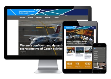
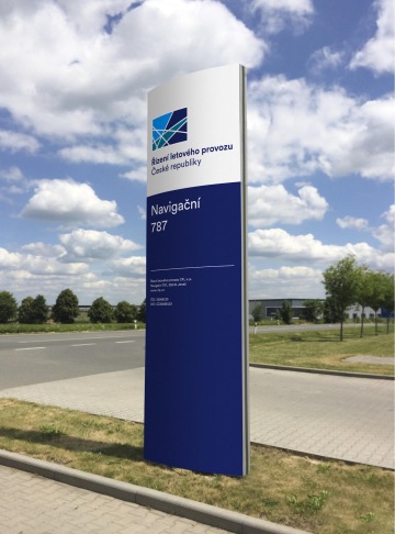
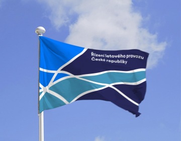
Air safety is responsible and an admirable job that ensures the free flow of information, goods and people. We have replaced the aged airplane logo with a flight sector, which is an open intersection of flying paths, departures and arrivals. Even the colors, inspired by the radar screen, represent the sky in unending twenty-four hour cycle of different times of day and night. The new logo also offers many ways to reflect its morphology (paths, cuts, colors) into the visual style – the logo itself is actually already a visual style that easily covers a variety of formats, from key ring to a balloon.
Client: Řízení letového provozu,
Designer: Martin Vácha, Pavel Lev
Font: Circular,
Type: Brand,
Year: 2016
