Czech Centres 2023
After more than 13 years since the first redesign of a Czech Centers logo, the time has now come for a new reflection of their current needs, a change of the logo and a visual style.
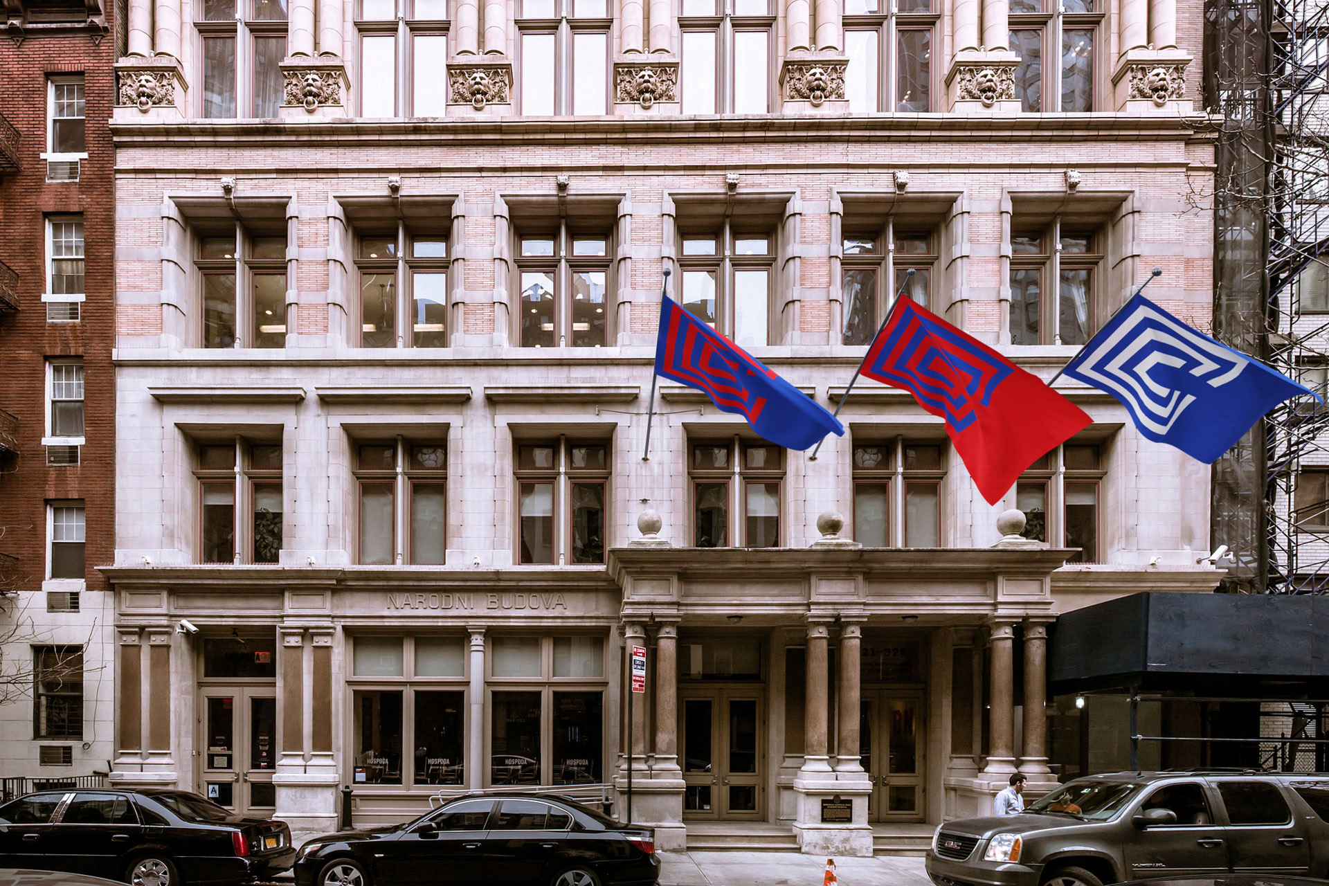
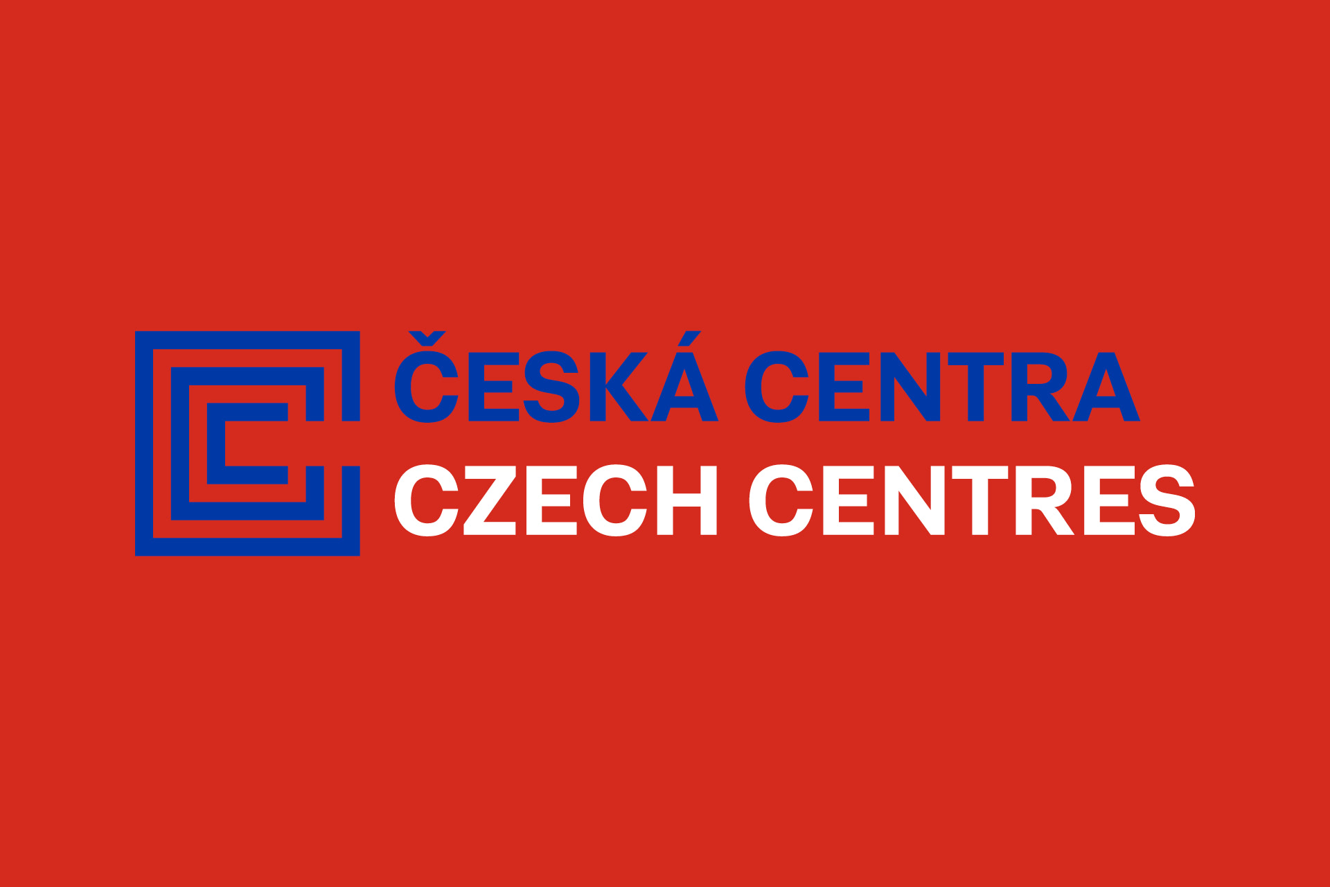
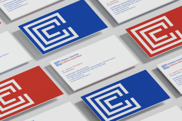
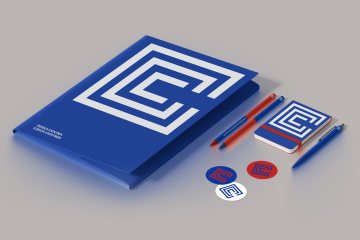
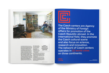
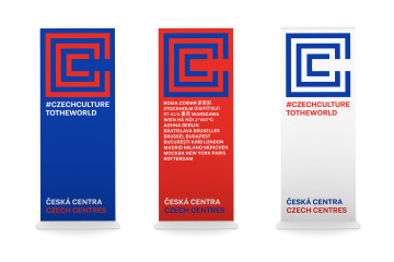
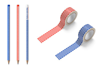
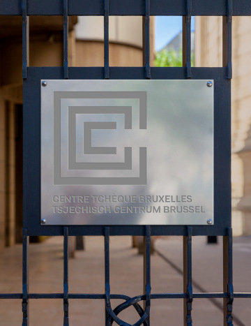
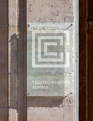
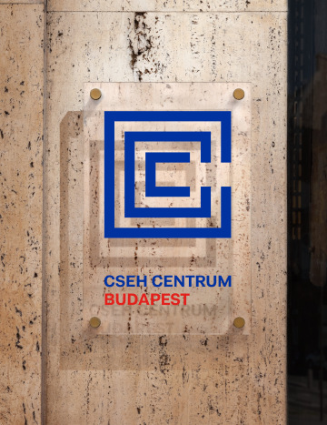
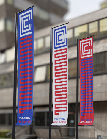
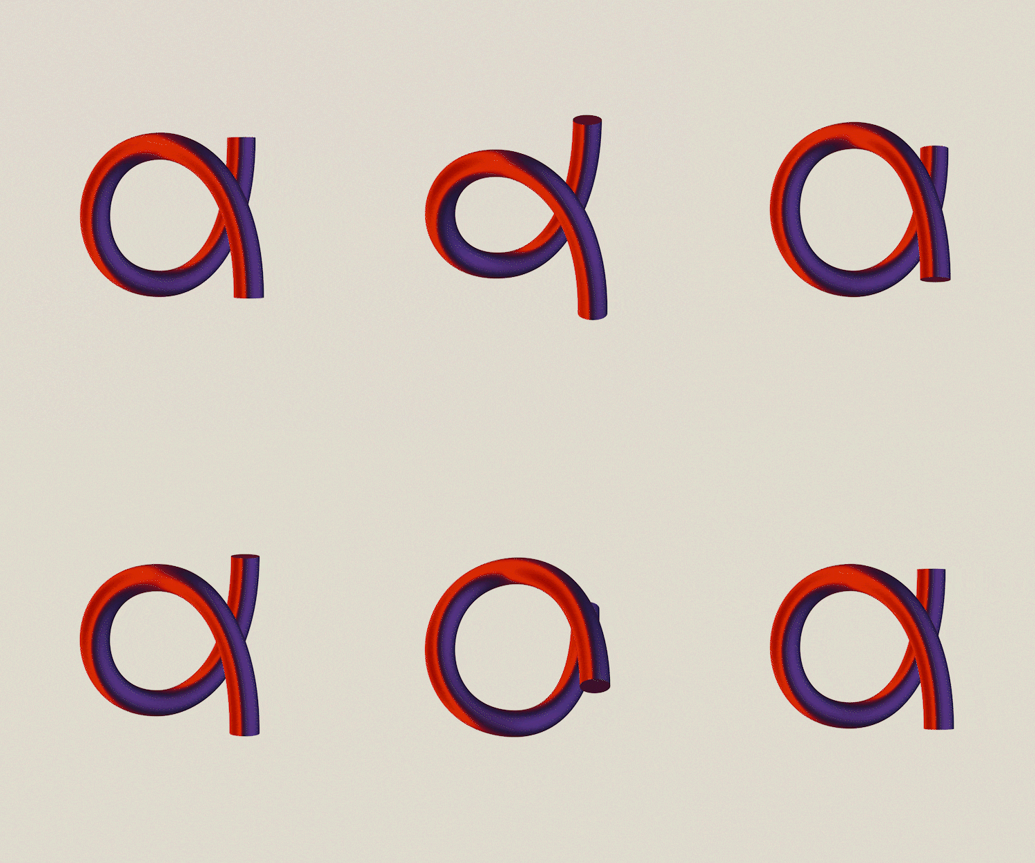
A new strong identifying element is a meander symbol with a letter C in its center. The shape is based on the original symbol in the shape of a spiral. The original line heading out of the spiral has been replaced by a free space between two lines in the bilingual name of the institution.
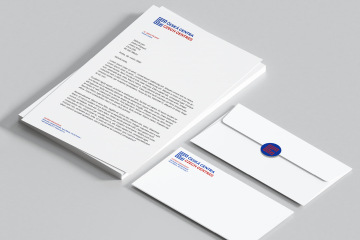
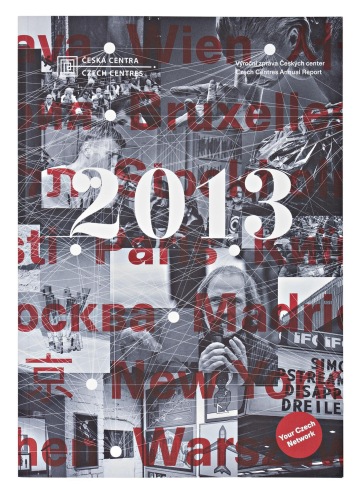
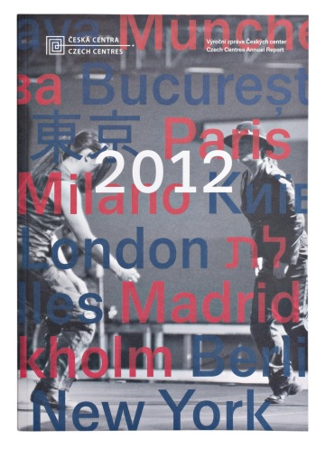
One of the important steps was shifting the color code of red and blue. The color code now matches the colors of the Ministry of Foreign Affairs of the Czech Republic as a reminder that the Czech national red and blue colors should have a singular codification.
An unequivocal motive of the work on the current redesign was a simplification and minimization of used elements which had been increasing over the years. This now brings a clear identification for Czech Centers with many branches around the world.
Client: Česká centra,
Designer: Andrea Vacovská
Art director: Aleš Najbrt
Animation: Zdeněk Trinkewitz
DTP: Mária Černá
Production: Pavlína Nebáznivá, Alžběta Baráková
Font: Adapter,
Type: Brand,
Year: 2023
