The Czech Philharmonic 2015/2016
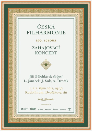
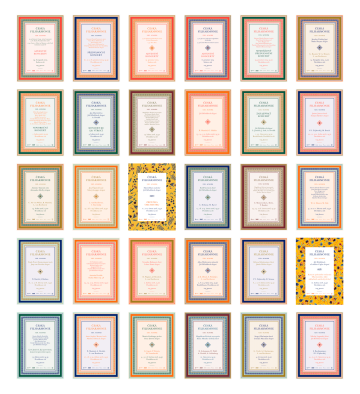
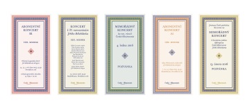
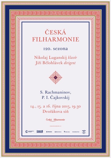
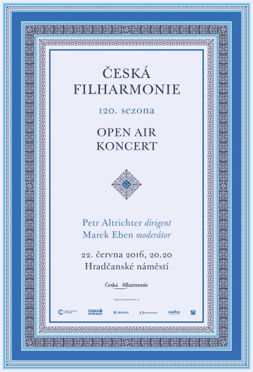
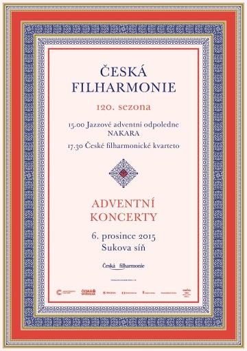
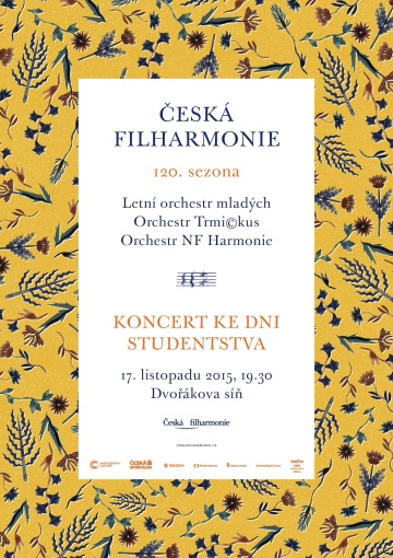
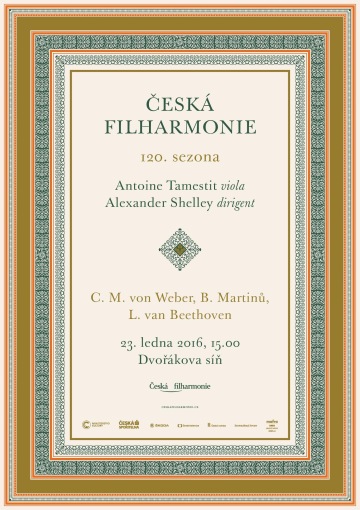
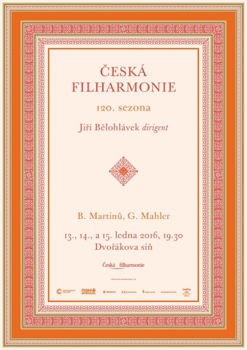
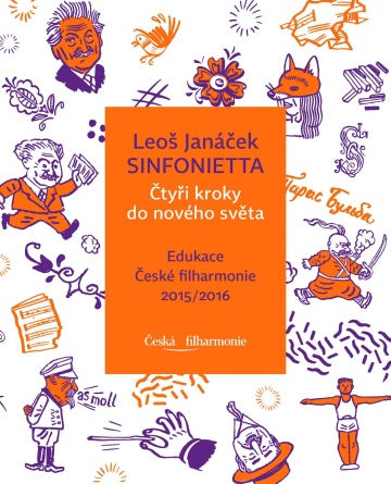
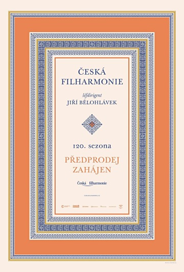
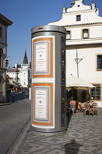
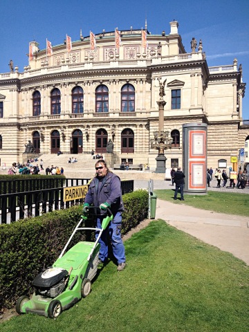
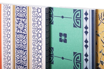
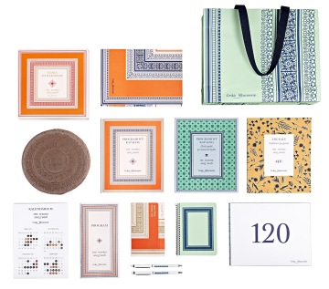
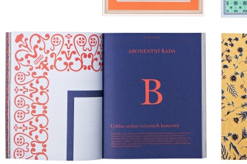
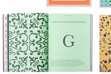
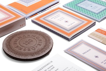
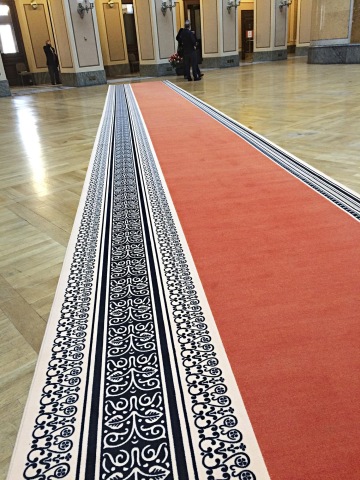
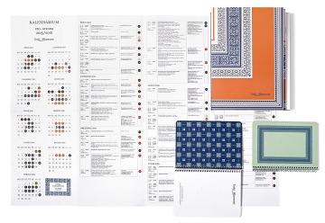
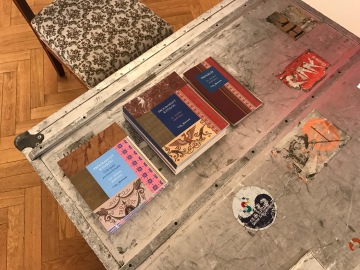
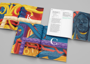
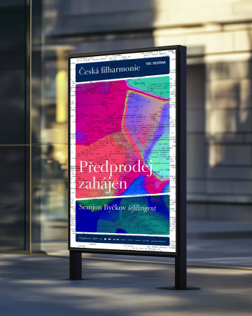
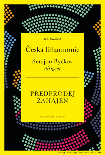
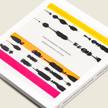
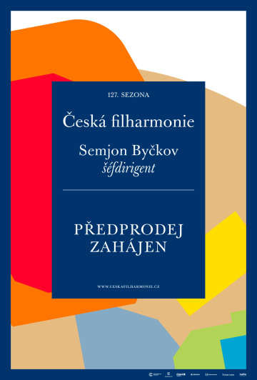
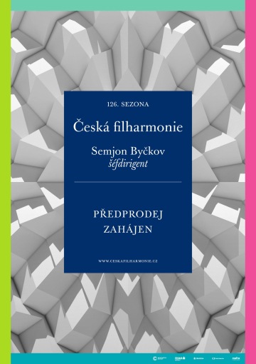
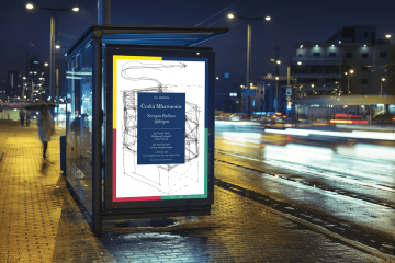
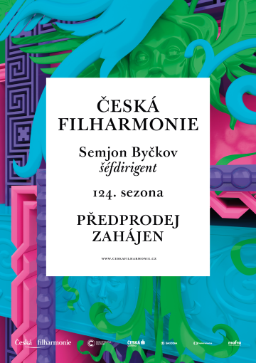
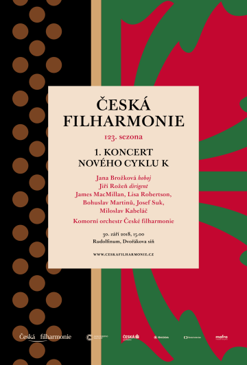
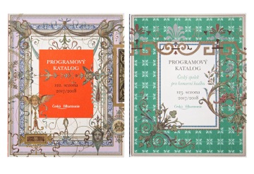
Someone who is 120 years old demands our respect, but we also take him a little easy. Therefore the visual style of the 120th year celebrates what underlies the identity of the first Czech orchestra and what it can rightly boast – its home in the building of the Rudolfinum in Prague, its first program brochures and the aesthetics of the time it was built. The recurring motifs act as choruses, details pulsate, the ornaments play. We call this vector virtuosity. The visuals express the current position of classical music, which cannot only build on its history. It accentuates the solemnity, tradition and prestige of the institution. But as an old sheet music in a new interpretation, the neo-Renaissance designs of old printers’ catalogues get a contemporary, digitally relaxed remake – that takes us to neo-neo-Renaissance. It is clear that we are not about punishing historicism; this style can smile at its beautiful, but a little exaggerated, out of place decorativeness.
Client: Česká filharmonie,
Designer: Marek Pistora, Michal Nanoru, Aleš Najbrt
Additional cooperation: Nikola Logosová (illustrations), Alexey Klyuykov (illustrations)
Font: Baskerville Original,
Year: 2015
Related work:
