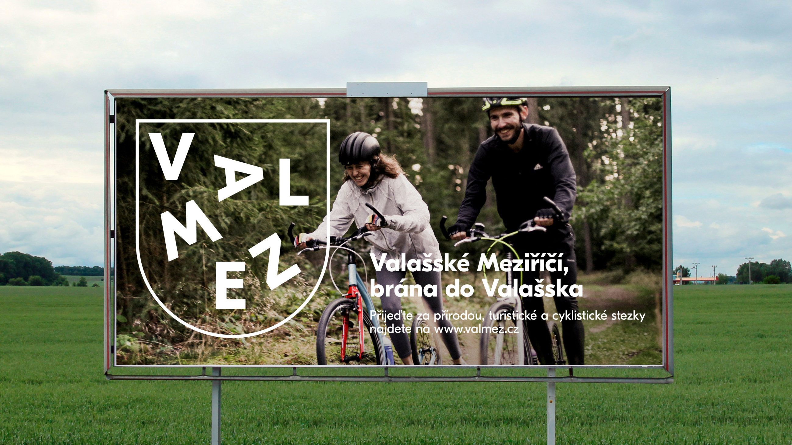
Valmez
Valmez is not just a love hotel and a bus station, as it can sometimes seem to the listener of its most famous band Mňága a Žďorp. “At half past three in the square in Valašské Meziříčí“, as they sang in their early 1990s hit song “Made in Valmez”, an average of 16 bands is started and disbanded each day. Valašské Meziříčí is a city that revels in cultural, sports and civic life.
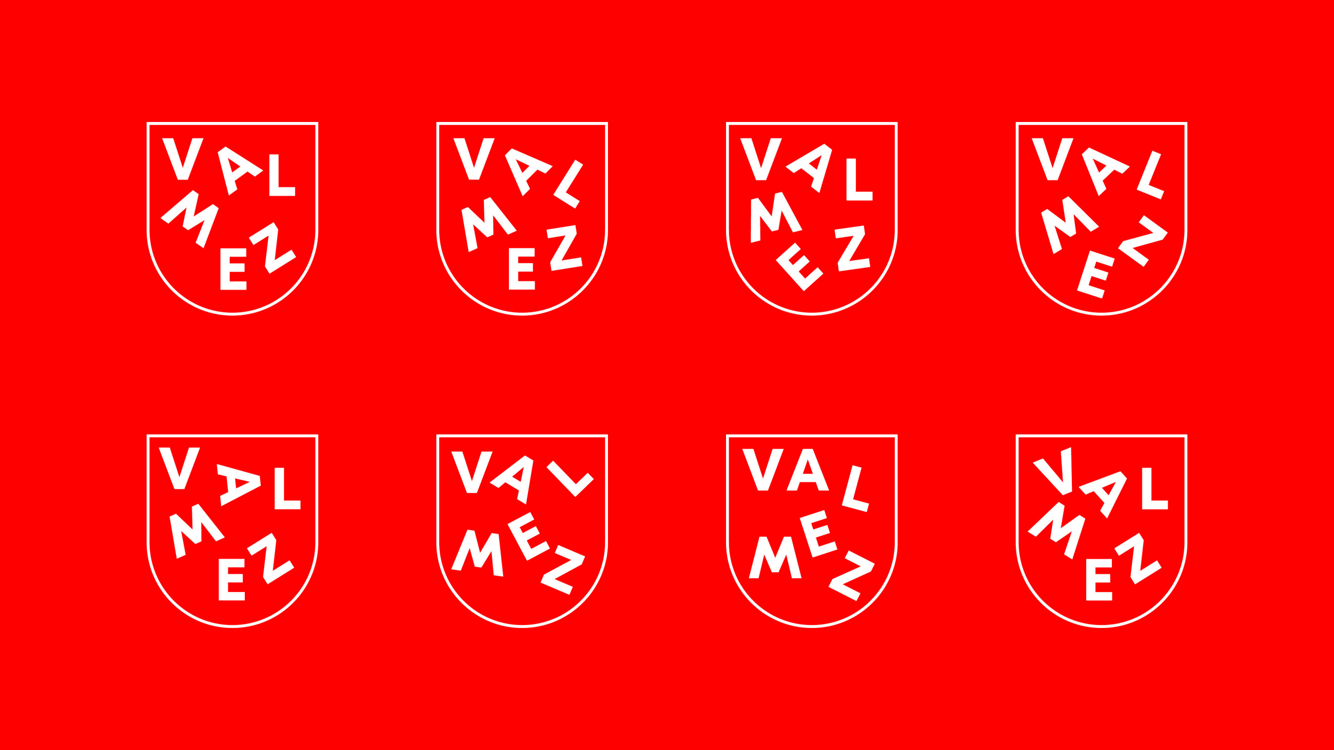
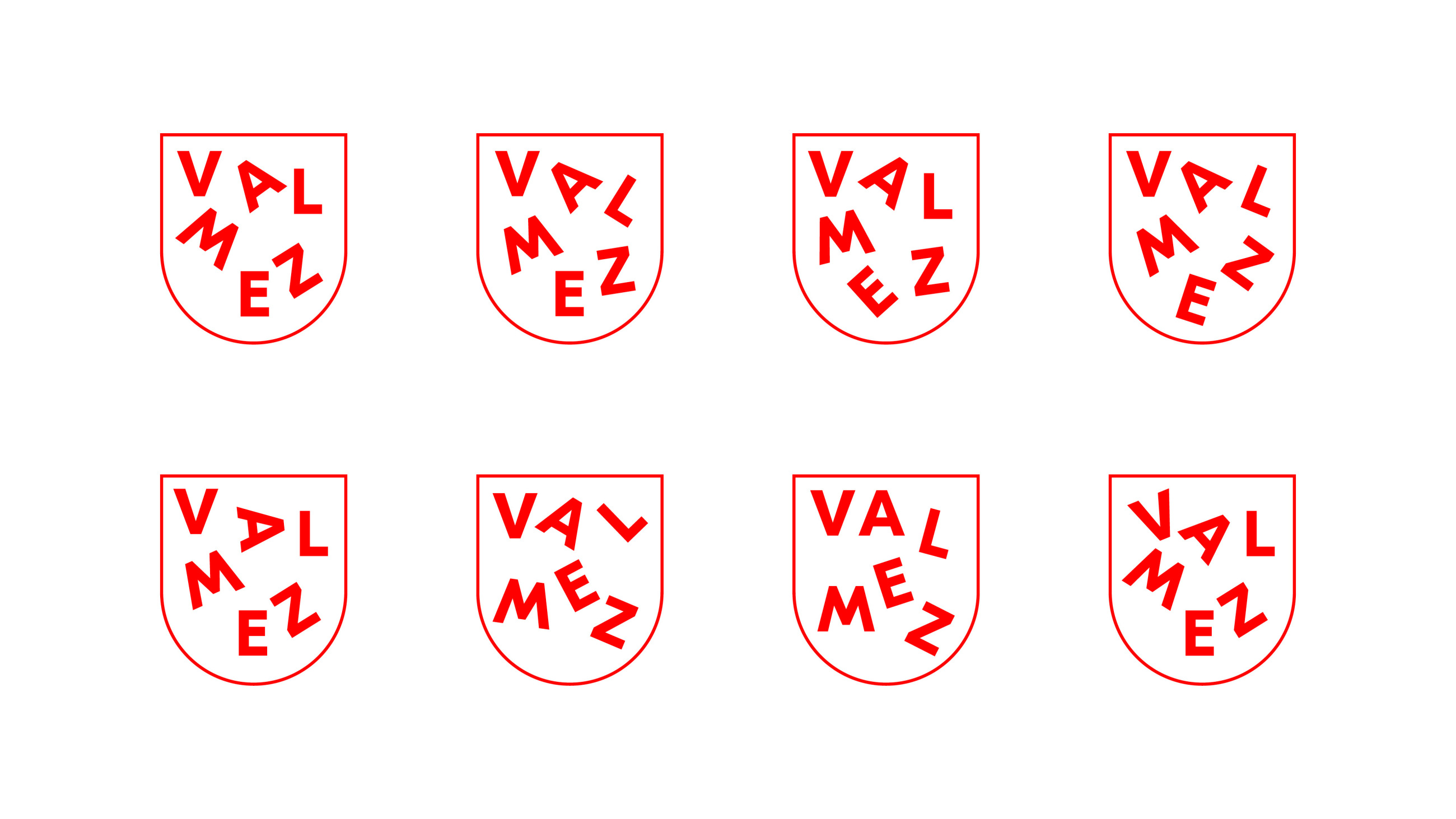
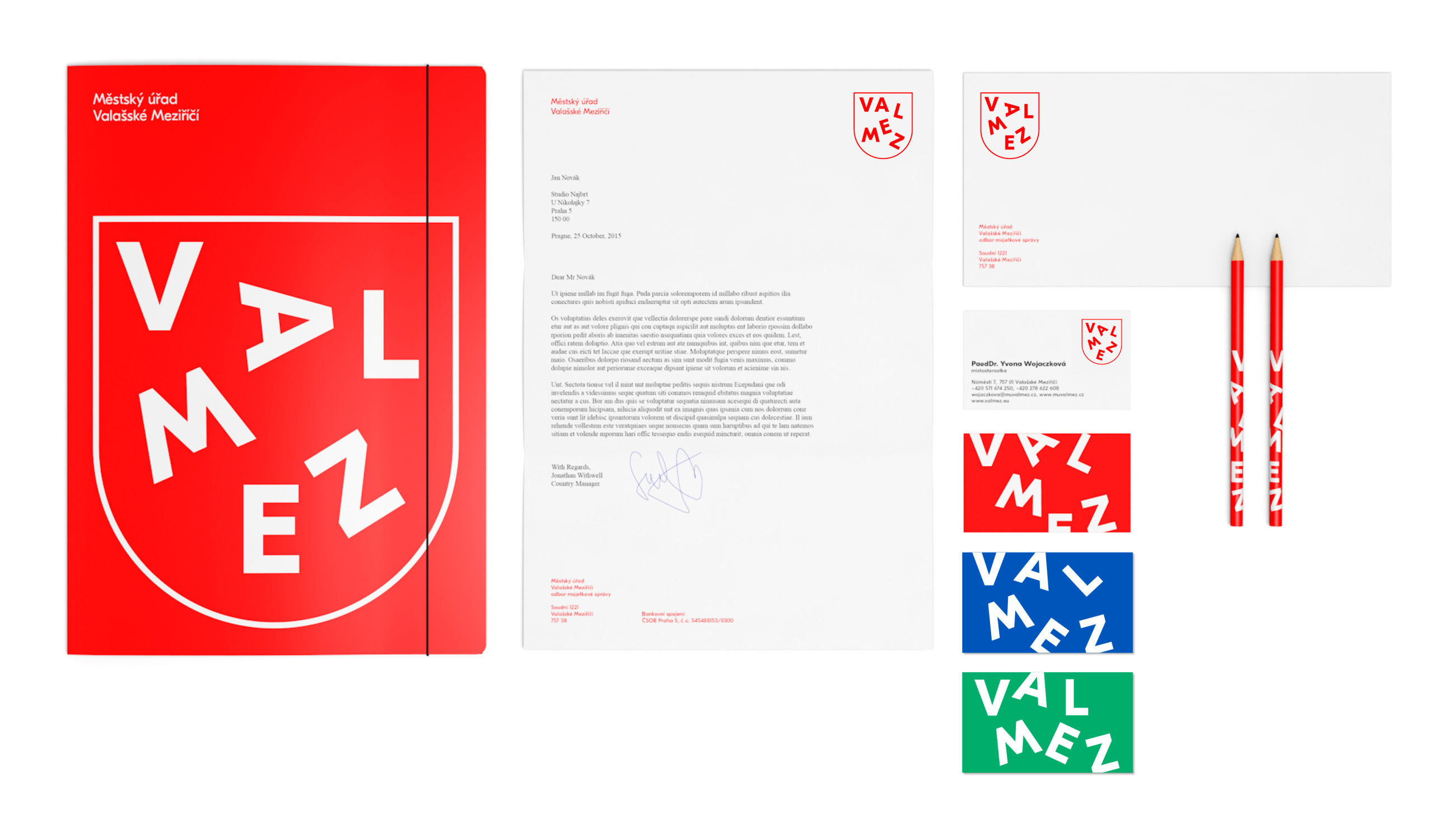
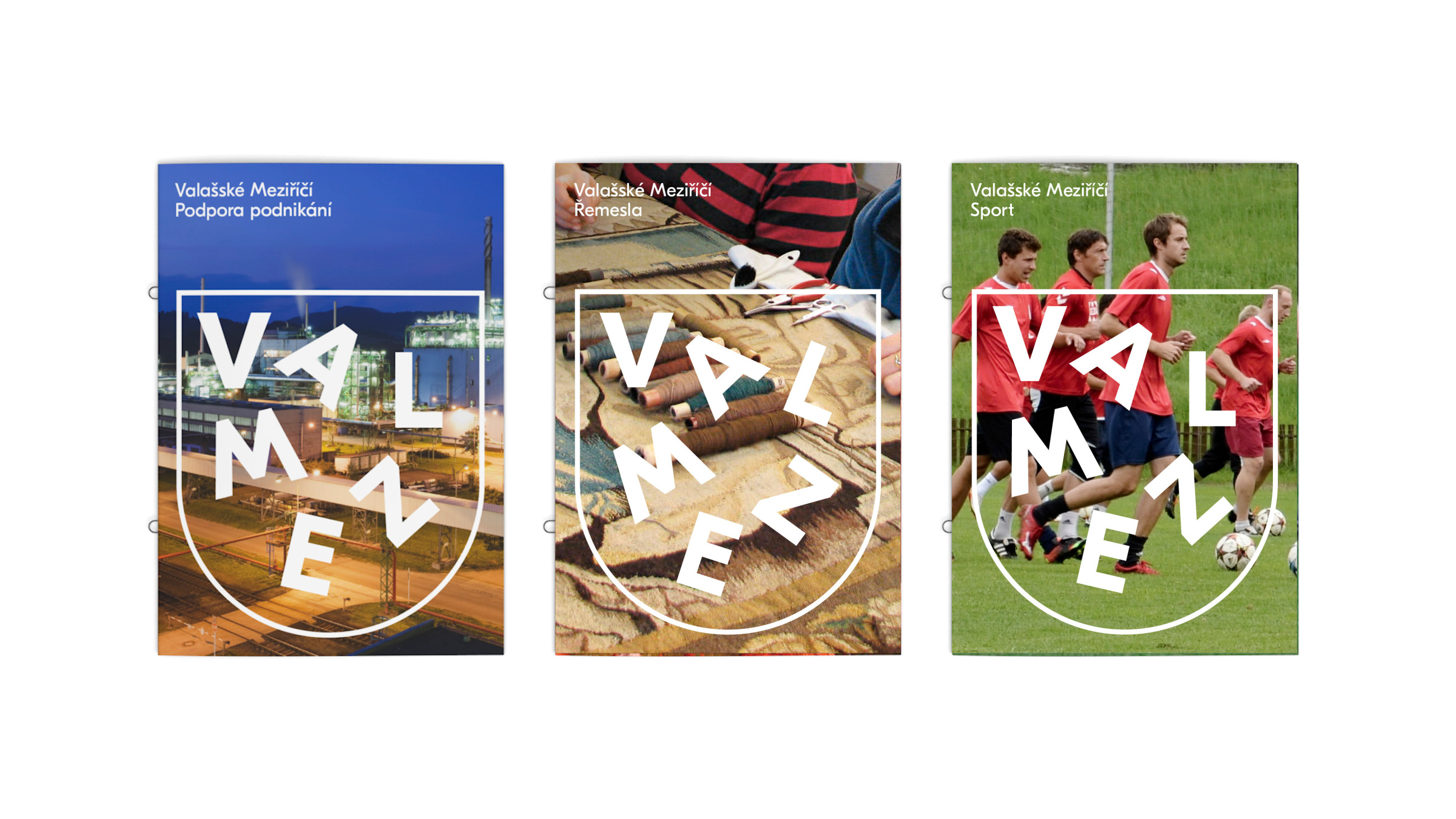
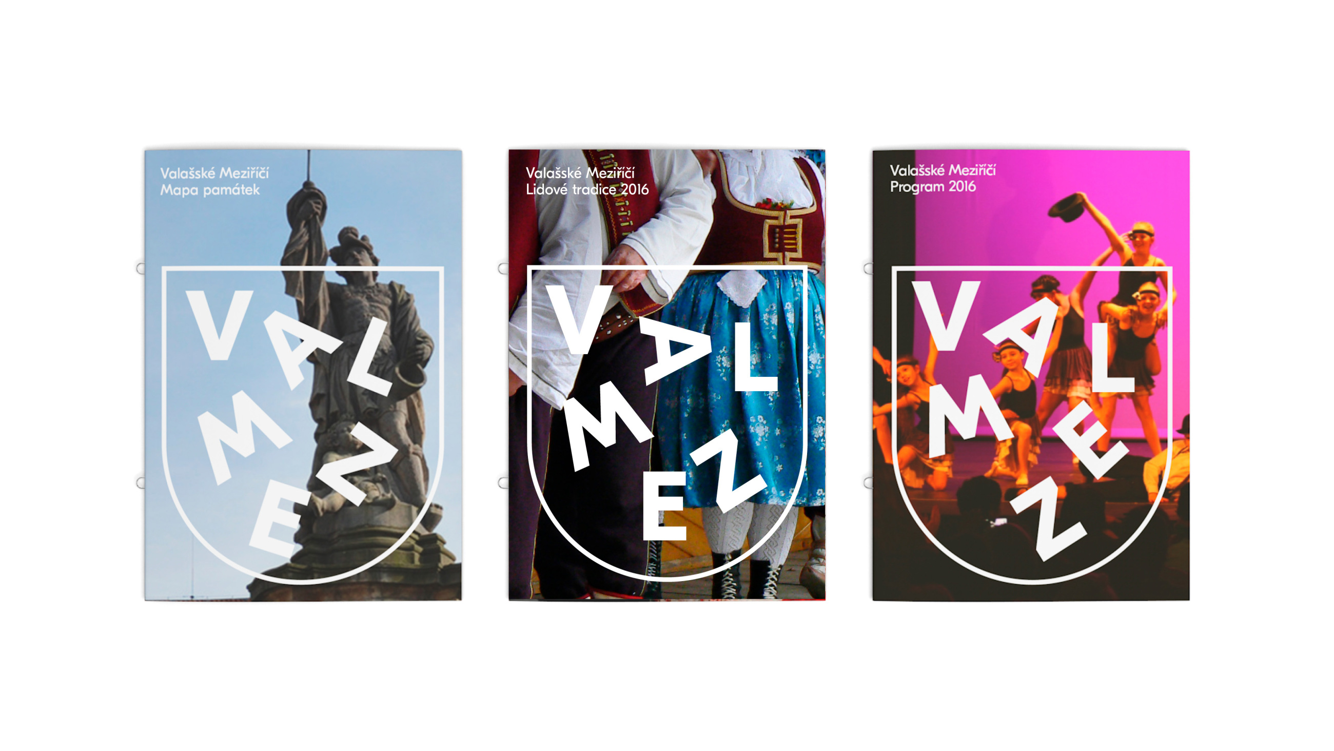
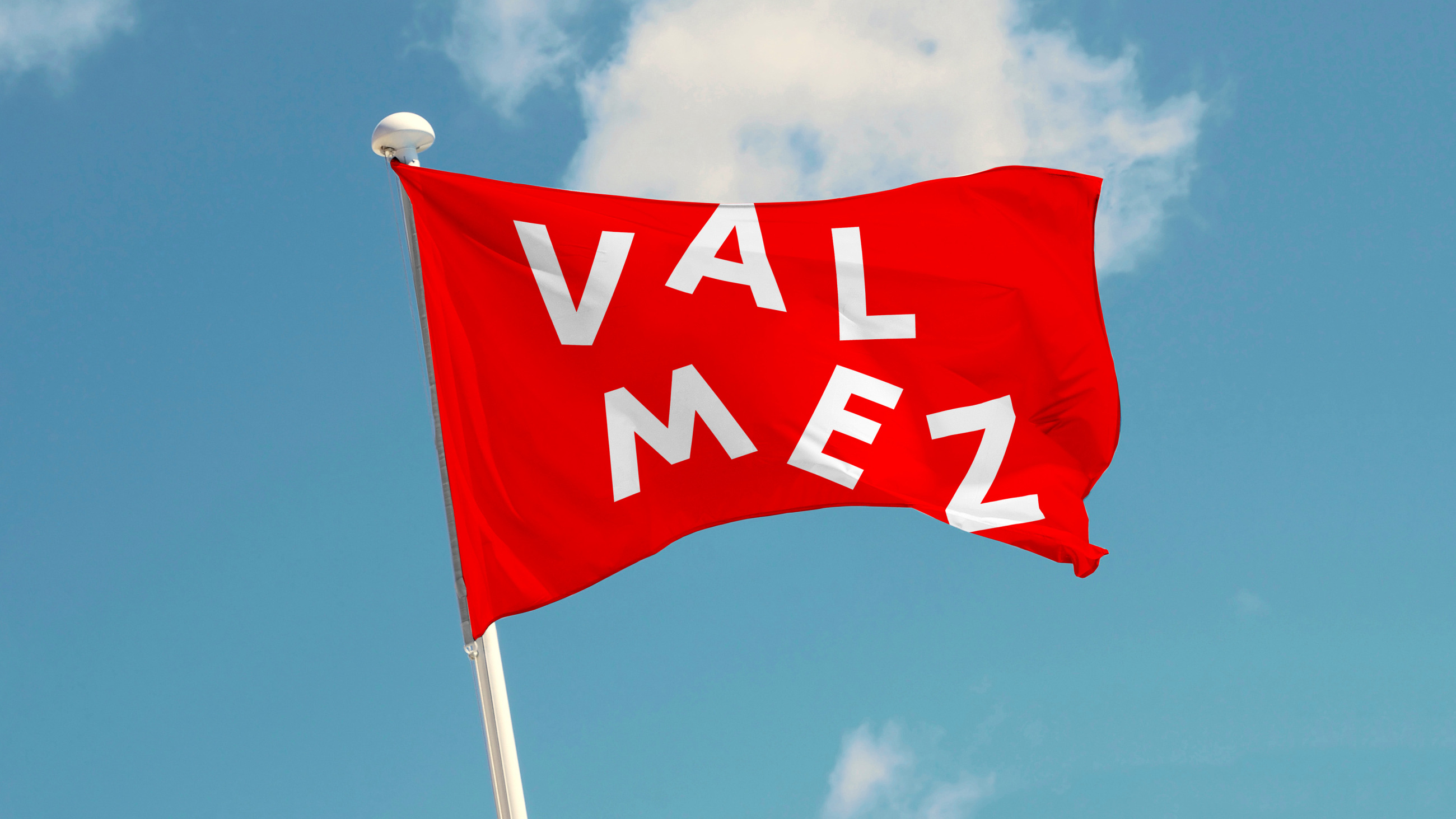
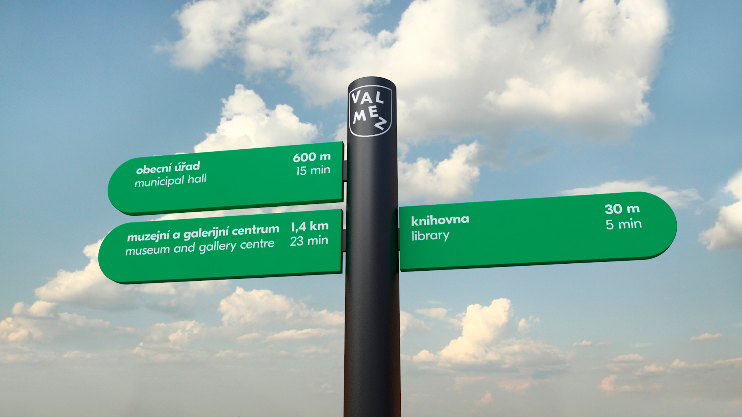
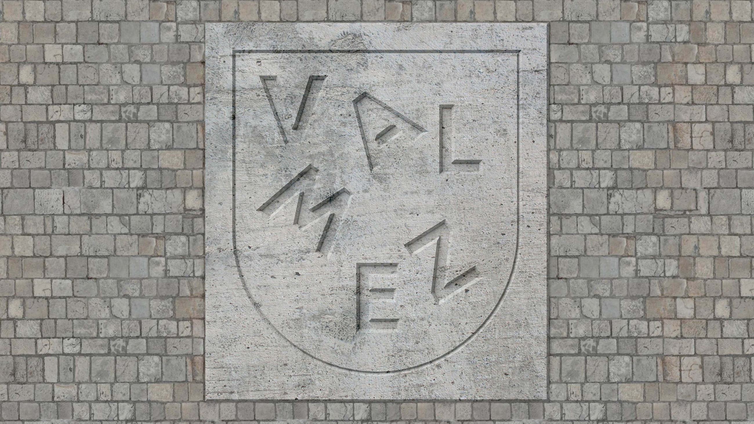
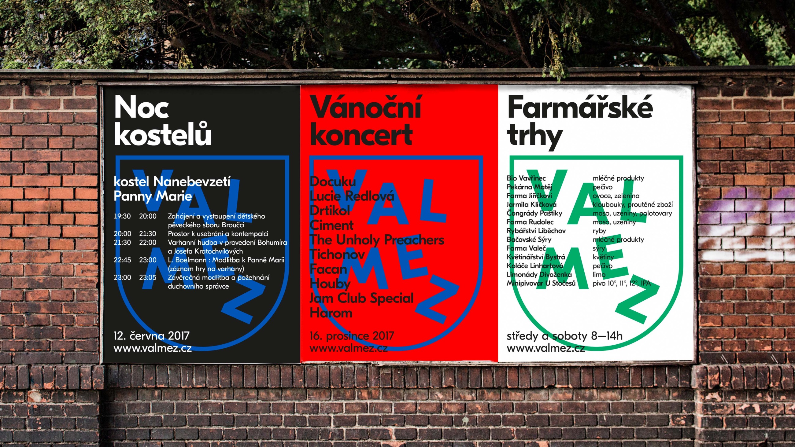
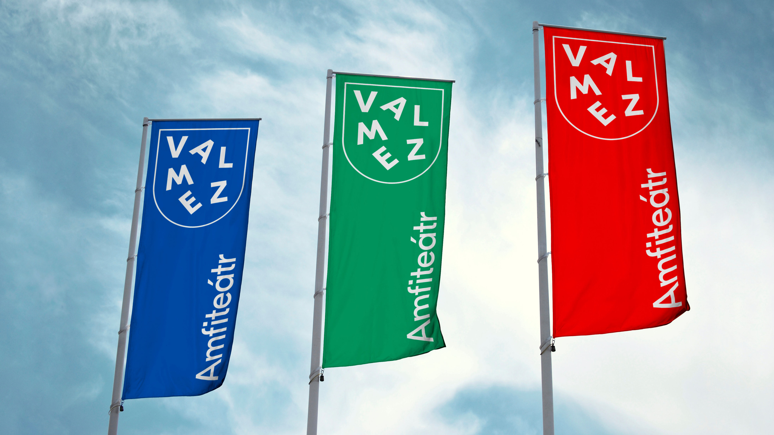
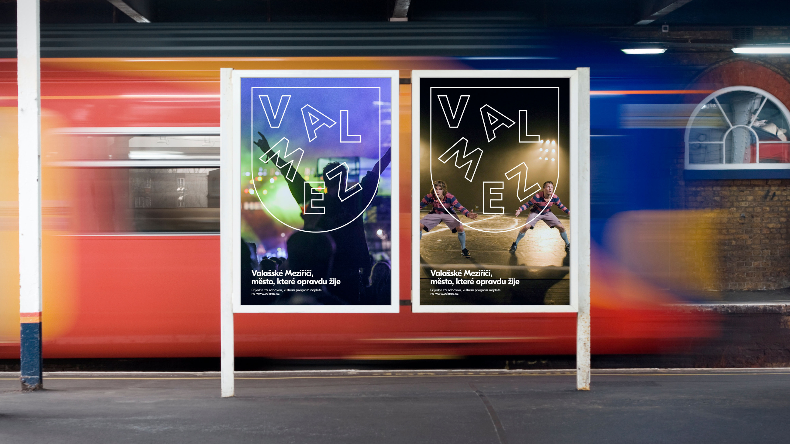
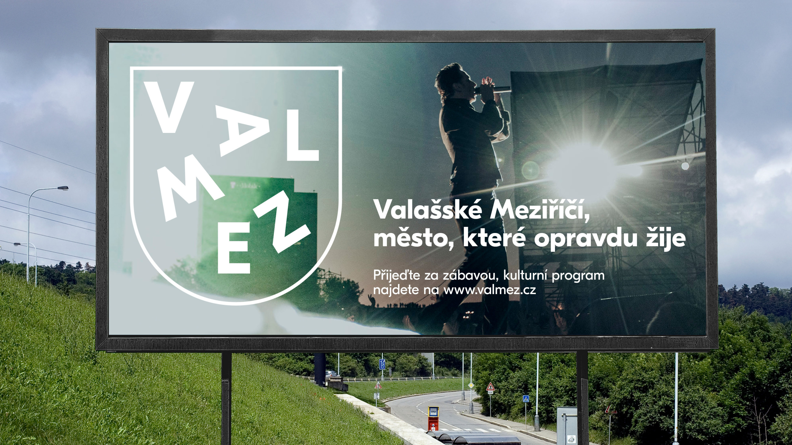
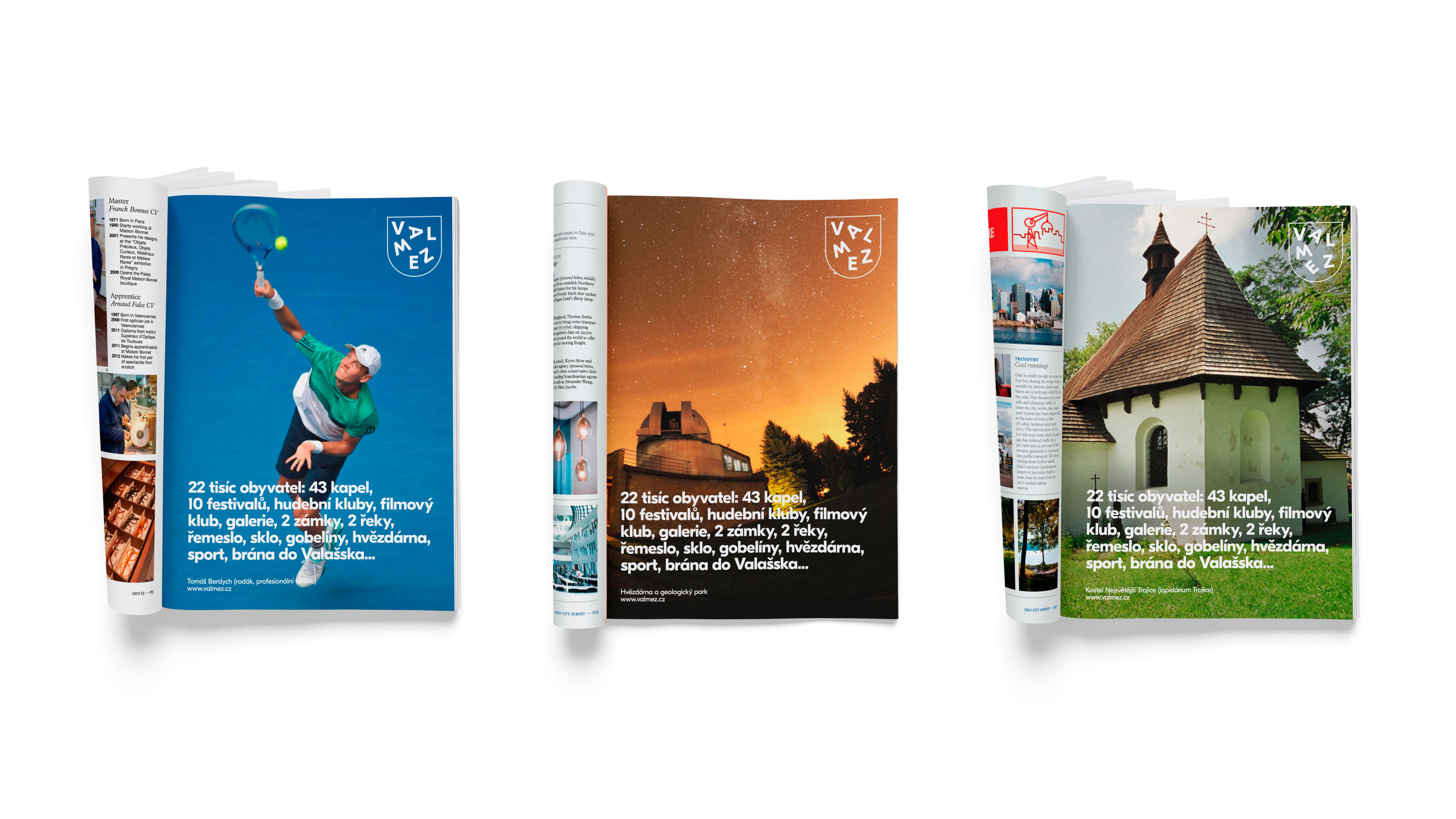
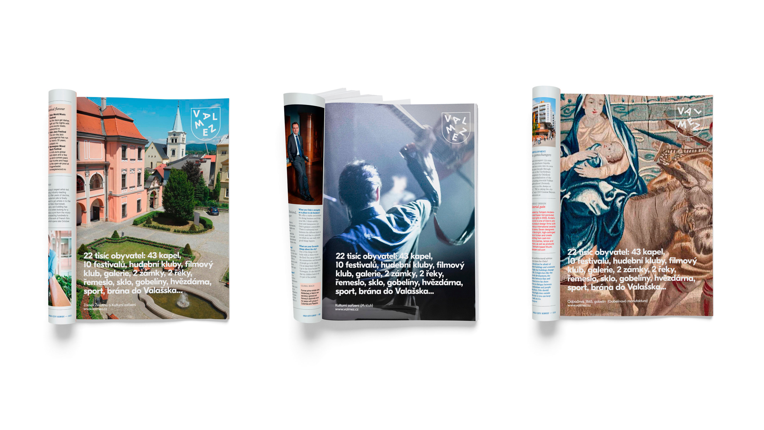
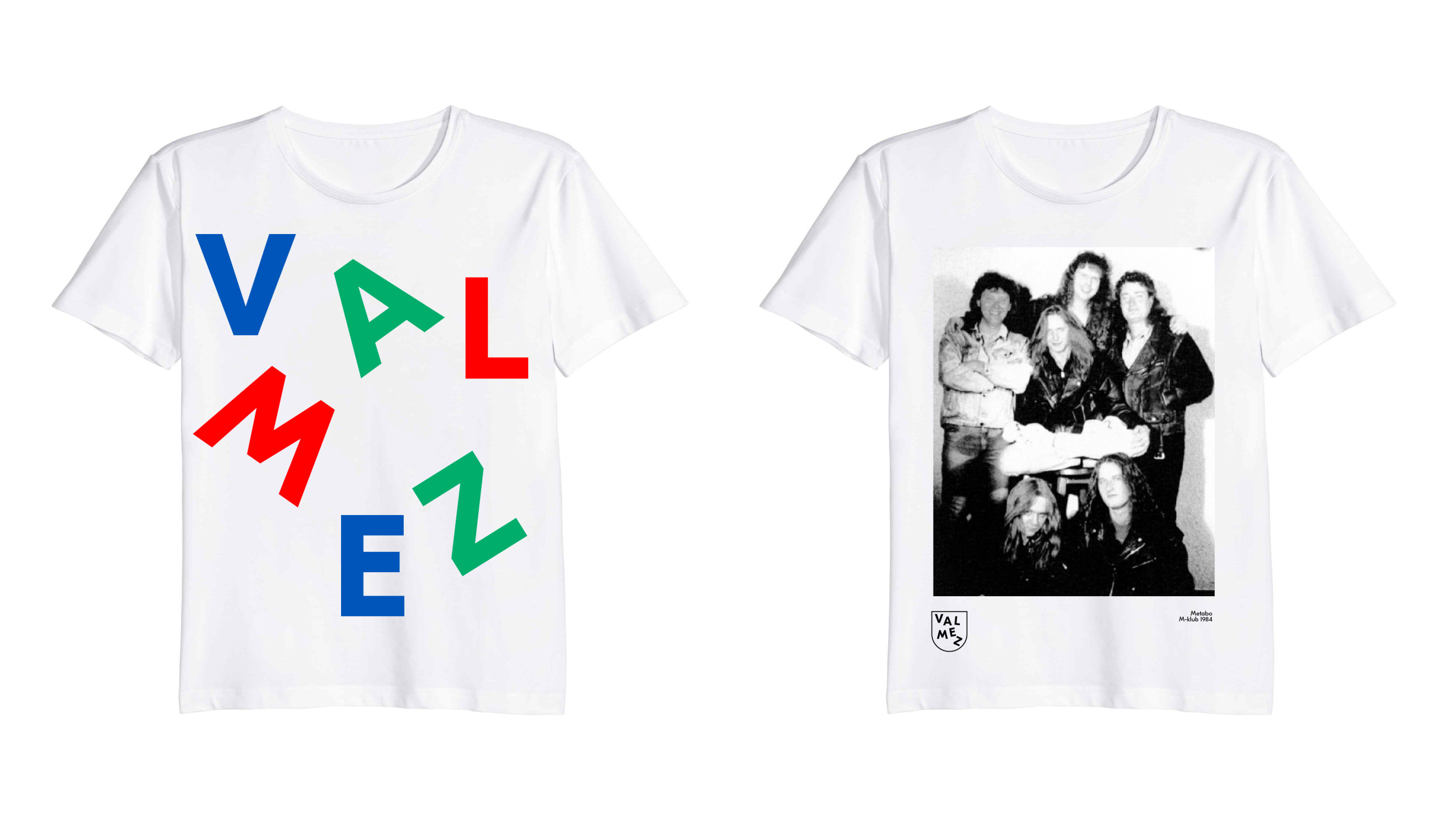
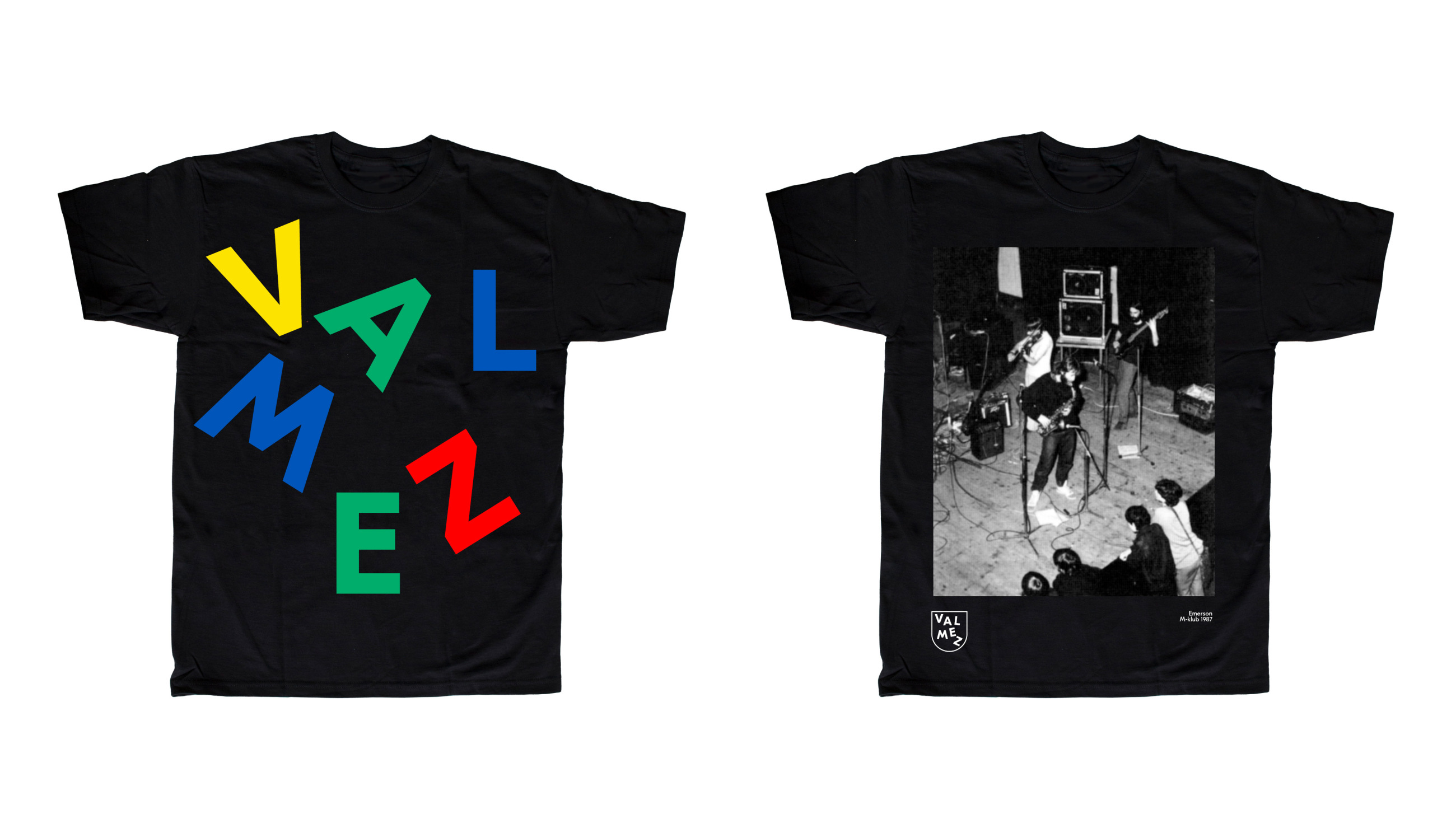
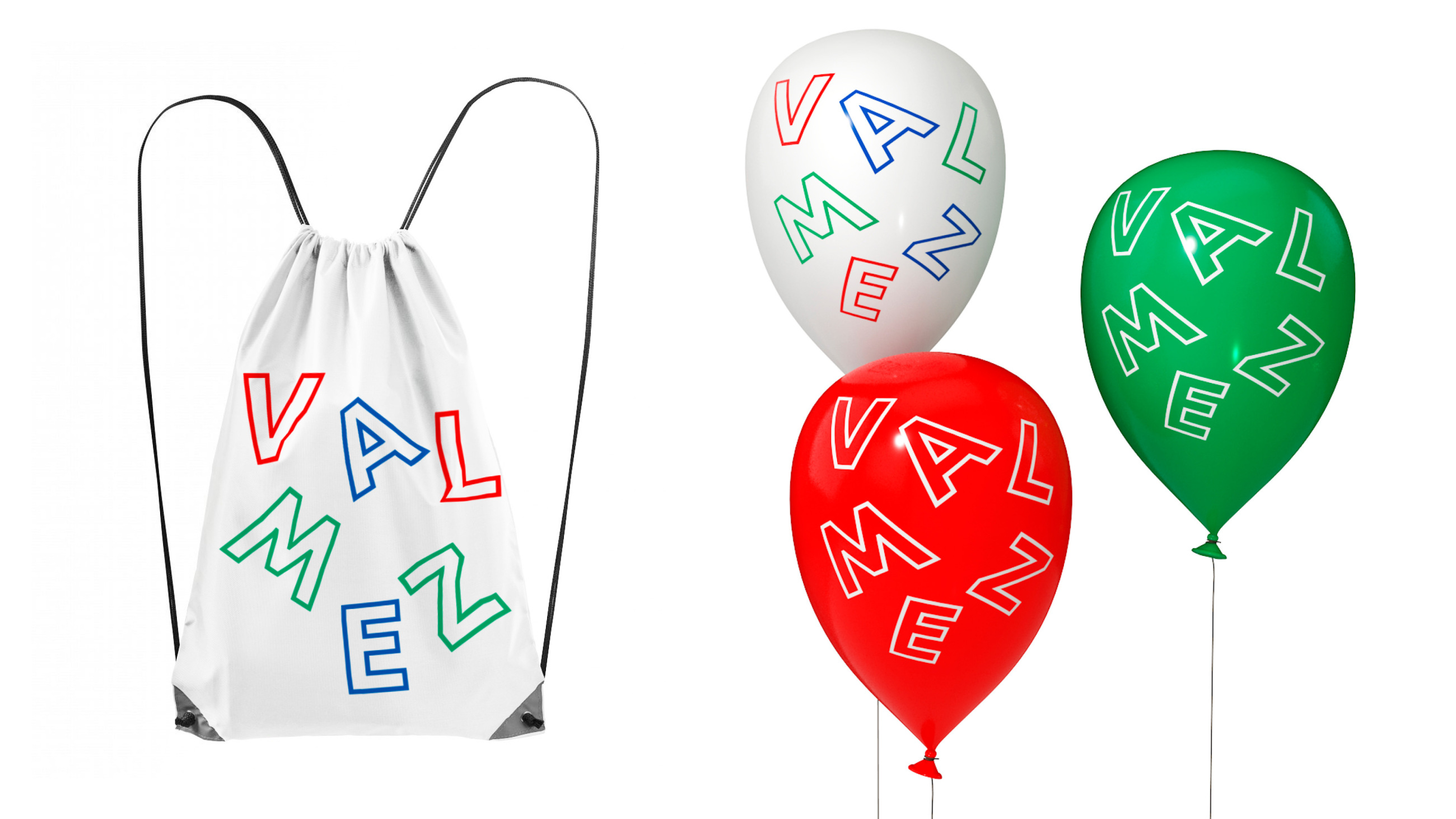
This all is embodied in the logo by the dancing, shaking letters in the bold shortening Valmez (Valašské Meziříčí), which is already in itself a word-logo. Swaying letters lean on a heraldic shield, which gives the logo a solid foundation and dignity. The combination of these two positions is smooth, like the historical connection between the two parts of the city, links between generations and the local confluence. From a comfortable distance of 2016, the logo makes fun of armorial aesthetics a little, but Valmez is a confident city and surely can take it.
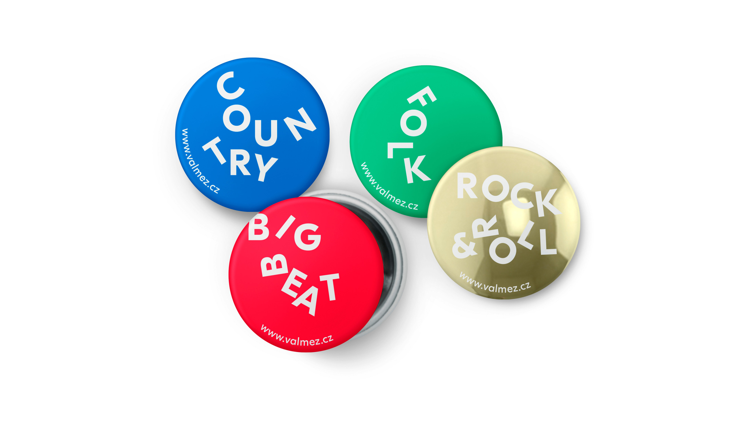
Similarly to the city itself, its logo is constantly changing within the framework given by its historical boundaries. The symbol offers almost endless possibilities for newly combining letters, for shake-ups. It's easy to remember, easily reproducible and drawn even by a kid, from school to the football stands. As a result, it gets closer to those who will use it and whom it represents.
Client: Valašské Meziříčí,
Designer: Martin Vácha
Art director: Zuzana Lednická
Font: Eesti,
Type: Brand,
Year: 2016