Yedoo
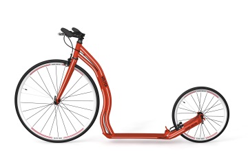
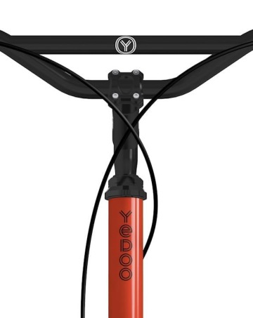
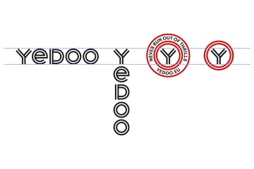
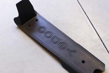
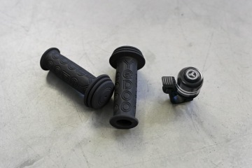
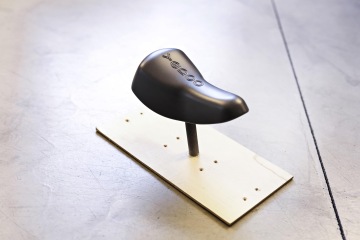
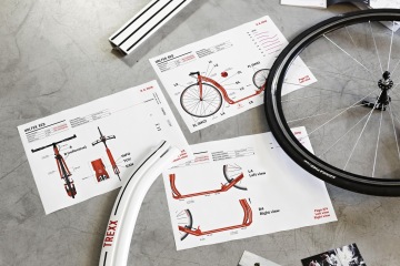
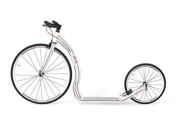
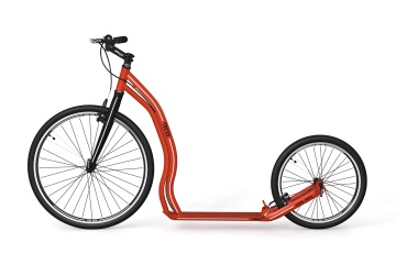
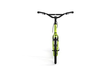
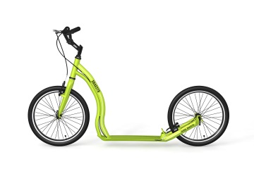
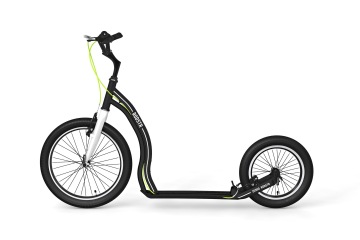
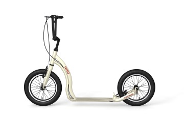
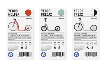
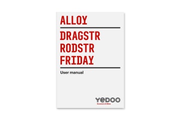
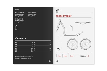
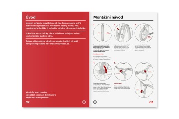
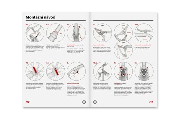
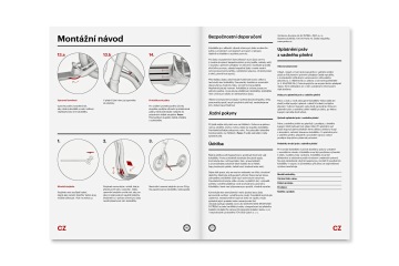
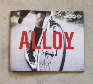
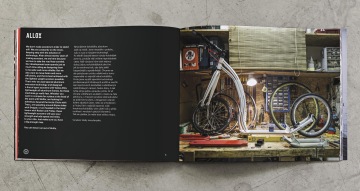
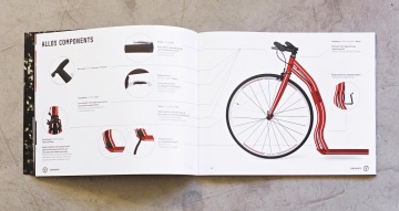
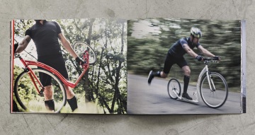
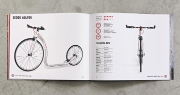
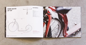
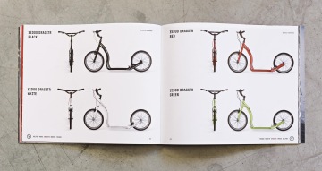
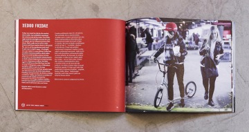
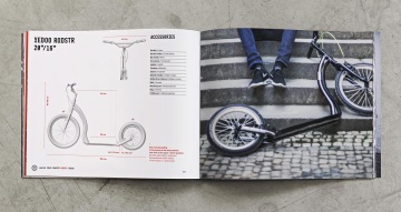
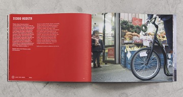
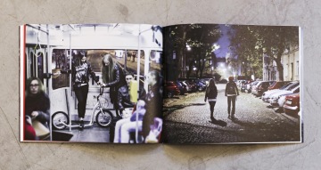
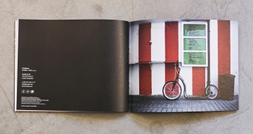
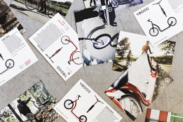
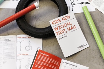
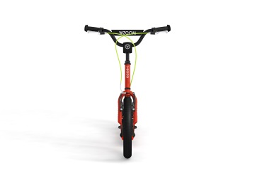
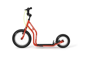
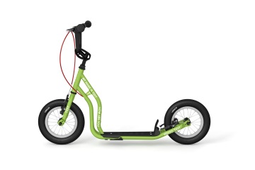
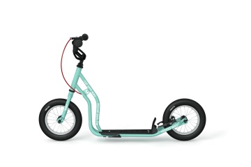
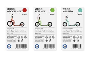
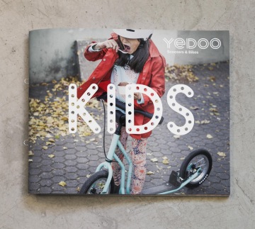
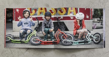
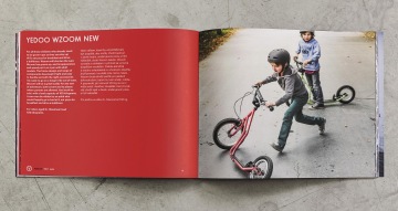
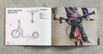
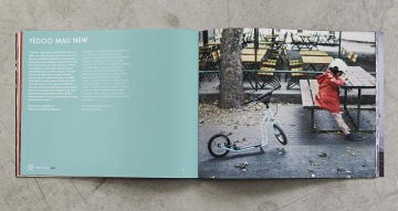
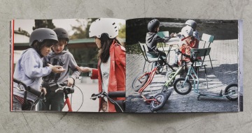
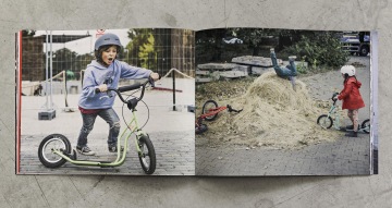
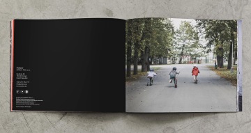
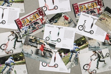
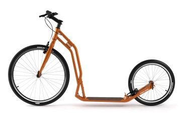
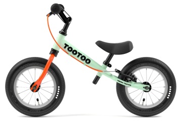
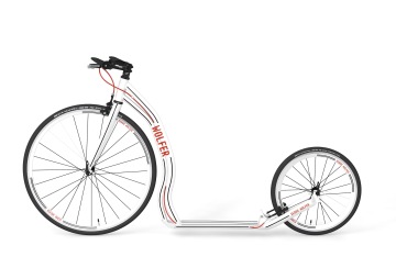
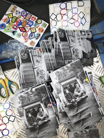
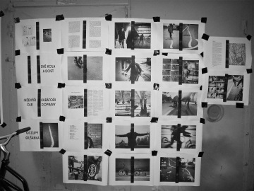
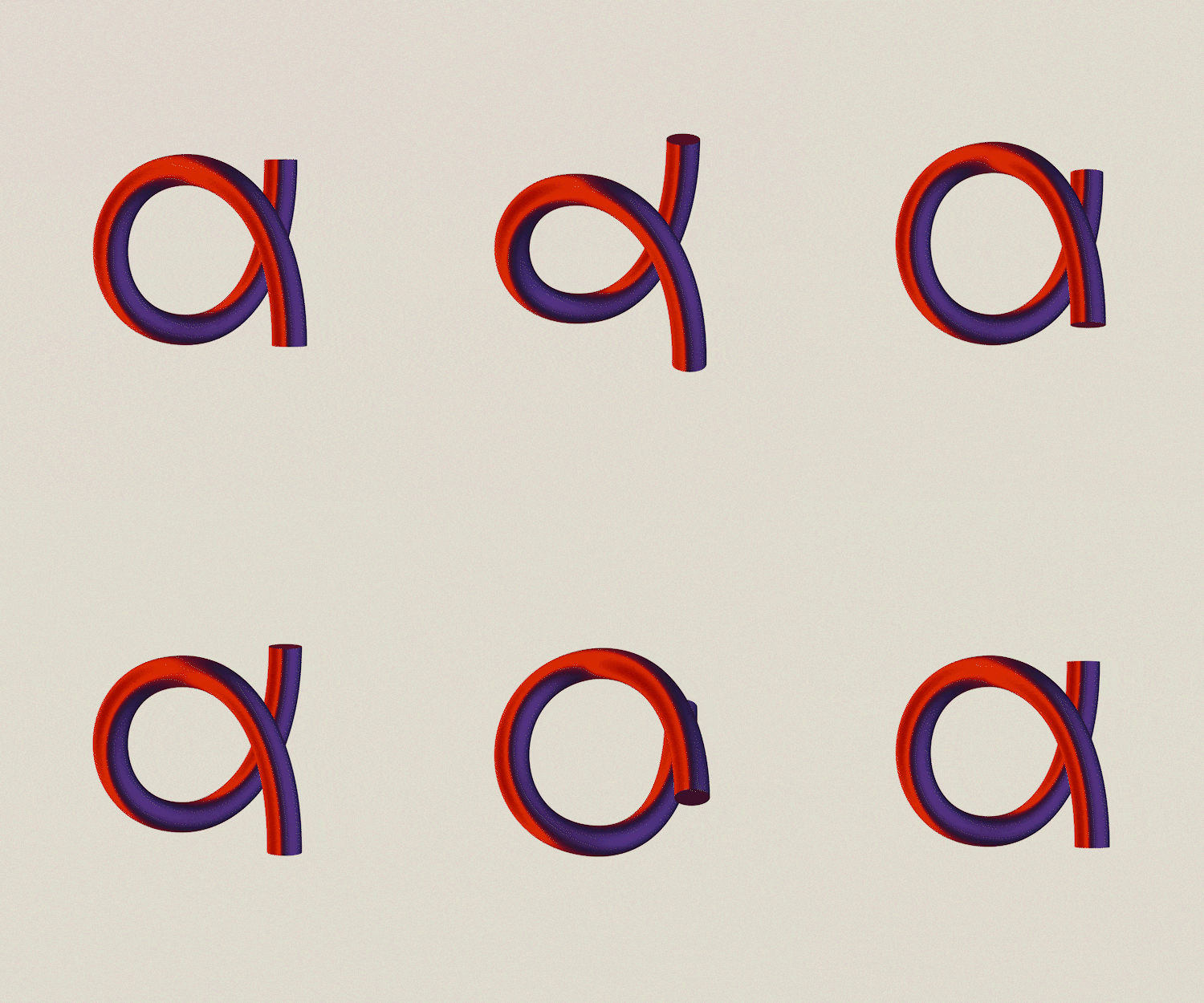
“When we develop a new seat, you can be certain that all of our neighbors’ rear ends will test dozens of prototypes,” read one sentence in the introductory text of our Yedoo catalog. It took several reads before someone realized that these scooters don’t have seats (and that balance bikes are discussed elsewhere). Nobody knew what is Zuzana talking about when she referred to the “clutchies” on the handlebars. We learn slowly. We started in 2013 with our first Yedoo presentation at Designblok, the largest selection of design and fashion show in Central Europe, and then we gradually added graphic redesign and color combinations for the sports’ line of scooters, then some promotional materials and a logo. It was necessary to create a system and a logo that works in both horizontal and vertical form, but also as a separate symbol. Symbol now consists of two circles – one larger and one smaller wheel, just as those the Yedoo scooters run on. The two lanes are then repeated in other letters, bringing in dynamism and speed of the lines on the road and creating an easily identifiable and easy to apply feature of the visual identity. Similarly crucial are Dušan Tománek’s photos that use moving, documentary style to show the scooters and their owners in everyday situations: during sports, at the market or on field trips. We produce the catalogues essentially turnkey, from shoot concepts to texts and sometimes even our own children as models. Gradually we redesign and name new scooters, and the entire series. Then come the instruction manuals, product sheets, boxes ... and recently even the seat for a balance bike. Although we will never call grips other than “clutchies”.
Client: Yedoo,
Designer: Zuzana Lednická, Ondřej Kahánek
Art director: Michal Nanoru
Name: Michal Nanoru
Production: Pavlína Nebáznivá
Additional cooperation: Dušan Tománek (photo)
Font: Sklonar, Graphik, Merkur,
Type: Brand, Catalogue, Web, Album Cover, Product,
Year: 2017
