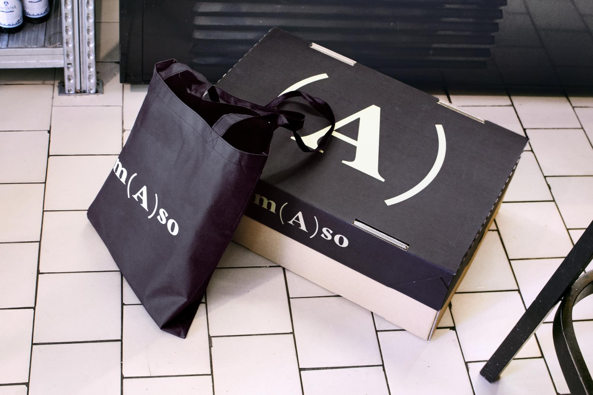
Amaso
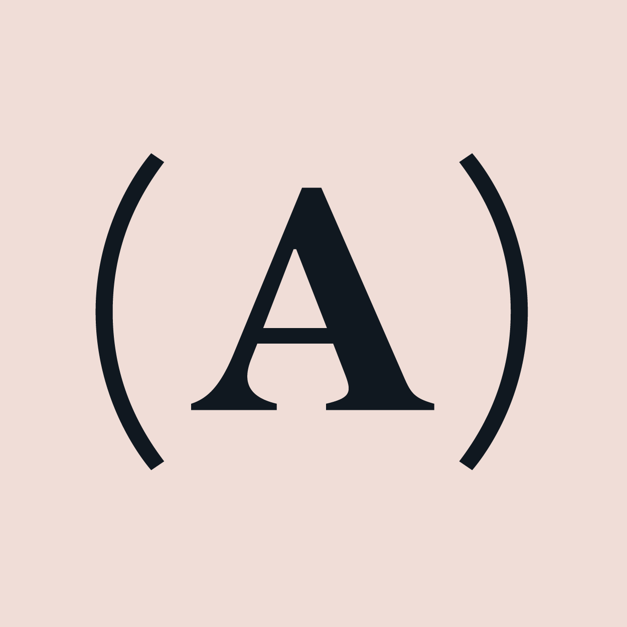
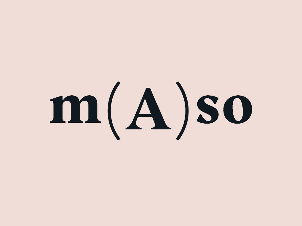
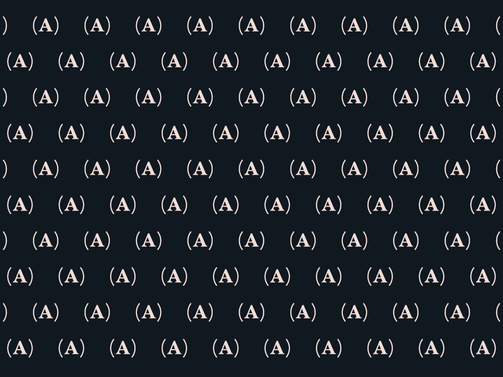
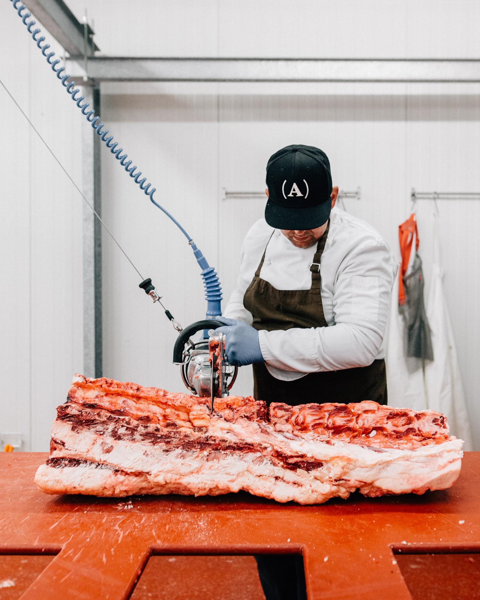
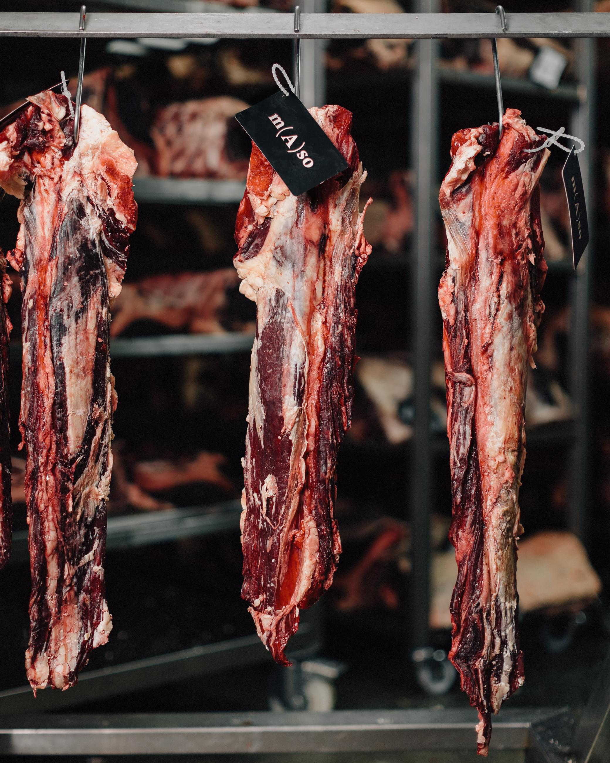
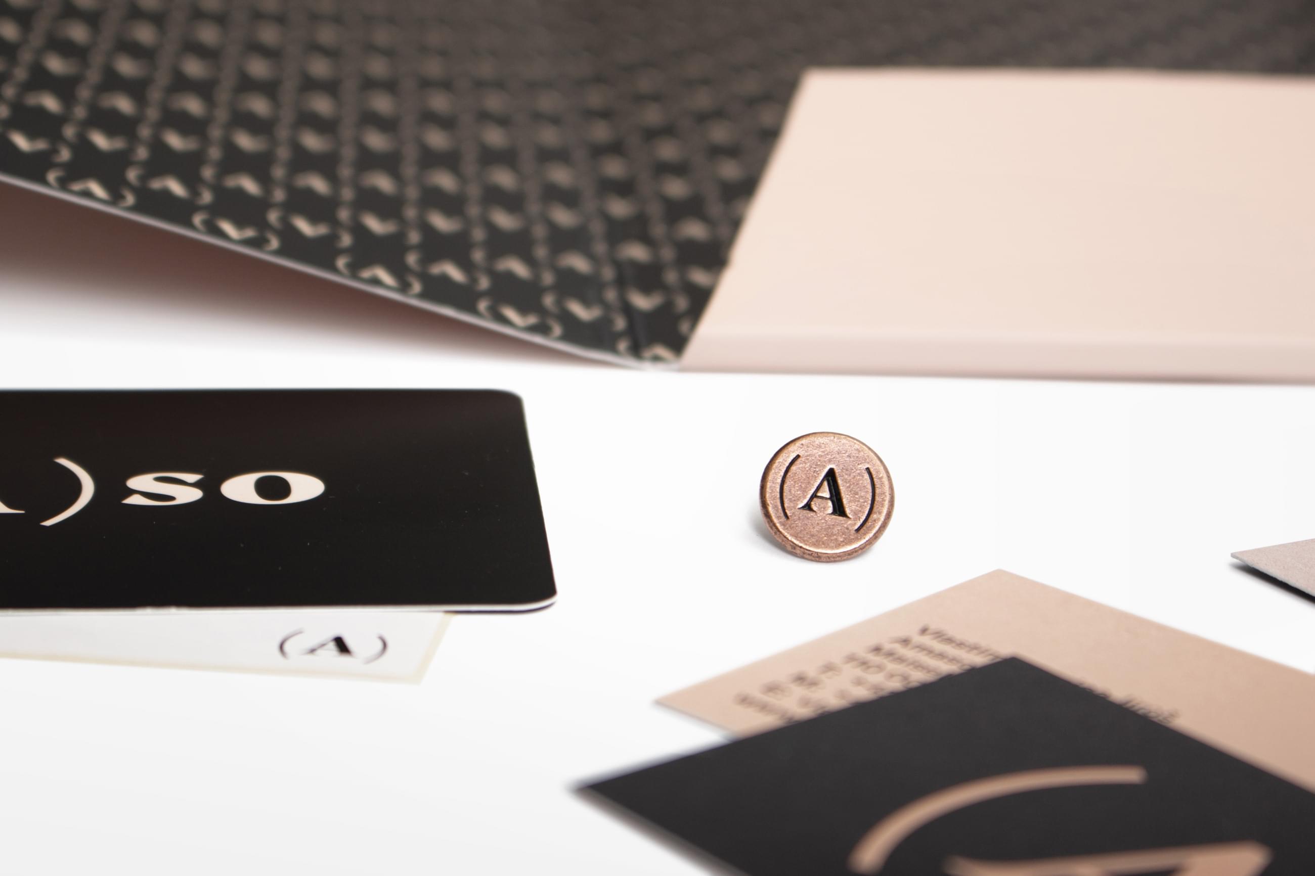
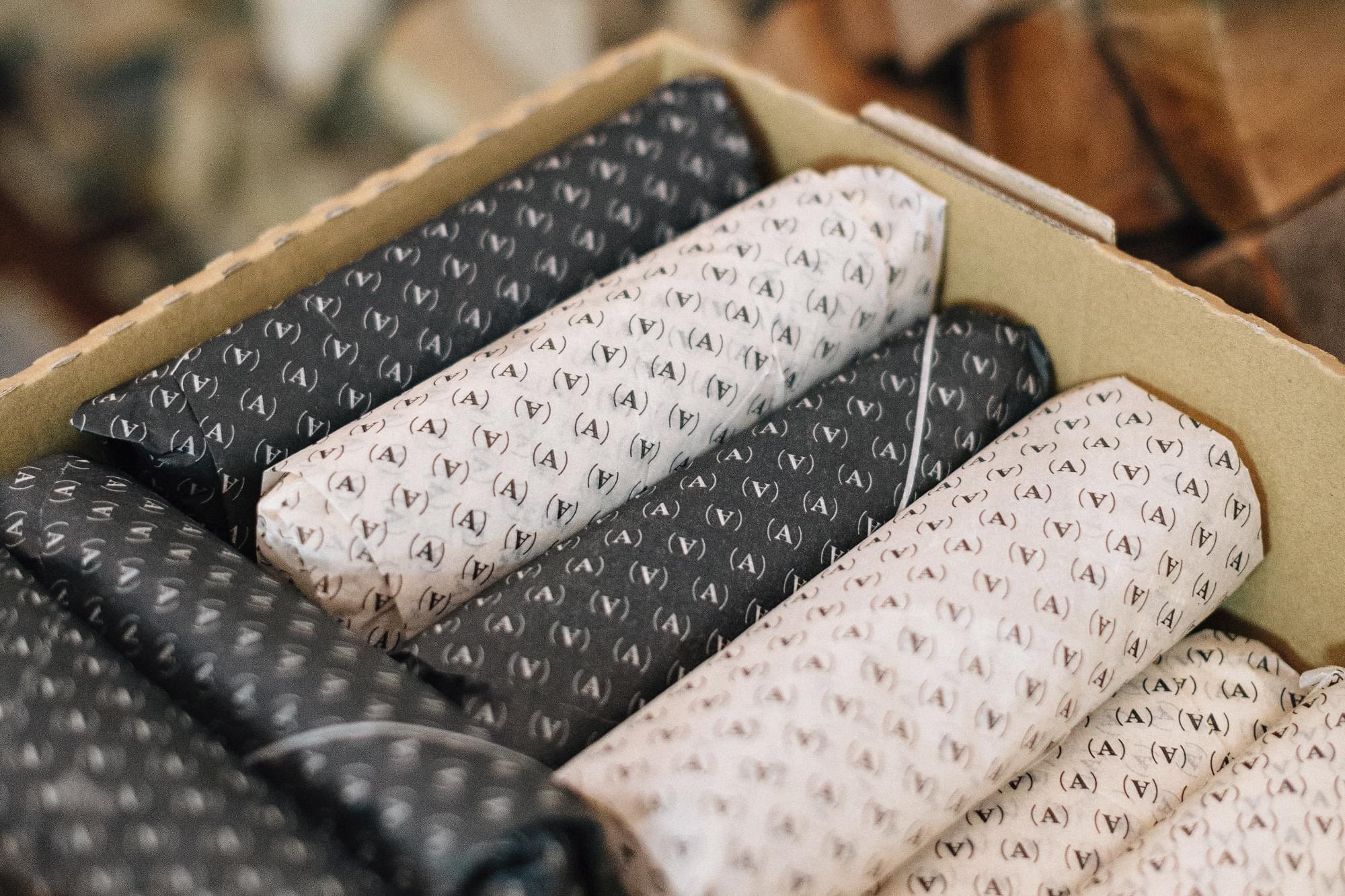
A sophisticated customer deserves a sophisticated logotype. The supplier of Ambiente’s “our meat” chose a typographic puzzle that visually entangles the already complicated name (“Ameat”). To all but the typography buffs the ascetic design only subtly suggests – an antiseptic purity of a cutting room, a capitalized A as a mark of quality, a "juicy" traditional serif with a delicate sausage-shaped brackets, all in a lard pink with the side of blue-black.
Client: Ambiente,
Designer: Jakub Spurný
Art director: Aleš Najbrt
Font: GT America, Kunda,
Type: Brand, Restaurant, Packaging, Album Cover, Product,
Year: 2019