Žilka Optik Studio
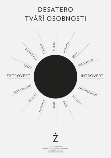
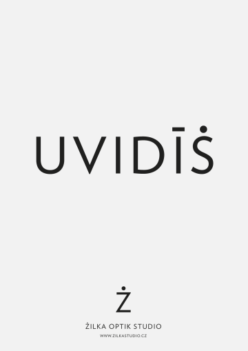
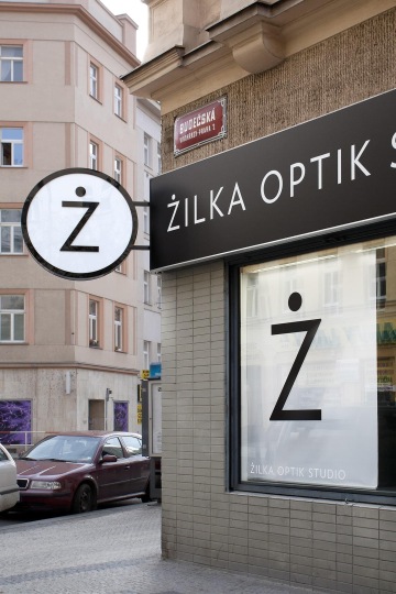
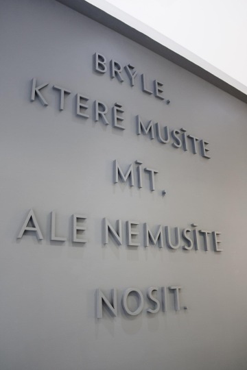
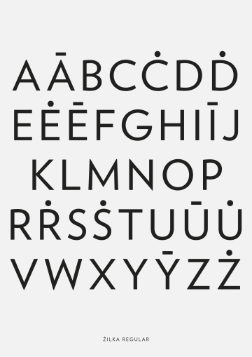
Hook over Z in the name of the Prague’s studio known for its mischievous rims narrowed to a seeing pupil. It watches over the whole alphabet with dots instead of hooks, a bit mysterious and immediately recognizable language for all printed materials of the studio. The first campaign goes with its black and white strictness and symbolism of a magic eye in the Old Testament-y terse slogans, whose ambiguous prophecies carry a permanent challenge to fate. Look. See through. You'll see.
Client: Žilka Optik Studio,
Designer: Zuzana Lednická
Additional cooperation: Radek Sidun (typeface)
Font: Custom,
Type: Brand,
Year: 2013
