Eska
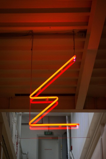
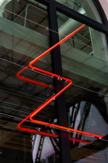
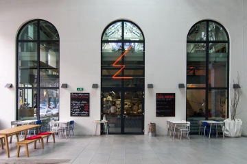
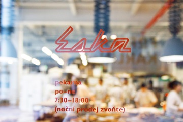
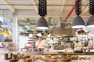
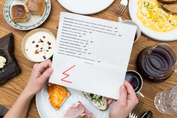
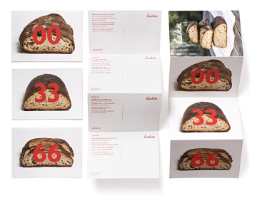
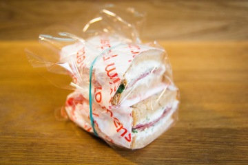
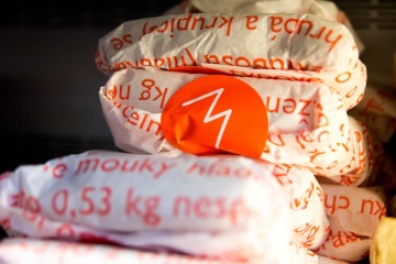
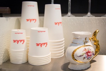
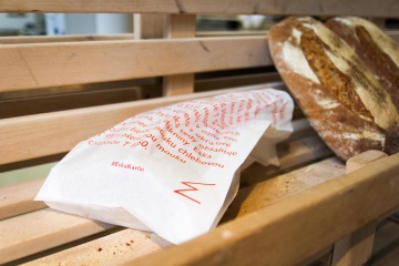
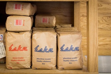
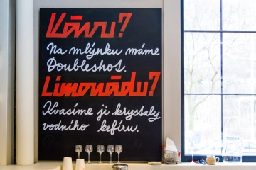
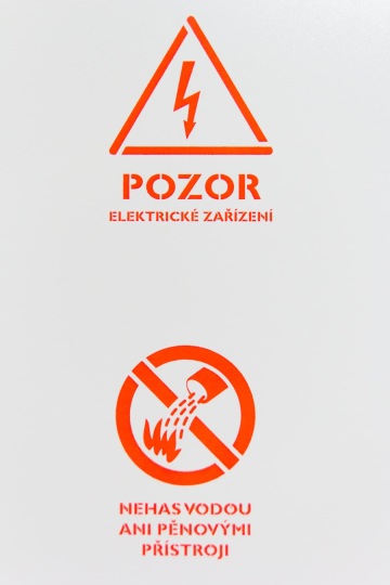
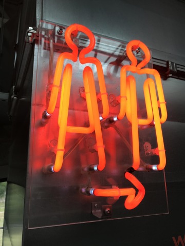
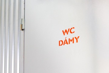
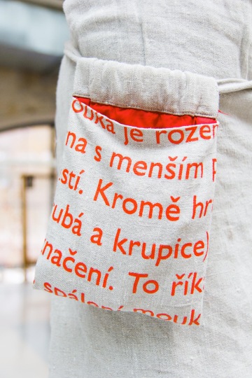
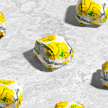
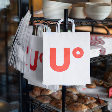
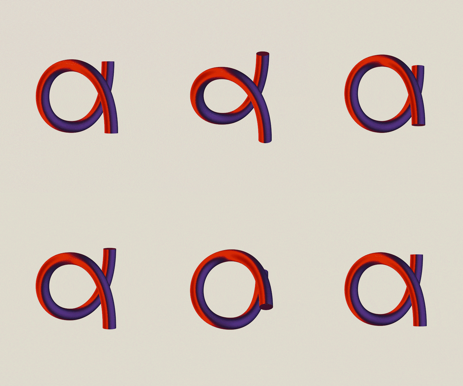
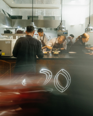
A new, light Ambiente restaurant and a bakery with Northern European approach to Czech cuisine just opened in Prague’s Karlín. Eska, for some a Czechoslovakian bicycle brand from childhood, for another a cryptogram for Scandinavia (S-K), fills the former industrial space with desire to do things in non-industrial way, artisanal, with personal attention, patience and forest spices. The principle of revival, cooking with leftovers and husks, blending and fermentation reflects in the logo. Nostalgia for the '70s, Communist-era signposts and electro packaging heat the bakery with red-hot neon. Openly stated contents lists follow open kitchen and the restaurant space on products and packaging, and in visual style of stencil version of the classic Gill Sans font. Finally, we recommended the signwriter Petra Dočekalová so that chalkboards look like something too.
Client: Ambiente,
Designer: Marek Pistora
Art director: Aleš Najbrt
Additional cooperation: Tereza Froňková (architecture), Petra Dočekalová (caligraphy)
Font: Gill Sans Nova, Eska Script,
Type: Exterior, Interior, Brand, Web,
Year: 2016
