Prague Botanical Garden
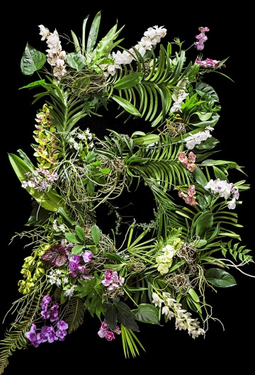
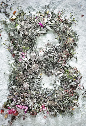
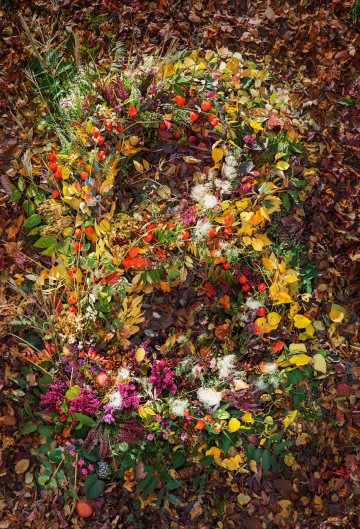
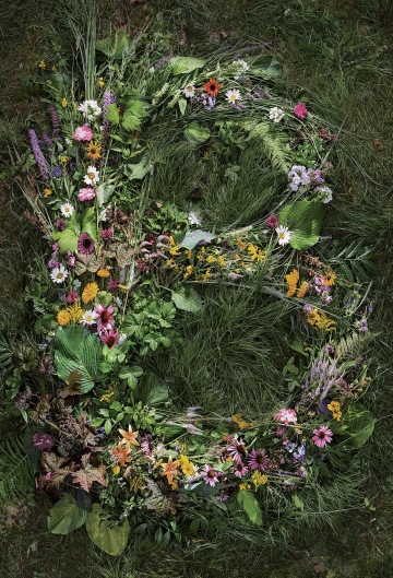
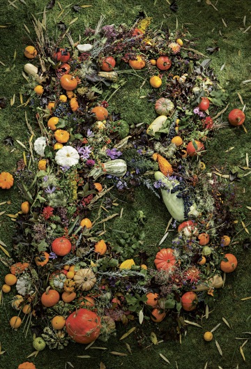
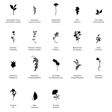
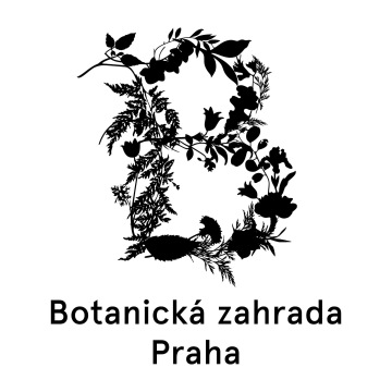
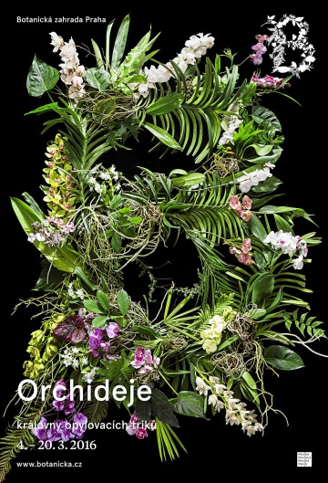
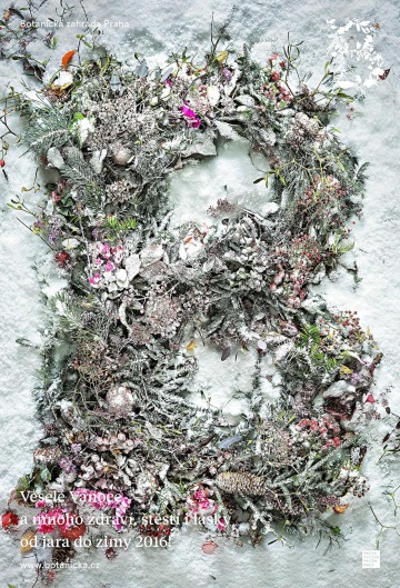
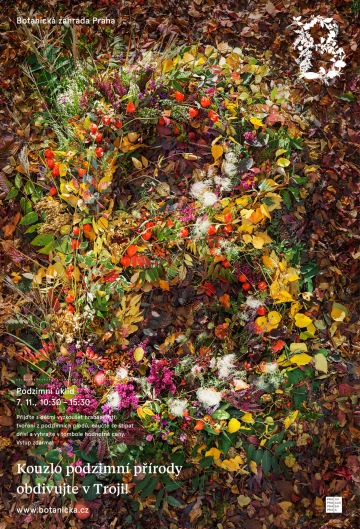
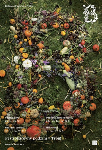
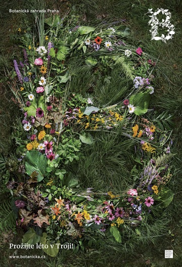
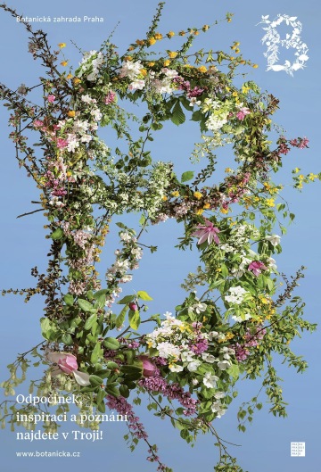
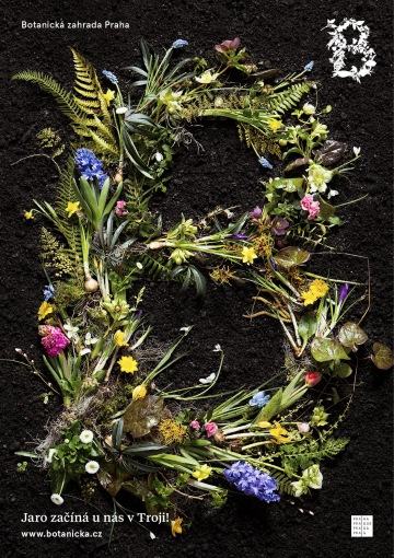
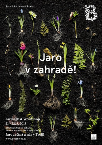
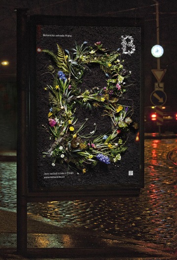
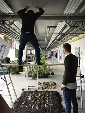
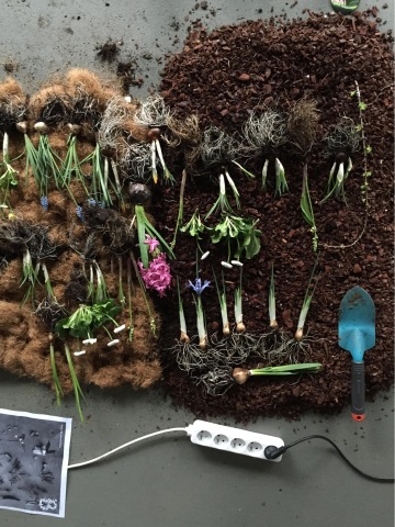
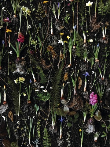
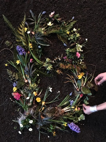
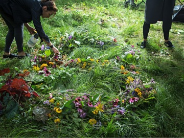
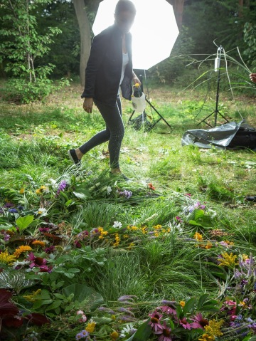
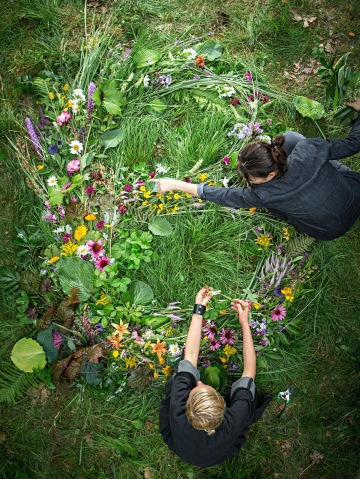
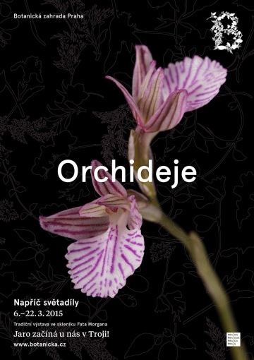
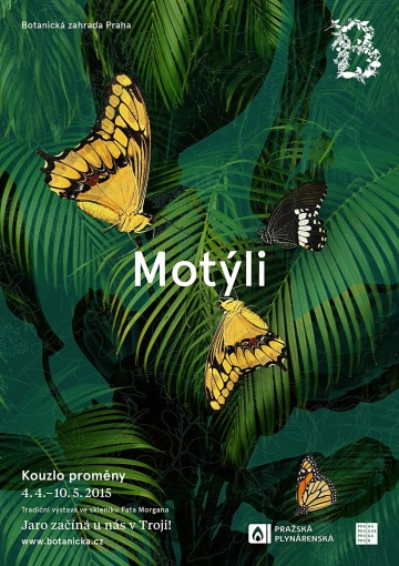
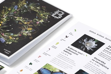
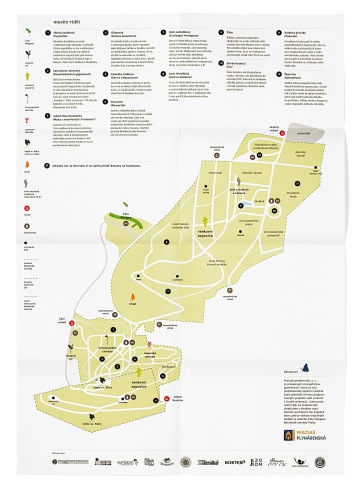
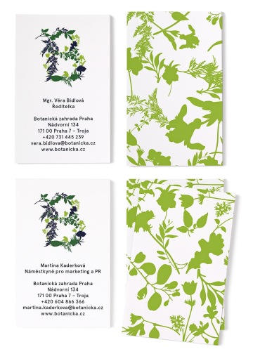
Together with the curators of the Garden we designed an organic logo using eighteen pieces of fifteen species of plants that every visitor with just a little determination can find on their grounds. The outlines of the plants then shape the basis of visual style. The peonies, orchids, ferns, violets and irises form patters distinguishing the business cards, tickets and other internal, but also some promotional materials. Pasque (sort of Przewalski horse of the Prague Botanical Garden), lily of the valley, eucalyptus, Hellebore or chickweed are made into symbols on merchandising, but they also find work as pictograms on the Garden’s map. We also made the variety of the gardens the principle of the campaigns: the new identity is launched with the spring Arcimboldo-meets-Sagmeister B we shot with the baroque photographer Vaclav Jirásek, composed of diverse seasonal plants complete with roots, laid bare on soil… We look forward to the upcoming seasons to see how will they naturally transform the composition. We rarely see an identity to blossom like this.
Client: Botanická zahrada Praha,
Designer: Anna Divišová, Zuzana Lednická
Additional cooperation: Václav Jirásek (photo), Yveta Kroupová (styling), Wild Flowers Mario (styling)
Year: 2015
