Wikov
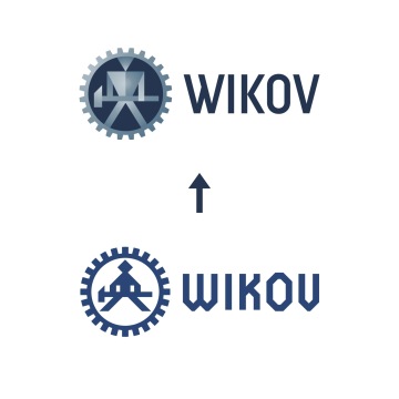
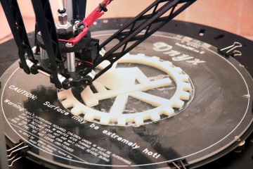
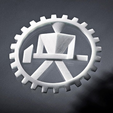
The redesign of Wikov logo is based on respect for the history of the brand that operates in engineering since 1878, for over 95 years producing gears and mechanical transmissions. The new, dynamic expression of the logo builds on the best of interwar modernism, styled in the plastic shape emphasizing the materiality of steel and the watchmakers’ precision in the size for oilrigs and mines. The weightlifter with hunched shoulders in the original logo matured into a superhero blacksmith, whose confident attitude stands for the ever-growing company. The re-energized tradition of the Ladislav typeface from 2013, whose morphology is based on the legacy of the Czech constructivist innovator Ladislav Sutnar, supports the same idea.
