Dva kohouti
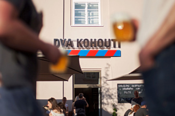
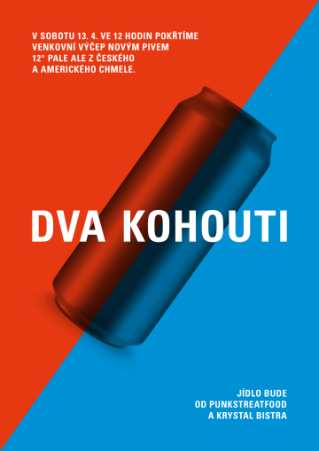
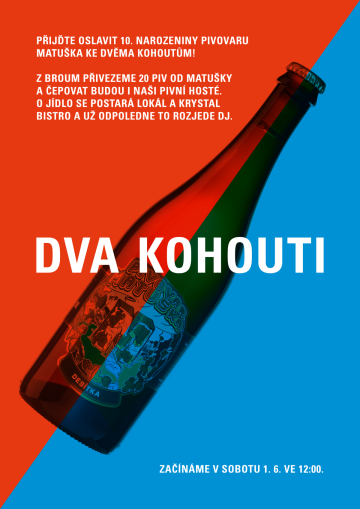
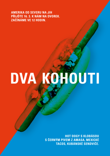
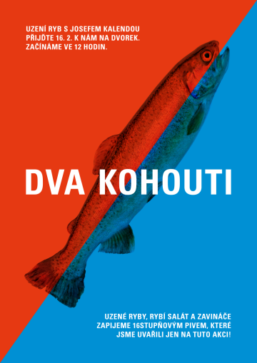
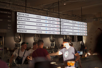
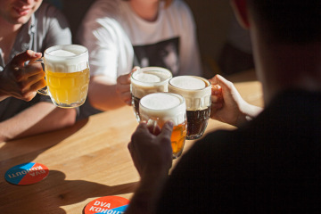
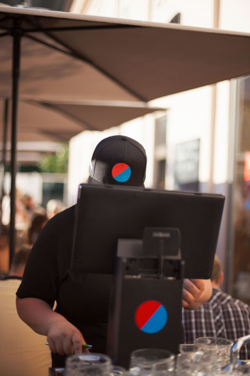
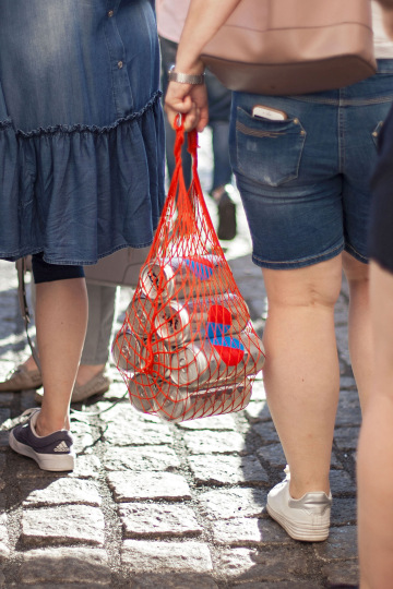
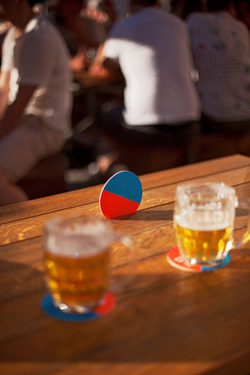
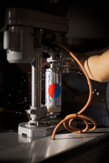
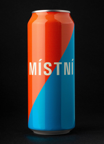
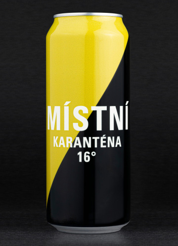
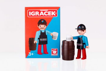
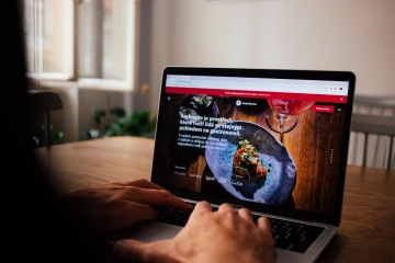
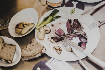
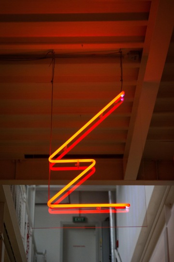
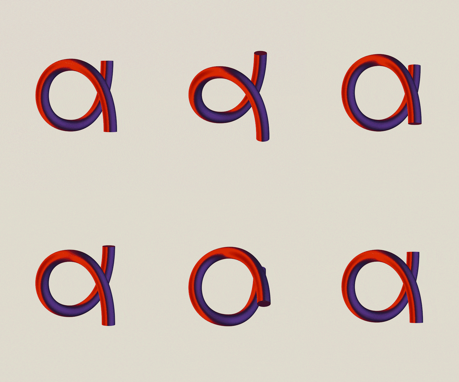
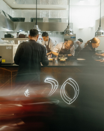
Prague’s Dva kohouti [The Two Roosters] connects two crafts in one room: brewing and draft. In the morning, Místní ležák [Local Lager] is brewed and in the afternoon the bartenders attend the taps. And because the house was founded by two strong personalities, the brewer Adam Matuška and the master bartender from Lokál, Lukáš Svoboda, we suggested a name that described the situation in the Karlín courtyard according to an old Czech parable “like two roosters in one yard” [like a pair of fighting-cocks; “kohout” means both “a rooster/cock” and “a tap” in Czech]. We added a two-color design showing the meeting of the two worlds – red symbolizing the beer brewing (or “beer cooking/boiling” in Czech), blue for cooling the drink before serving. The combination is an appropriation of the ubiquitous water tap symbols; here always ready to be turned on for an endless stream of beer. Then we underlined the industrial character of the bar located directly in the brewery with warning tape design and utilitarian typography. Now, there’s actually way more roosters/cocks/taps than two there.
Client: Ambiente,
Designer: Marek Pistora
Art director: Aleš Najbrt, Michal Nanoru
Name: Michal Nanoru
Additional cooperation: Michal Nanoru (name)
Font: Univers,
Type: Interior, Poster, Brand, Web, Restaurant, Packaging, Album Cover,
Year: 2019
Related work:
