Kunsthalle Prague
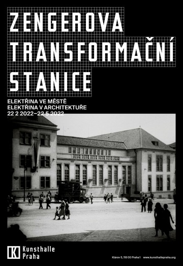
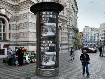
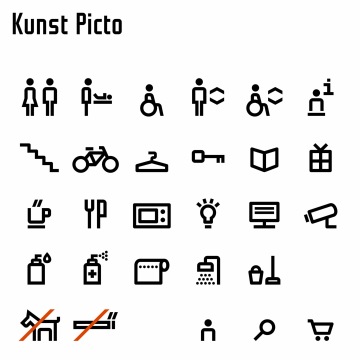
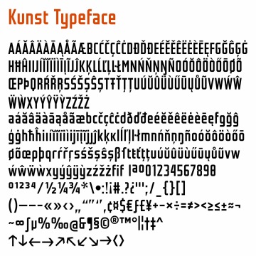
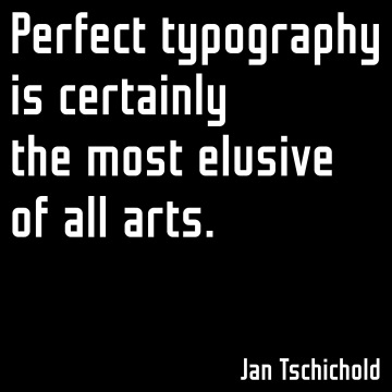
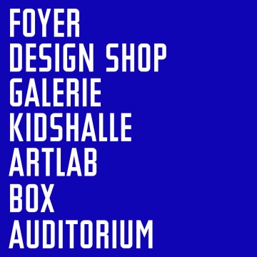
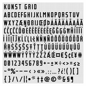
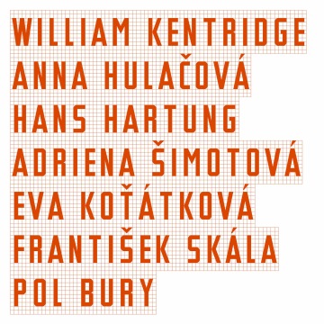
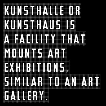
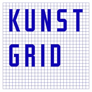
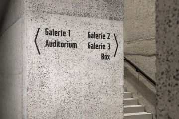
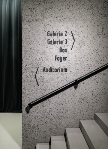
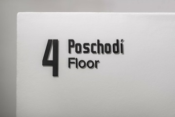
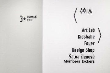
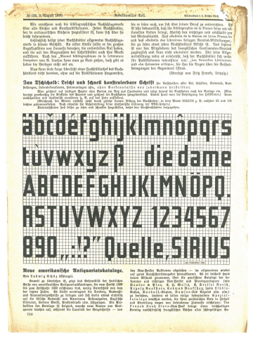
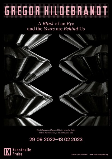
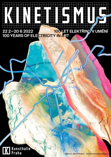
We created the logo of Kunsthalle Praha, this new art institution at Klárov, five years before its opening, and the Kunst font became the basis and an integral part of the future visual style of the orientation system and exhibitions. This font, designed by Mark Pistora, is based on a sketch by German typographer Jan Tschichold from 1930, the same time when the building of the former Zenger Transformer Substation was built.
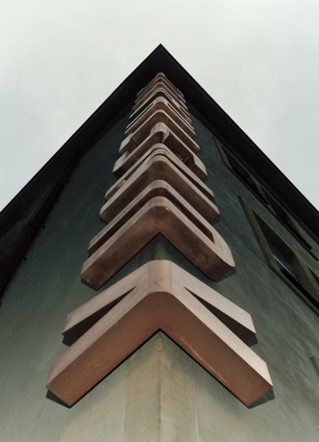
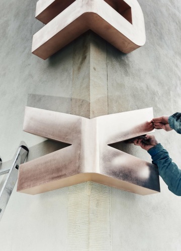
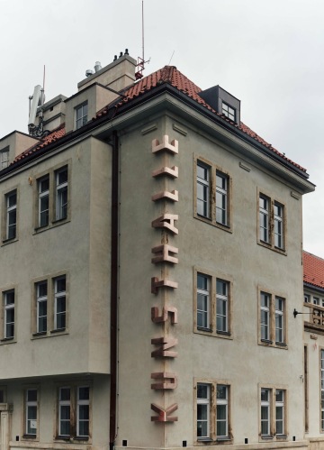
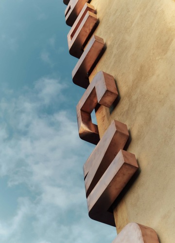
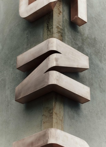
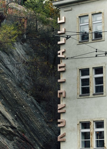
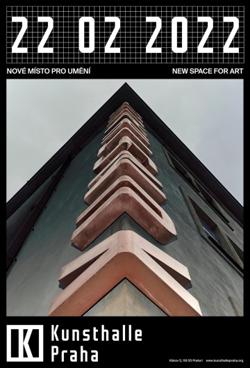
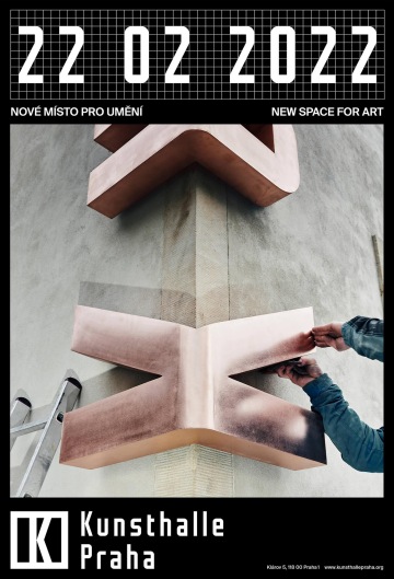
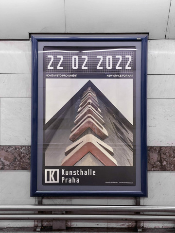
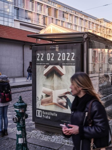
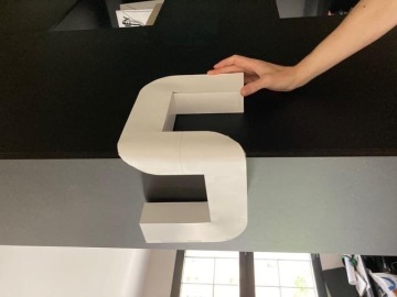
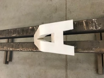
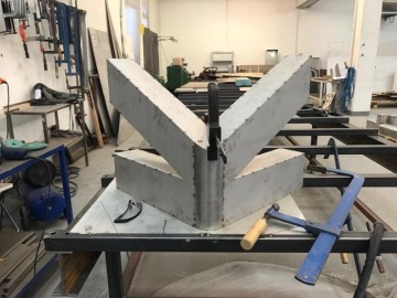
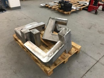
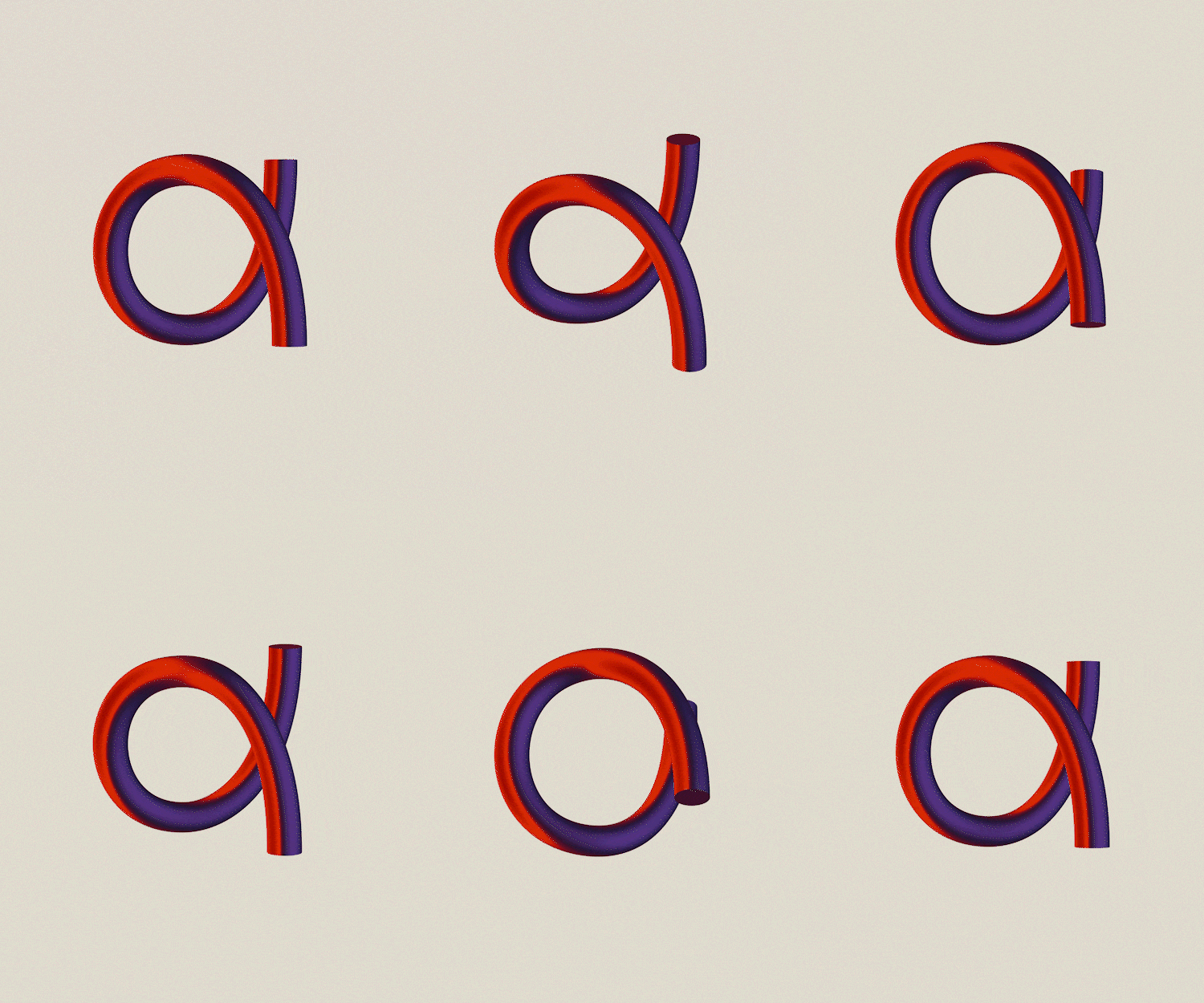
The idea for the typographic designation on the corner of the Kunsthalle Praha building arose during the development of the logotype and visual style. This unusual solution is not only well visible from different angles, but has become a natural part of the specific morphology of the building. The application on the facade required a lot of modifications and testing, paper models, visualizations, including the necessary stress of the Kunst font central strokes. The resulting metal inscription is definitely our biggest realization of typography in public space!
Client: Kunsthalle Praha,
Designer: Andrea Vacovská, Iveta Bláhová
Art director: Aleš Najbrt, Zuzana Lednická
Typography: Marek Pistora
3D: Jonatan Kuna
Webdesign: Michael Dolejš
Technical cooperation: Jakub Spurný, Zdeněk Trinkewitz
Production: Pavlína Nebáznivá
Additional cooperation: Vojtěch Veškrna (photo documentation), Schindler Seko (architecture), Moniteurs (interior architecture), Jakub Cabalka (application photography), Wellen (technical production)
Font: Custom, Suisse Intl,
Type: Exterior, Interior, Poster, Brand, Book, Exhibition, Web, Gallery,
Year: 2022
